Avg Results: Positive ROI within the first 90 days
Scale Smarter. Convert More. Survive the Storm.
When ad costs rise and margins shrink, we help ecom brands win with data-backed CRO. Our testing engine is built to drive growth — even in the toughest markets.
New year, new traffic - Start your CRO now to kick off the year on the right foot
What to expect from your CRO Audit
Some of our successful projects (so far...)
Click on each brand to read the full case study
Company
Service
Extra Revenue
ROI

CRO Partner
+$947,607.48
9.29x
Read More

CRO Partner
+€671,817.00
7.09x
Read More

CRO Partner
+€254,981
4.72x
Read More

CRO Partner
+$2,670,275.39
22.36x
Read More

CRO Partner
+$1,051,578.00
10.31x
Read More

CRO Partner
+€778.009,58
8.64x
Read More

CRO Partner
+$1,545,549.51
13.93x
Read More

CRO Partner
+5,411,693.83 DKK
7.44x
Read More

CRO Partner
+$211,622.31
2.35x
Read More

CRO Partner
+$514.392,70
18.37x
Read More
LOAD MORE
AI Supercharges Our CRO Work
At PurpleFire, we don’t just use AI, we leverage it to unlock smarter, faster, and more impactful results.
AI helps us cut through the noise, saving time on manual tasks and letting us focus on what really matters: driving growth.
It helps us uncover powerful insights: from spotting new customer segments to discovering product opportunities you didn’t even know existed.
Think of it as X-ray vision for your user experience.
When we combine these AI-powered insights with our team’s strategic expertise, we’re not just keeping up with trends, we’re setting them.
That means faster testing, smarter decisions, and a CRO program that keeps your brand one step ahead.

Avg Results: Positive ROI within the first 90 days
Scale Smarter. Convert More. Survive the Storm.
When ad costs rise and margins shrink, we help ecom brands win with data-backed CRO. Our testing engine is built to drive growth — even in the toughest markets.
New year, new traffic - Start your CRO now to kick off the year on the right foot
What to expect from your CRO Audit
Some of our successful projects (so far...)
Click on each brand to read the full case study
Company
Service
Extra Revenue
ROI

CRO Partner
+$947,607.48
9.29x
Read More

CRO Partner
+€671,817.00
7.09x
Read More

CRO Partner
+€254,981
4.72x
Read More

CRO Partner
+$2,670,275.39
22.36x
Read More

CRO Partner
+$1,051,578.00
10.31x
Read More

CRO Partner
+€778.009,58
8.64x
Read More

CRO Partner
+$1,545,549.51
13.93x
Read More

CRO Partner
+5,411,693.83 DKK
7.44x
Read More

CRO Partner
+$211,622.31
2.35x
Read More

CRO Partner
+$514.392,70
18.37x
Read More
LOAD MORE
AI Supercharges Our CRO Work
At PurpleFire, we don’t just use AI, we leverage it to unlock smarter, faster, and more impactful results.
AI helps us cut through the noise, saving time on manual tasks and letting us focus on what really matters: driving growth.
It helps us uncover powerful insights: from spotting new customer segments to discovering product opportunities you didn’t even know existed.
Think of it as X-ray vision for your user experience.
When we combine these AI-powered insights with our team’s strategic expertise, we’re not just keeping up with trends, we’re setting them.
That means faster testing, smarter decisions, and a CRO program that keeps your brand one step ahead.

Avg Results: Positive ROI within the first 90 days
Scale Smarter. Convert More. Survive the Storm.
When ad costs rise and margins shrink, we help ecom brands win with data-backed CRO. Our testing engine is built to drive growth — even in the toughest markets.
New year, new traffic - Start your CRO now to kick off the year on the right foot
What to expect from your CRO Audit
Some of our successful projects (so far...)
Click on each brand to read the full case study
Company
ROI

9.29x
Read More

7.09x
Read More

4.72x
Read More

22.36x
Read More

10.31x
Read More

8.64x
Read More

13.93x
Read More

7.44x
Read More

2.35x
Read More

18.37x
Read More
LOAD MORE

AI Supercharges Our CRO Work
At PurpleFire, we don’t just use AI, we leverage it to unlock smarter, faster, and more impactful results.
AI helps us cut through the noise, saving time on manual tasks and letting us focus on what really matters: driving growth.
It helps us uncover powerful insights: from spotting new customer segments to discovering product opportunities you didn’t even know existed.
Think of it as X-ray vision for your user experience.
When we combine these AI-powered insights with our team’s strategic expertise, we’re not just keeping up with trends, we’re setting them.
That means faster testing, smarter decisions, and a CRO program that keeps your brand one step ahead.
Case Studies
Case Studies
What works for one brand, doesn’t work for another
Trusting universal ‘best practices” will only get you so far. Benchmarking is good in the beginning but after a while you’ll realise you’re going round in circles.
Engage
Convert

From 30k/month to 100k/month in less than 2 months
“After we received the landing page, it was so professional and so well done that we decided to further work with Daniel and his team.”
ROI
3.0x
CVR
+24.8%
Extra Revenue
3.9x
Martijn
Owner of Real Mad Honey
What we can generate from A/B tests
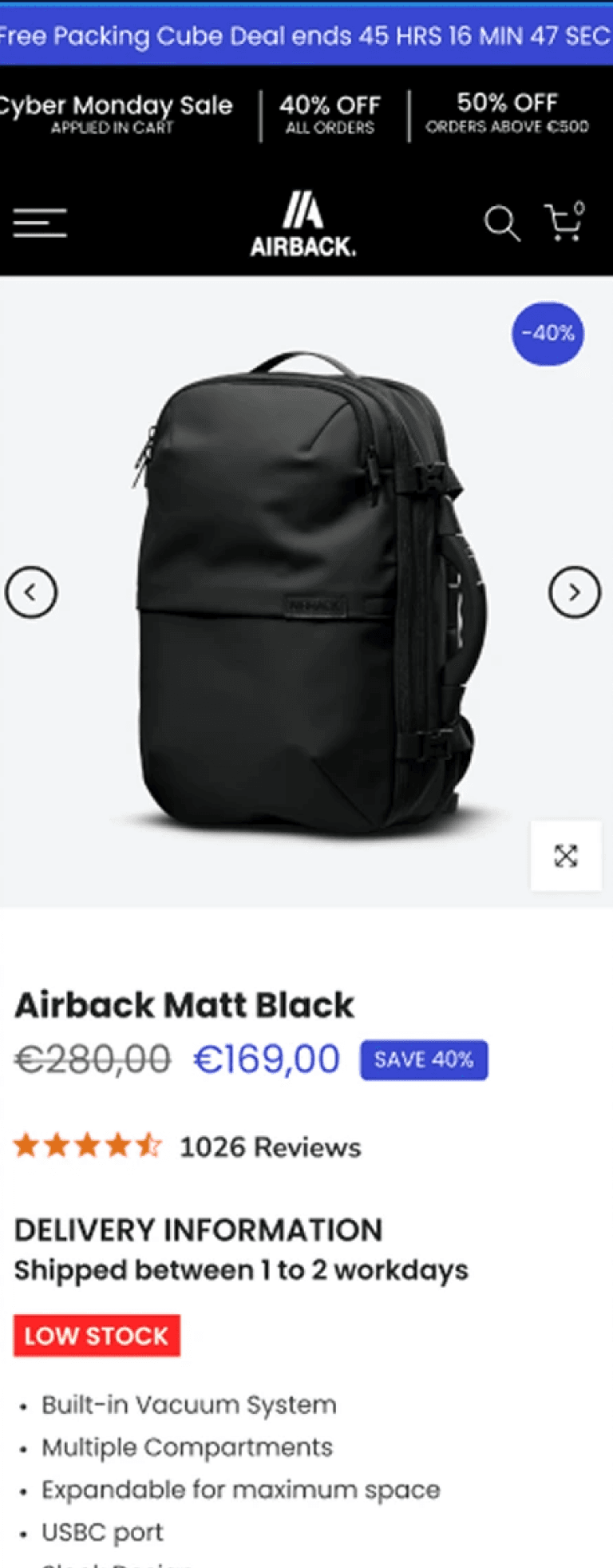
PDP redesign
Before
After
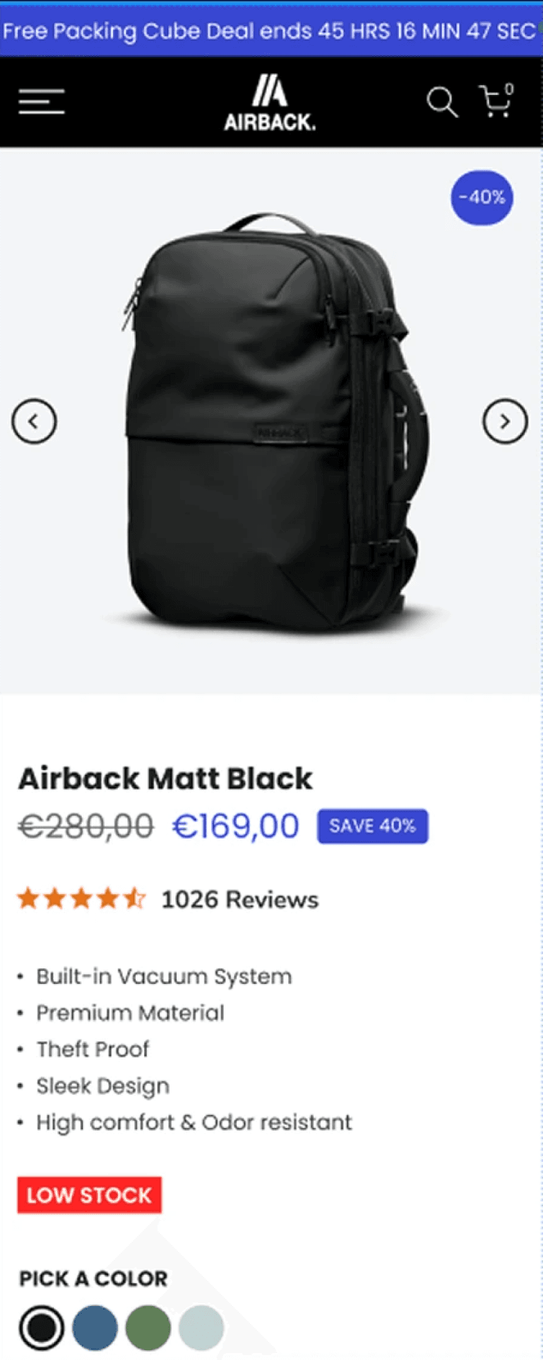
improvements
revenue
+29.70%
CVR:
+30.64%
HYPOTHESIS
Integrating clearly defined Unique Selling Propositions (USPs) will enhance customer understanding of AirBack products, leading to increased conversion rates. Streamlining the page by removing distractions will reduce cognitive load, allowing customers to focus on key benefits. Emphasizing powerful product benefits while eliminating weaker ones is expected to enhance perceived value and engagement. Adding prominent "Add to Cart" (ATC) buttons will facilitate quicker purchasing decisions, potentially increasing add-to-cart rates and overall sales.

Sticky ATC optimisation
Before
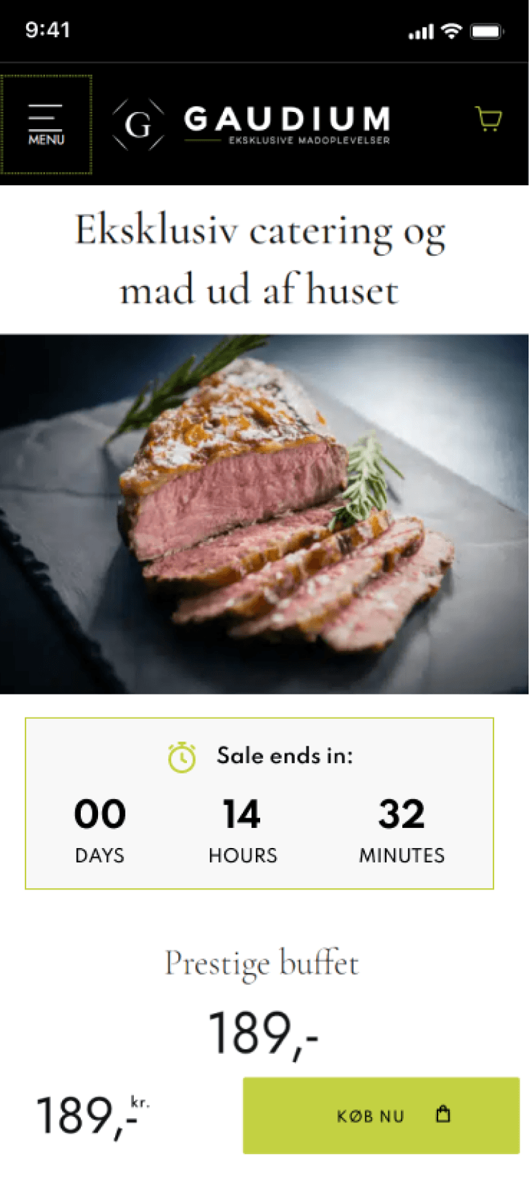
After
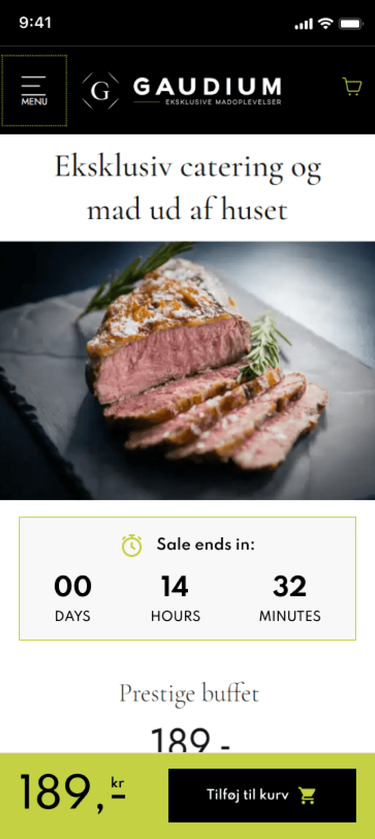
improvements
revenue
kr 332,321
CVR:
+22.39%
ATC:
+34.o1%
HYPOTHESIS
Best practices dictate we need to match the feeling with CTAs and try to make them specific on what will happen next.
Display product rating, thumbnails, and usage video in upper right corner
Before

After
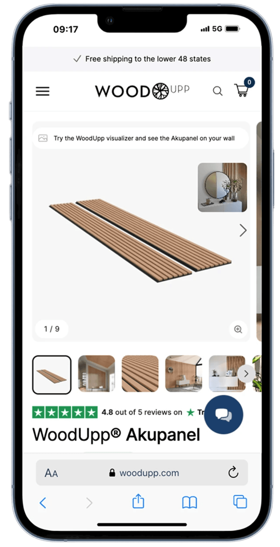
improvements
revenue
$224,715
CVR:
+4.84%
HYPOTHESIS
By displaying the product rating, thumbnails, and a product usage video in the upper right corner of mobile product pages, we will improve user engagement and trust, leading to higher conversion rates.

FAQs
Before
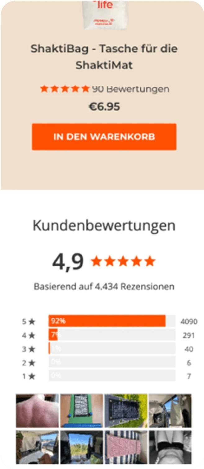
After

improvements
revenue
€32,794
CVR:
+6.32%
HYPOTHESIS
By Adding the FAQS for mobile devices, we will increase CVR, because users will find the information provided helpful and will reduce their friction for purchase.

Use arrows to guide scrolling in the “In the spotlight” section
Before
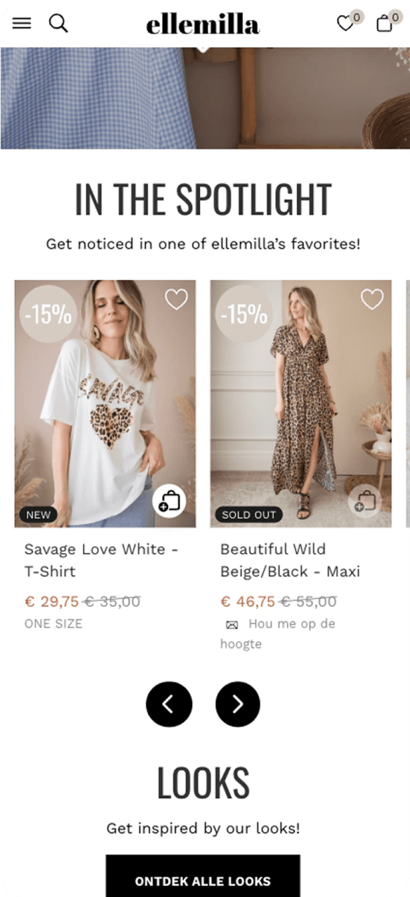
After
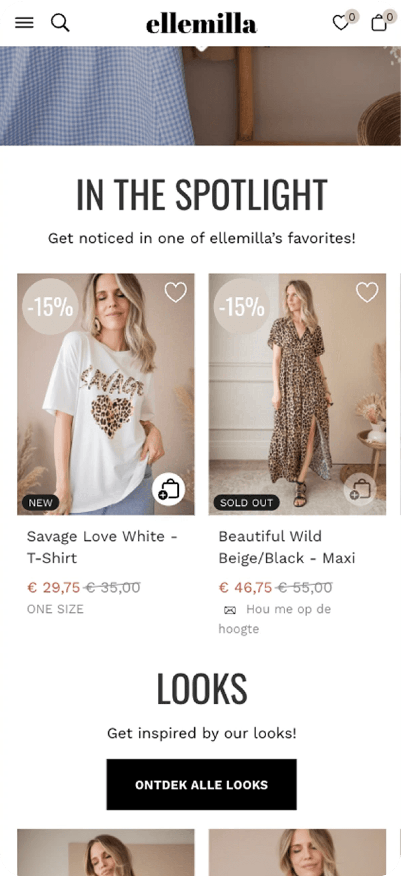
improvements
revenue
€2,093
CVR:
+267.32%
ENHANCES ENG:
+7.09%
HYPOTHESIS
By implementing arrow indicators to guide user scrolling in the "In the spotlight" section, users will be
more likely to engage with the content, resulting in increased visibility and interaction with featured
items, thereby enhancing the overall user experience and potentially boosting conversion rates. Use
Netflix as example.

Guarantees and benefits
Before

After
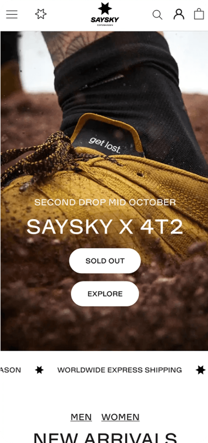
improvements
revenue
€24,663
CVR:
+12.53%
HYPOTHESIS
By having a dynamic bar below the main homepage banner highlighting the main benefits of Saysky like
free shipping and returns, we expect to see an increase in CVR. Users pay more attention to bigger
elements above the fold, having a greater impact than the announcement bar on top.

1st fold redesign
Before
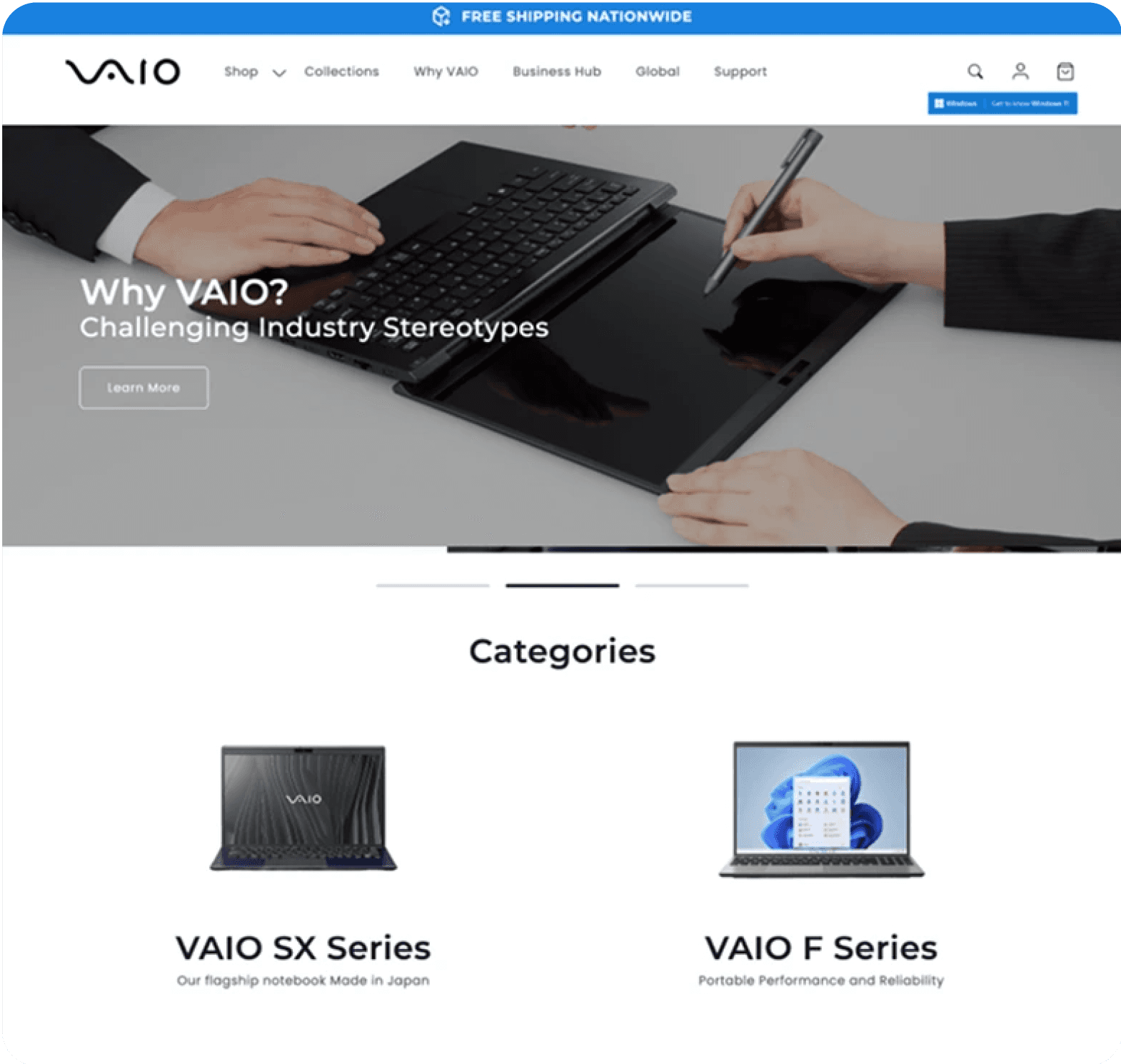
After
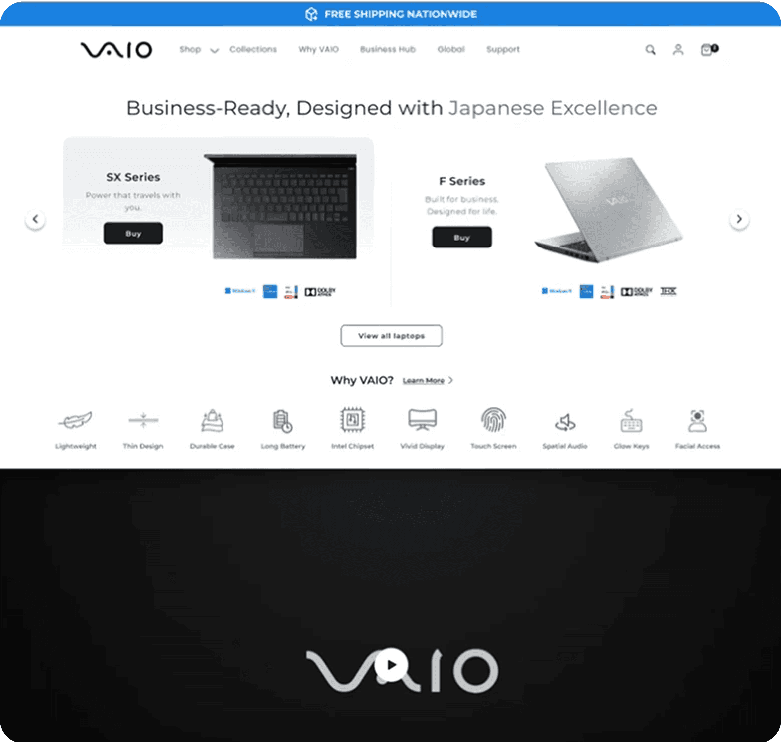
improvements
revenue
$65,669
RVP:
+46.91%
CVR:
+31.28%
HYPOTHESIS
Reduce Bounce Rate: By making the core products and collections more visible and accessible, we aim to keep users engaged and reduce the tendency to bounce back to the homepage.
Increase Conversion Rate (CVR): Highlighting the main collections and clarifying the USPs should lead to more informed and confident purchasing decisions, boosting conversions.
Improve User Experience: The new design will create a cleaner, more intuitive interface that helps users quickly understand what Vaio offers and navigate seamlessly to the products they are interested in.

PDP redesign
Before
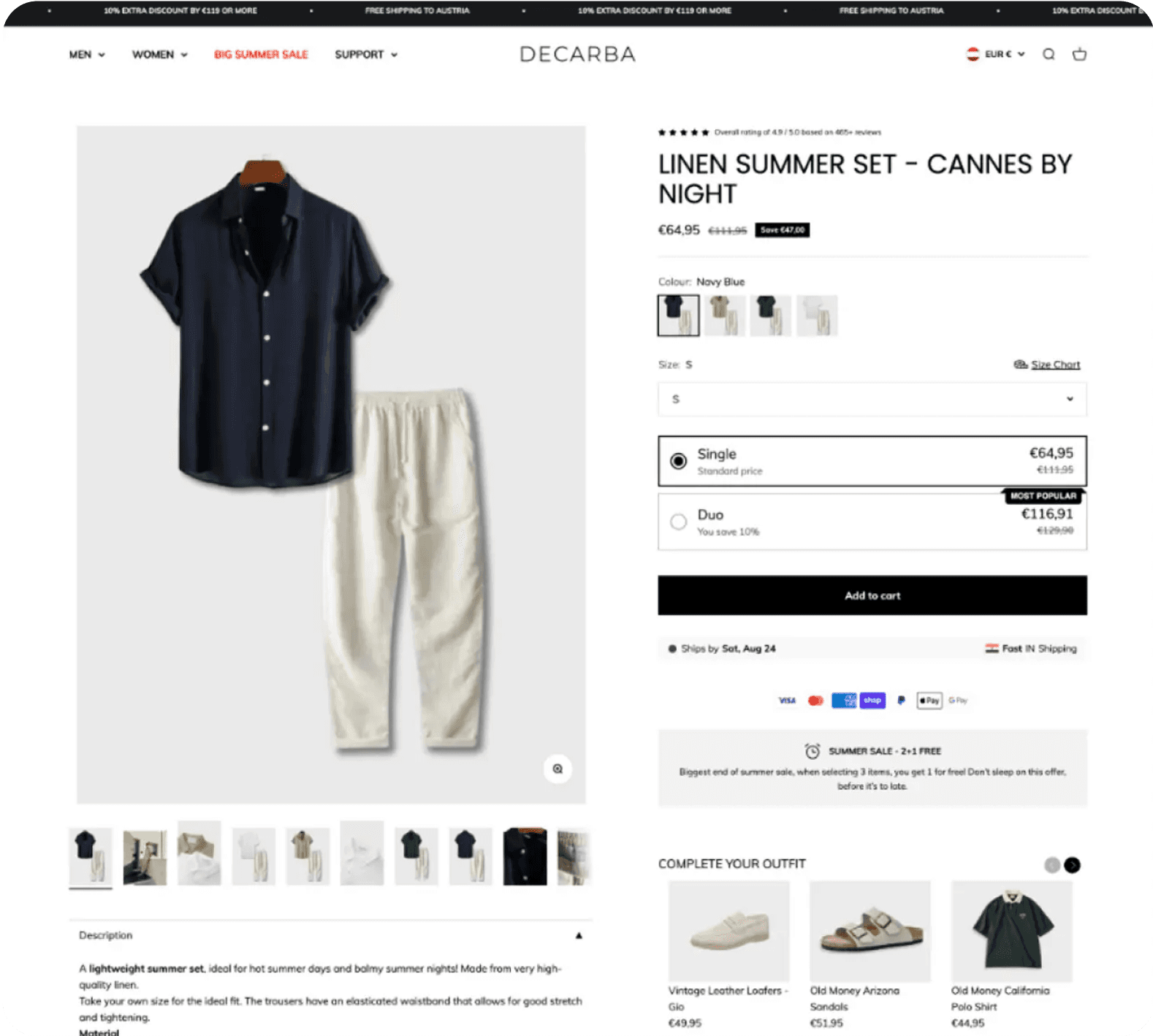
After
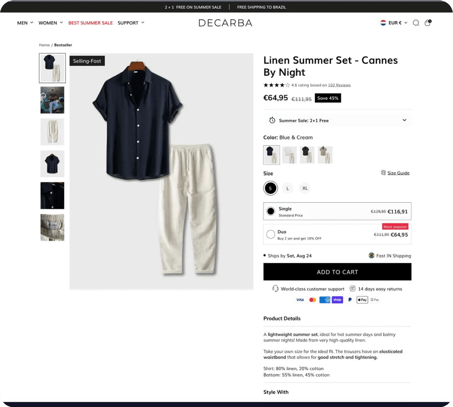
improvements
revenue
£6,290
CVR:
+4258.28%
HYPOTHESIS
By redesigning the product landing page, specifically through improved product size indicators and improved presentation of cross-sell and upsell options, we hypothesize that users will find it easier to navigate and make informed purchase decisions. This increased visibility and clarity will lead to higher conversion rates and improved customer satisfaction compared to the existing design.
The Saltworks Co.
Add sticky ATC button on the 1st fold
Before

After

improvements
revenue
£37,803
CVR:
+5.78%
HYPOTHESIS
By adding a sticky "Add to Cart" (ATC) button on the first fold that remains fixed during scrolling, we aim to reduce the effort users spend scrolling down to the "Add to Cart" section. This will increase the probability of purchase completion by making it easier for users to add items to their cart.

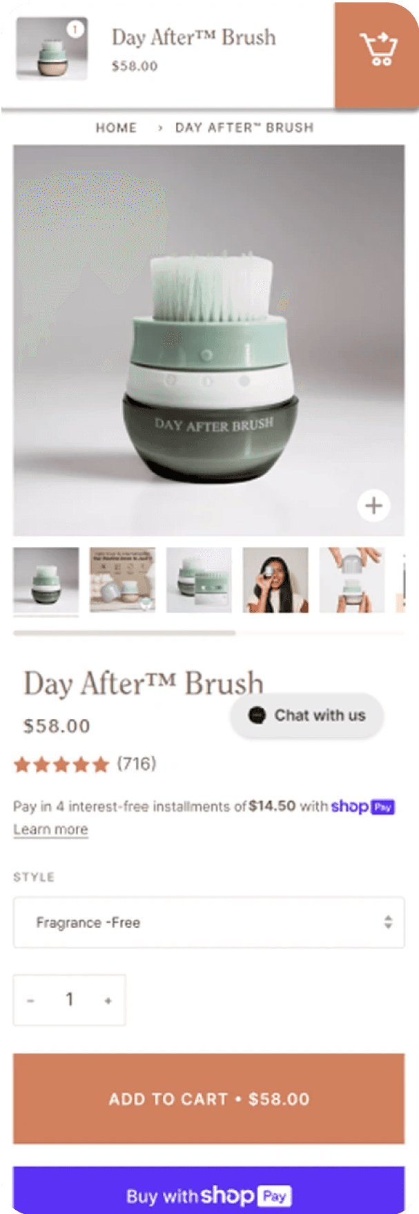
Use sticky order notification on PDP
Before

After
improvements
revenue
$15,370
CVR:
+13.36%
HYPOTHESIS
Implementing a sticky order notification on mobile product detail pages (PDP) that appears after a user clicks "Add to Cart" will improve user engagement, leading to an increase in the view cart rate and overall conversion rate.

PDP redesign
Before

After

improvements
revenue
+29.70%
CVR:
+30.64%
HYPOTHESIS
Integrating clearly defined Unique Selling Propositions (USPs) will enhance customer understanding of AirBack products, leading to increased conversion rates. Streamlining the page by removing distractions will reduce cognitive load, allowing customers to focus on key benefits. Emphasizing powerful product benefits while eliminating weaker ones is expected to enhance perceived value and engagement. Adding prominent "Add to Cart" (ATC) buttons will facilitate quicker purchasing decisions, potentially increasing add-to-cart rates and overall sales.

Sticky ATC optimisation
Before

After

improvements
revenue
kr 332,321
CVR:
+22.39%
ATC:
+34.o1%
HYPOTHESIS
Best practices dictate we need to match the feeling with CTAs and try to make them specific on what will happen next.
Display product rating, thumbnails, and usage video in upper right corner
Before

After

improvements
revenue
$224,715
CVR:
+4.84%
HYPOTHESIS
By displaying the product rating, thumbnails, and a product usage video in the upper right corner of mobile product pages, we will improve user engagement and trust, leading to higher conversion rates.

FAQs
Before

After

improvements
revenue
€32,794
CVR:
+6.32%
HYPOTHESIS
By Adding the FAQS for mobile devices, we will increase CVR, because users will find the information provided helpful and will reduce their friction for purchase.

Use arrows to guide scrolling in the “In the spotlight” section
Before

After

improvements
revenue
€2,093
CVR:
+267.32%
ENHANCES ENG:
+7.09%
HYPOTHESIS
By implementing arrow indicators to guide user scrolling in the "In the spotlight" section, users will be
more likely to engage with the content, resulting in increased visibility and interaction with featured
items, thereby enhancing the overall user experience and potentially boosting conversion rates. Use
Netflix as example.

Guarantees and benefits
Before

After

improvements
revenue
€24,663
CVR:
+12.53%
HYPOTHESIS
By having a dynamic bar below the main homepage banner highlighting the main benefits of Saysky like
free shipping and returns, we expect to see an increase in CVR. Users pay more attention to bigger
elements above the fold, having a greater impact than the announcement bar on top.

1st fold redesign
Before

After

improvements
revenue
$65,669
RVP:
+46.91%
CVR:
+31.28%
HYPOTHESIS
Reduce Bounce Rate: By making the core products and collections more visible and accessible, we aim to keep users engaged and reduce the tendency to bounce back to the homepage.
Increase Conversion Rate (CVR): Highlighting the main collections and clarifying the USPs should lead to more informed and confident purchasing decisions, boosting conversions.
Improve User Experience: The new design will create a cleaner, more intuitive interface that helps users quickly understand what Vaio offers and navigate seamlessly to the products they are interested in.

PDP redesign
Before

After

improvements
revenue
£6,290
CVR:
+4258.28%
HYPOTHESIS
By redesigning the product landing page, specifically through improved product size indicators and improved presentation of cross-sell and upsell options, we hypothesize that users will find it easier to navigate and make informed purchase decisions. This increased visibility and clarity will lead to higher conversion rates and improved customer satisfaction compared to the existing design.
The Saltworks Co.
Add sticky ATC button on the 1st fold
Before

After

improvements
revenue
£37,803
CVR:
+5.78%
HYPOTHESIS
By adding a sticky "Add to Cart" (ATC) button on the first fold that remains fixed during scrolling, we aim to reduce the effort users spend scrolling down to the "Add to Cart" section. This will increase the probability of purchase completion by making it easier for users to add items to their cart.

Use sticky order notification on PDP
Before

After

improvements
revenue
$15,370
CVR:
+13.36%
HYPOTHESIS
Implementing a sticky order notification on mobile product detail pages (PDP) that appears after a user clicks "Add to Cart" will improve user engagement, leading to an increase in the view cart rate and overall conversion rate.

PDP redesign
Before

After

improvements
revenue
+29.70%
CVR:
+30.64%
HYPOTHESIS
Integrating clearly defined Unique Selling Propositions (USPs) will enhance customer understanding of AirBack products, leading to increased conversion rates. Streamlining the page by removing distractions will reduce cognitive load, allowing customers to focus on key benefits. Emphasizing powerful product benefits while eliminating weaker ones is expected to enhance perceived value and engagement. Adding prominent "Add to Cart" (ATC) buttons will facilitate quicker purchasing decisions, potentially increasing add-to-cart rates and overall sales.

Sticky ATC optimisation
Before

After

improvements
revenue
kr 332,321
CVR:
+22.39%
ATC:
+34.o1%
HYPOTHESIS
Best practices dictate we need to match the feeling with CTAs and try to make them specific on what will happen next.
Display product rating, thumbnails, and usage video in upper right corner
Before

After

improvements
revenue
$224,715
CVR:
+4.84%
HYPOTHESIS
By displaying the product rating, thumbnails, and a product usage video in the upper right corner of mobile product pages, we will improve user engagement and trust, leading to higher conversion rates.

FAQs
Before

After

improvements
revenue
€32,794
CVR:
+6.32%
HYPOTHESIS
By Adding the FAQS for mobile devices, we will increase CVR, because users will find the information provided helpful and will reduce their friction for purchase.

Use arrows to guide scrolling in the “In the spotlight” section
Before

After

improvements
revenue
€2,093
CVR:
+267.32%
ENHANCES ENG:
+7.09%
HYPOTHESIS
By implementing arrow indicators to guide user scrolling in the "In the spotlight" section, users will be
more likely to engage with the content, resulting in increased visibility and interaction with featured
items, thereby enhancing the overall user experience and potentially boosting conversion rates. Use
Netflix as example.

Guarantees and benefits
Before

After

improvements
revenue
€24,663
CVR:
+12.53%
HYPOTHESIS
By having a dynamic bar below the main homepage banner highlighting the main benefits of Saysky like
free shipping and returns, we expect to see an increase in CVR. Users pay more attention to bigger
elements above the fold, having a greater impact than the announcement bar on top.

1st fold redesign
Before

After

improvements
revenue
$65,669
RVP:
+46.91%
CVR:
+31.28%
HYPOTHESIS
Reduce Bounce Rate: By making the core products and collections more visible and accessible, we aim to keep users engaged and reduce the tendency to bounce back to the homepage.
Increase Conversion Rate (CVR): Highlighting the main collections and clarifying the USPs should lead to more informed and confident purchasing decisions, boosting conversions.
Improve User Experience: The new design will create a cleaner, more intuitive interface that helps users quickly understand what Vaio offers and navigate seamlessly to the products they are interested in.

PDP redesign
Before

After

improvements
revenue
£6,290
CVR:
+4258.28%
HYPOTHESIS
By redesigning the product landing page, specifically through improved product size indicators and improved presentation of cross-sell and upsell options, we hypothesize that users will find it easier to navigate and make informed purchase decisions. This increased visibility and clarity will lead to higher conversion rates and improved customer satisfaction compared to the existing design.
The Saltworks Co.
Add sticky ATC button on the 1st fold
Before

After

improvements
revenue
£37,803
CVR:
+5.78%
HYPOTHESIS
By adding a sticky "Add to Cart" (ATC) button on the first fold that remains fixed during scrolling, we aim to reduce the effort users spend scrolling down to the "Add to Cart" section. This will increase the probability of purchase completion by making it easier for users to add items to their cart.

Use sticky order notification on PDP
Before

After

improvements
revenue
$15,370
CVR:
+13.36%
HYPOTHESIS
Implementing a sticky order notification on mobile product detail pages (PDP) that appears after a user clicks "Add to Cart" will improve user engagement, leading to an increase in the view cart rate and overall conversion rate.

PDP redesign
Before

After

improvements
revenue
+29.70%
CVR:
+30.64%
HYPOTHESIS
Integrating clearly defined Unique Selling Propositions (USPs) will enhance customer understanding of AirBack products, leading to increased conversion rates. Streamlining the page by removing distractions will reduce cognitive load, allowing customers to focus on key benefits. Emphasizing powerful product benefits while eliminating weaker ones is expected to enhance perceived value and engagement. Adding prominent "Add to Cart" (ATC) buttons will facilitate quicker purchasing decisions, potentially increasing add-to-cart rates and overall sales.

Sticky ATC optimisation
Before

After

improvements
revenue
kr 332,321
CVR:
+22.39%
ATC:
+34.o1%
HYPOTHESIS
Best practices dictate we need to match the feeling with CTAs and try to make them specific on what will happen next.
Display product rating, thumbnails, and usage video in upper right corner
Before

After

improvements
revenue
$224,715
CVR:
+4.84%
HYPOTHESIS
By displaying the product rating, thumbnails, and a product usage video in the upper right corner of mobile product pages, we will improve user engagement and trust, leading to higher conversion rates.

FAQs
Before

After

improvements
revenue
€32,794
CVR:
+6.32%
HYPOTHESIS
By Adding the FAQS for mobile devices, we will increase CVR, because users will find the information provided helpful and will reduce their friction for purchase.

Use arrows to guide scrolling in the “In the spotlight” section
Before

After

improvements
revenue
€2,093
CVR:
+267.32%
ENHANCES ENG:
+7.09%
HYPOTHESIS
By implementing arrow indicators to guide user scrolling in the "In the spotlight" section, users will be
more likely to engage with the content, resulting in increased visibility and interaction with featured
items, thereby enhancing the overall user experience and potentially boosting conversion rates. Use
Netflix as example.

Guarantees and benefits
Before

After

improvements
revenue
€24,663
CVR:
+12.53%
HYPOTHESIS
By having a dynamic bar below the main homepage banner highlighting the main benefits of Saysky like
free shipping and returns, we expect to see an increase in CVR. Users pay more attention to bigger
elements above the fold, having a greater impact than the announcement bar on top.

1st fold redesign
Before

After

improvements
revenue
$65,669
RVP:
+46.91%
CVR:
+31.28%
HYPOTHESIS
Reduce Bounce Rate: By making the core products and collections more visible and accessible, we aim to keep users engaged and reduce the tendency to bounce back to the homepage.
Increase Conversion Rate (CVR): Highlighting the main collections and clarifying the USPs should lead to more informed and confident purchasing decisions, boosting conversions.
Improve User Experience: The new design will create a cleaner, more intuitive interface that helps users quickly understand what Vaio offers and navigate seamlessly to the products they are interested in.

PDP redesign
Before

After

improvements
revenue
£6,290
CVR:
+4258.28%
HYPOTHESIS
By redesigning the product landing page, specifically through improved product size indicators and improved presentation of cross-sell and upsell options, we hypothesize that users will find it easier to navigate and make informed purchase decisions. This increased visibility and clarity will lead to higher conversion rates and improved customer satisfaction compared to the existing design.
The Saltworks Co.
Add sticky ATC button on the 1st fold
Before

After

improvements
revenue
£37,803
CVR:
+5.78%
HYPOTHESIS
By adding a sticky "Add to Cart" (ATC) button on the first fold that remains fixed during scrolling, we aim to reduce the effort users spend scrolling down to the "Add to Cart" section. This will increase the probability of purchase completion by making it easier for users to add items to their cart.

Use sticky order notification on PDP
Before

After

improvements
revenue
$15,370
CVR:
+13.36%
HYPOTHESIS
Implementing a sticky order notification on mobile product detail pages (PDP) that appears after a user clicks "Add to Cart" will improve user engagement, leading to an increase in the view cart rate and overall conversion rate.
What works for one brand, doesn’t work for another
Trusting universal ‘best practices” will only get you so far. Benchmarking is good in the beginning but after a while you’ll realise you’re going round in circles.
Engage
Convert

From 30k/month to 100k/month in less than 2 months
“After we received the landing page, it was so professional and so well done that we decided to further work with Daniel and his team.”
ROI
3.0x
CVR
+24.8%
Extra Revenue
3.9x
Martijn
Owner of Real Mad Honey
What we can generate from A/B tests

PDP redesign
Before

After

improvements
revenue
+29.70%
CVR:
+30.64%
HYPOTHESIS
Integrating clearly defined Unique Selling Propositions (USPs) will enhance customer understanding of AirBack products, leading to increased conversion rates. Streamlining the page by removing distractions will reduce cognitive load, allowing customers to focus on key benefits. Emphasizing powerful product benefits while eliminating weaker ones is expected to enhance perceived value and engagement. Adding prominent "Add to Cart" (ATC) buttons will facilitate quicker purchasing decisions, potentially increasing add-to-cart rates and overall sales.

Sticky ATC optimisation
Before

After

improvements
revenue
kr 332,321
CVR:
+22.39%
ATC:
+34.o1%
HYPOTHESIS
Best practices dictate we need to match the feeling with CTAs and try to make them specific on what will happen next.
Display product rating, thumbnails, and usage video in upper right corner
Before

After

improvements
revenue
$224,715
CVR:
+4.84%
HYPOTHESIS
By displaying the product rating, thumbnails, and a product usage video in the upper right corner of mobile product pages, we will improve user engagement and trust, leading to higher conversion rates.

FAQs
Before

After

improvements
revenue
€32,794
CVR:
+6.32%
HYPOTHESIS
By Adding the FAQS for mobile devices, we will increase CVR, because users will find the information provided helpful and will reduce their friction for purchase.

Use arrows to guide scrolling in the “In the spotlight” section
Before

After

improvements
revenue
€2,093
CVR:
+267.32%
ENHANCES ENG:
+7.09%
HYPOTHESIS
By implementing arrow indicators to guide user scrolling in the "In the spotlight" section, users will be
more likely to engage with the content, resulting in increased visibility and interaction with featured
items, thereby enhancing the overall user experience and potentially boosting conversion rates. Use
Netflix as example.

Guarantees and benefits
Before

After

improvements
revenue
€24,663
CVR:
+12.53%
HYPOTHESIS
By having a dynamic bar below the main homepage banner highlighting the main benefits of Saysky like
free shipping and returns, we expect to see an increase in CVR. Users pay more attention to bigger
elements above the fold, having a greater impact than the announcement bar on top.

1st fold redesign
Before

After

improvements
revenue
$65,669
RVP:
+46.91%
CVR:
+31.28%
HYPOTHESIS
Reduce Bounce Rate: By making the core products and collections more visible and accessible, we aim to keep users engaged and reduce the tendency to bounce back to the homepage.
Increase Conversion Rate (CVR): Highlighting the main collections and clarifying the USPs should lead to more informed and confident purchasing decisions, boosting conversions.
Improve User Experience: The new design will create a cleaner, more intuitive interface that helps users quickly understand what Vaio offers and navigate seamlessly to the products they are interested in.

PDP redesign
Before

After

improvements
revenue
£6,290
CVR:
+4258.28%
HYPOTHESIS
By redesigning the product landing page, specifically through improved product size indicators and improved presentation of cross-sell and upsell options, we hypothesize that users will find it easier to navigate and make informed purchase decisions. This increased visibility and clarity will lead to higher conversion rates and improved customer satisfaction compared to the existing design.
The Saltworks Co.
Add sticky ATC button on the 1st fold
Before

After

improvements
revenue
£37,803
CVR:
+5.78%
HYPOTHESIS
By adding a sticky "Add to Cart" (ATC) button on the first fold that remains fixed during scrolling, we aim to reduce the effort users spend scrolling down to the "Add to Cart" section. This will increase the probability of purchase completion by making it easier for users to add items to their cart.

Use sticky order notification on PDP
Before

After

improvements
revenue
$15,370
CVR:
+13.36%
HYPOTHESIS
Implementing a sticky order notification on mobile product detail pages (PDP) that appears after a user clicks "Add to Cart" will improve user engagement, leading to an increase in the view cart rate and overall conversion rate.

PDP redesign
Before

After

improvements
revenue
+29.70%
CVR:
+30.64%
HYPOTHESIS
Integrating clearly defined Unique Selling Propositions (USPs) will enhance customer understanding of AirBack products, leading to increased conversion rates. Streamlining the page by removing distractions will reduce cognitive load, allowing customers to focus on key benefits. Emphasizing powerful product benefits while eliminating weaker ones is expected to enhance perceived value and engagement. Adding prominent "Add to Cart" (ATC) buttons will facilitate quicker purchasing decisions, potentially increasing add-to-cart rates and overall sales.

Sticky ATC optimisation
Before

After

improvements
revenue
kr 332,321
CVR:
+22.39%
ATC:
+34.o1%
HYPOTHESIS
Best practices dictate we need to match the feeling with CTAs and try to make them specific on what will happen next.
Display product rating, thumbnails, and usage video in upper right corner
Before

After

improvements
revenue
$224,715
CVR:
+4.84%
HYPOTHESIS
By displaying the product rating, thumbnails, and a product usage video in the upper right corner of mobile product pages, we will improve user engagement and trust, leading to higher conversion rates.

FAQs
Before

After

improvements
revenue
€32,794
CVR:
+6.32%
HYPOTHESIS
By Adding the FAQS for mobile devices, we will increase CVR, because users will find the information provided helpful and will reduce their friction for purchase.

Use arrows to guide scrolling in the “In the spotlight” section
Before

After

improvements
revenue
€2,093
CVR:
+267.32%
ENHANCES ENG:
+7.09%
HYPOTHESIS
By implementing arrow indicators to guide user scrolling in the "In the spotlight" section, users will be
more likely to engage with the content, resulting in increased visibility and interaction with featured
items, thereby enhancing the overall user experience and potentially boosting conversion rates. Use
Netflix as example.

Guarantees and benefits
Before

After

improvements
revenue
€24,663
CVR:
+12.53%
HYPOTHESIS
By having a dynamic bar below the main homepage banner highlighting the main benefits of Saysky like
free shipping and returns, we expect to see an increase in CVR. Users pay more attention to bigger
elements above the fold, having a greater impact than the announcement bar on top.

1st fold redesign
Before

After

improvements
revenue
$65,669
RVP:
+46.91%
CVR:
+31.28%
HYPOTHESIS
Reduce Bounce Rate: By making the core products and collections more visible and accessible, we aim to keep users engaged and reduce the tendency to bounce back to the homepage.
Increase Conversion Rate (CVR): Highlighting the main collections and clarifying the USPs should lead to more informed and confident purchasing decisions, boosting conversions.
Improve User Experience: The new design will create a cleaner, more intuitive interface that helps users quickly understand what Vaio offers and navigate seamlessly to the products they are interested in.

PDP redesign
Before

After

improvements
revenue
£6,290
CVR:
+4258.28%
HYPOTHESIS
By redesigning the product landing page, specifically through improved product size indicators and improved presentation of cross-sell and upsell options, we hypothesize that users will find it easier to navigate and make informed purchase decisions. This increased visibility and clarity will lead to higher conversion rates and improved customer satisfaction compared to the existing design.
The Saltworks Co.
Add sticky ATC button on the 1st fold
Before

After

improvements
revenue
£37,803
CVR:
+5.78%
HYPOTHESIS
By adding a sticky "Add to Cart" (ATC) button on the first fold that remains fixed during scrolling, we aim to reduce the effort users spend scrolling down to the "Add to Cart" section. This will increase the probability of purchase completion by making it easier for users to add items to their cart.

Use sticky order notification on PDP
Before

After

improvements
revenue
$15,370
CVR:
+13.36%
HYPOTHESIS
Implementing a sticky order notification on mobile product detail pages (PDP) that appears after a user clicks "Add to Cart" will improve user engagement, leading to an increase in the view cart rate and overall conversion rate.

PDP redesign
Before

After

improvements
revenue
+29.70%
CVR:
+30.64%
HYPOTHESIS
Integrating clearly defined Unique Selling Propositions (USPs) will enhance customer understanding of AirBack products, leading to increased conversion rates. Streamlining the page by removing distractions will reduce cognitive load, allowing customers to focus on key benefits. Emphasizing powerful product benefits while eliminating weaker ones is expected to enhance perceived value and engagement. Adding prominent "Add to Cart" (ATC) buttons will facilitate quicker purchasing decisions, potentially increasing add-to-cart rates and overall sales.

Sticky ATC optimisation
Before

After

improvements
revenue
kr 332,321
CVR:
+22.39%
ATC:
+34.o1%
HYPOTHESIS
Best practices dictate we need to match the feeling with CTAs and try to make them specific on what will happen next.
Display product rating, thumbnails, and usage video in upper right corner
Before

After

improvements
revenue
$224,715
CVR:
+4.84%
HYPOTHESIS
By displaying the product rating, thumbnails, and a product usage video in the upper right corner of mobile product pages, we will improve user engagement and trust, leading to higher conversion rates.

FAQs
Before

After

improvements
revenue
€32,794
CVR:
+6.32%
HYPOTHESIS
By Adding the FAQS for mobile devices, we will increase CVR, because users will find the information provided helpful and will reduce their friction for purchase.

Use arrows to guide scrolling in the “In the spotlight” section
Before

After

improvements
revenue
€2,093
CVR:
+267.32%
ENHANCES ENG:
+7.09%
HYPOTHESIS
By implementing arrow indicators to guide user scrolling in the "In the spotlight" section, users will be
more likely to engage with the content, resulting in increased visibility and interaction with featured
items, thereby enhancing the overall user experience and potentially boosting conversion rates. Use
Netflix as example.

Guarantees and benefits
Before

After

improvements
revenue
€24,663
CVR:
+12.53%
HYPOTHESIS
By having a dynamic bar below the main homepage banner highlighting the main benefits of Saysky like
free shipping and returns, we expect to see an increase in CVR. Users pay more attention to bigger
elements above the fold, having a greater impact than the announcement bar on top.

1st fold redesign
Before

After

improvements
revenue
$65,669
RVP:
+46.91%
CVR:
+31.28%
HYPOTHESIS
Reduce Bounce Rate: By making the core products and collections more visible and accessible, we aim to keep users engaged and reduce the tendency to bounce back to the homepage.
Increase Conversion Rate (CVR): Highlighting the main collections and clarifying the USPs should lead to more informed and confident purchasing decisions, boosting conversions.
Improve User Experience: The new design will create a cleaner, more intuitive interface that helps users quickly understand what Vaio offers and navigate seamlessly to the products they are interested in.

PDP redesign
Before

After

improvements
revenue
£6,290
CVR:
+4258.28%
HYPOTHESIS
By redesigning the product landing page, specifically through improved product size indicators and improved presentation of cross-sell and upsell options, we hypothesize that users will find it easier to navigate and make informed purchase decisions. This increased visibility and clarity will lead to higher conversion rates and improved customer satisfaction compared to the existing design.
The Saltworks Co.
Add sticky ATC button on the 1st fold
Before

After

improvements
revenue
£37,803
CVR:
+5.78%
HYPOTHESIS
By adding a sticky "Add to Cart" (ATC) button on the first fold that remains fixed during scrolling, we aim to reduce the effort users spend scrolling down to the "Add to Cart" section. This will increase the probability of purchase completion by making it easier for users to add items to their cart.

Use sticky order notification on PDP
Before

After

improvements
revenue
$15,370
CVR:
+13.36%
HYPOTHESIS
Implementing a sticky order notification on mobile product detail pages (PDP) that appears after a user clicks "Add to Cart" will improve user engagement, leading to an increase in the view cart rate and overall conversion rate.

PDP redesign
Before

After

improvements
revenue
+29.70%
CVR:
+30.64%
HYPOTHESIS
Integrating clearly defined Unique Selling Propositions (USPs) will enhance customer understanding of AirBack products, leading to increased conversion rates. Streamlining the page by removing distractions will reduce cognitive load, allowing customers to focus on key benefits. Emphasizing powerful product benefits while eliminating weaker ones is expected to enhance perceived value and engagement. Adding prominent "Add to Cart" (ATC) buttons will facilitate quicker purchasing decisions, potentially increasing add-to-cart rates and overall sales.

Sticky ATC optimisation
Before

After

improvements
revenue
kr 332,321
CVR:
+22.39%
ATC:
+34.o1%
HYPOTHESIS
Best practices dictate we need to match the feeling with CTAs and try to make them specific on what will happen next.
Display product rating, thumbnails, and usage video in upper right corner
Before

After

improvements
revenue
$224,715
CVR:
+4.84%
HYPOTHESIS
By displaying the product rating, thumbnails, and a product usage video in the upper right corner of mobile product pages, we will improve user engagement and trust, leading to higher conversion rates.

FAQs
Before

After

improvements
revenue
€32,794
CVR:
+6.32%
HYPOTHESIS
By Adding the FAQS for mobile devices, we will increase CVR, because users will find the information provided helpful and will reduce their friction for purchase.

Use arrows to guide scrolling in the “In the spotlight” section
Before

After

improvements
revenue
€2,093
CVR:
+267.32%
ENHANCES ENG:
+7.09%
HYPOTHESIS
By implementing arrow indicators to guide user scrolling in the "In the spotlight" section, users will be
more likely to engage with the content, resulting in increased visibility and interaction with featured
items, thereby enhancing the overall user experience and potentially boosting conversion rates. Use
Netflix as example.

Guarantees and benefits
Before

After

improvements
revenue
€24,663
CVR:
+12.53%
HYPOTHESIS
By having a dynamic bar below the main homepage banner highlighting the main benefits of Saysky like
free shipping and returns, we expect to see an increase in CVR. Users pay more attention to bigger
elements above the fold, having a greater impact than the announcement bar on top.

1st fold redesign
Before

After

improvements
revenue
$65,669
RVP:
+46.91%
CVR:
+31.28%
HYPOTHESIS
Reduce Bounce Rate: By making the core products and collections more visible and accessible, we aim to keep users engaged and reduce the tendency to bounce back to the homepage.
Increase Conversion Rate (CVR): Highlighting the main collections and clarifying the USPs should lead to more informed and confident purchasing decisions, boosting conversions.
Improve User Experience: The new design will create a cleaner, more intuitive interface that helps users quickly understand what Vaio offers and navigate seamlessly to the products they are interested in.

PDP redesign
Before

After

improvements
revenue
£6,290
CVR:
+4258.28%
HYPOTHESIS
By redesigning the product landing page, specifically through improved product size indicators and improved presentation of cross-sell and upsell options, we hypothesize that users will find it easier to navigate and make informed purchase decisions. This increased visibility and clarity will lead to higher conversion rates and improved customer satisfaction compared to the existing design.
The Saltworks Co.
Add sticky ATC button on the 1st fold
Before

After

improvements
revenue
£37,803
CVR:
+5.78%
HYPOTHESIS
By adding a sticky "Add to Cart" (ATC) button on the first fold that remains fixed during scrolling, we aim to reduce the effort users spend scrolling down to the "Add to Cart" section. This will increase the probability of purchase completion by making it easier for users to add items to their cart.

Use sticky order notification on PDP
Before

After

improvements
revenue
$15,370
CVR:
+13.36%
HYPOTHESIS
Implementing a sticky order notification on mobile product detail pages (PDP) that appears after a user clicks "Add to Cart" will improve user engagement, leading to an increase in the view cart rate and overall conversion rate.
What works for one brand, doesn’t work for another
Trusting universal ‘best practices” will only get you so far. Benchmarking is good in the beginning but after a while you’ll realise you’re going round in circles.
Engage
Convert

From 30k/month to 100k/month in less than 2 months
“After we received the landing page, it was so professional and so well done that we decided to further work with Daniel and his team.”
CVR
25%
Extra Revenue
3.8x
ROI
3.0x
Martijn
Owner of Real Mad Honey
What we can generate from A/B tests

PDP redesign
Before
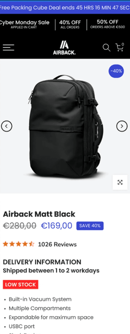
After

revenue
+29.70%
CVR:
+30.64%
HYPOTHESIS
Integrating clearly defined Unique Selling Propositions (USPs) will enhance customer understanding of AirBack products, leading to increased conversion rates. Streamlining the page by removing distractions will reduce cognitive load, allowing customers to focus on key benefits. Emphasizing powerful product benefits while eliminating weaker ones is expected to enhance perceived value and engagement. Adding prominent "Add to Cart" (ATC) buttons will facilitate quicker purchasing decisions, potentially increasing add-to-cart rates and overall sales.

Sticky ATC optimisation
Before
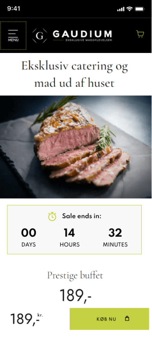
After

revenue
kr 332,321
CVR:
+22.39%
ATC:
+34.o1%
HYPOTHESIS
Best practices dictate we need to match the feeling with CTAs and try to make them specific on what will happen next.
Display product rating, thumbnails, and usage video in upper right corner
Before
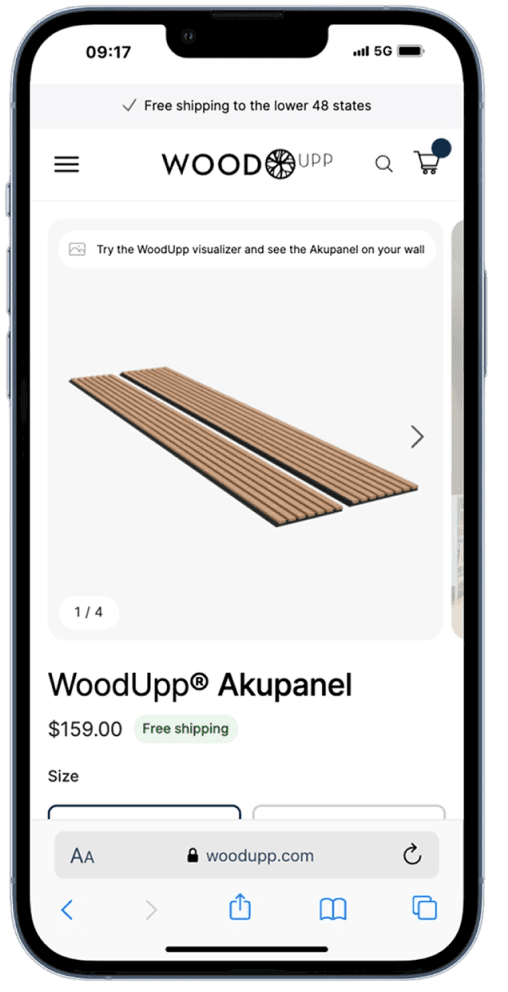
After
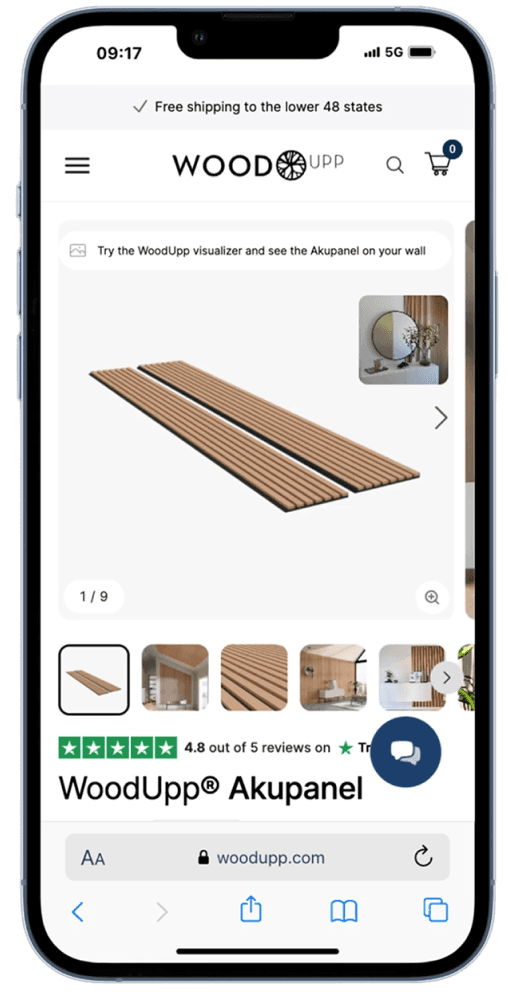
revenue
$224,715
CVR:
+4.84%
HYPOTHESIS
By displaying the product rating, thumbnails, and a product usage video in the upper right corner of mobile product pages, we will improve user engagement and trust, leading to higher conversion rates.

FAQs
Before
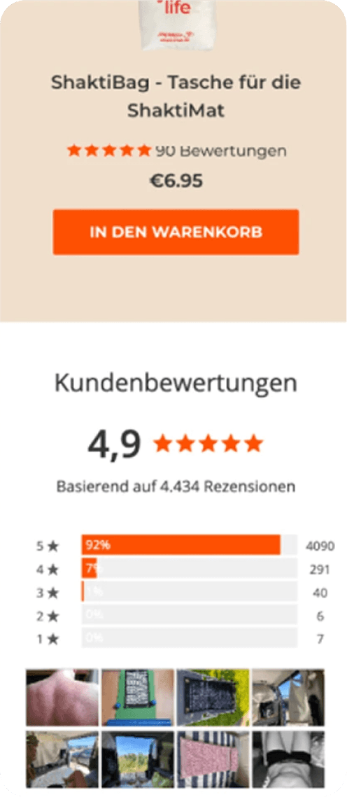
After

revenue
€32,794
CVR:
+6.32%
HYPOTHESIS
By Adding the FAQS for mobile devices, we will increase CVR, because users will find the information provided helpful and will reduce their friction for purchase.

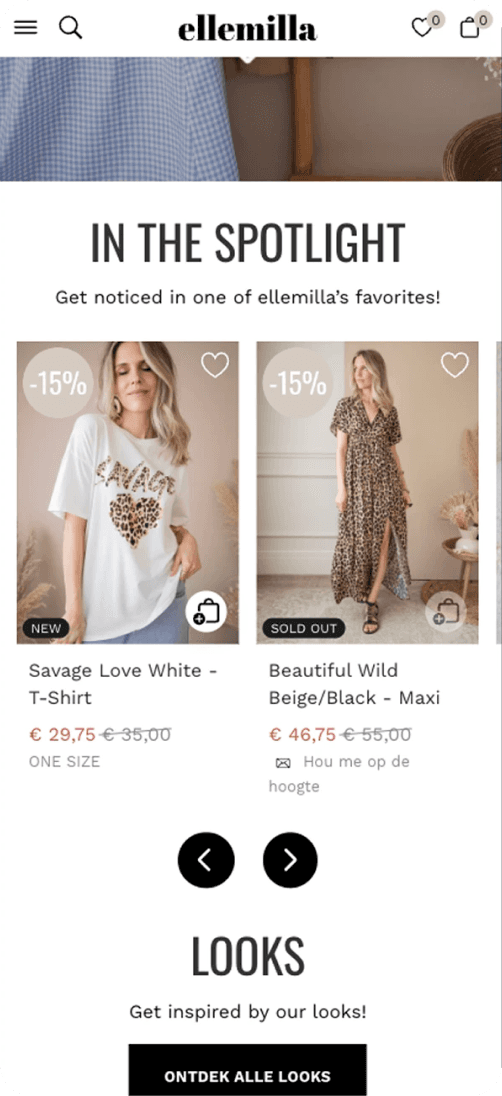
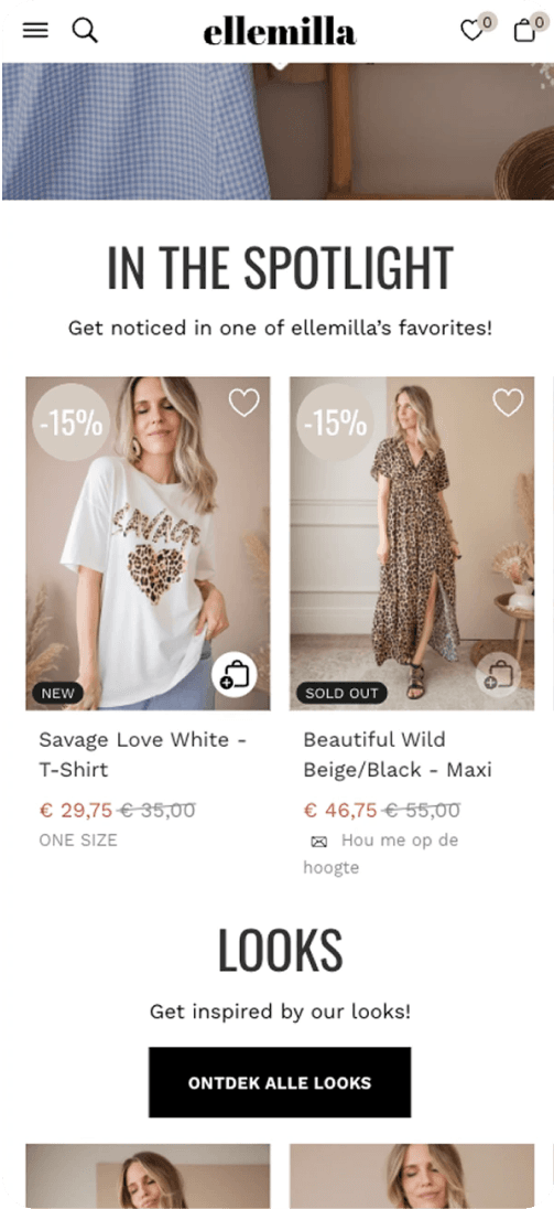
Use arrows to guide scrolling in the “In the spotlight” section
Before
After
revenue
€2,093
CVR:
+267.32%
ENHANCES ENG:
+7.09%
HYPOTHESIS
By implementing arrow indicators to guide user scrolling in the "In the spotlight" section, users will be more likely to engage with the content, resulting in increased visibility and interaction with featured items, thereby enhancing the overall user experience and potentially boosting conversion rates. Use Netflix as example.
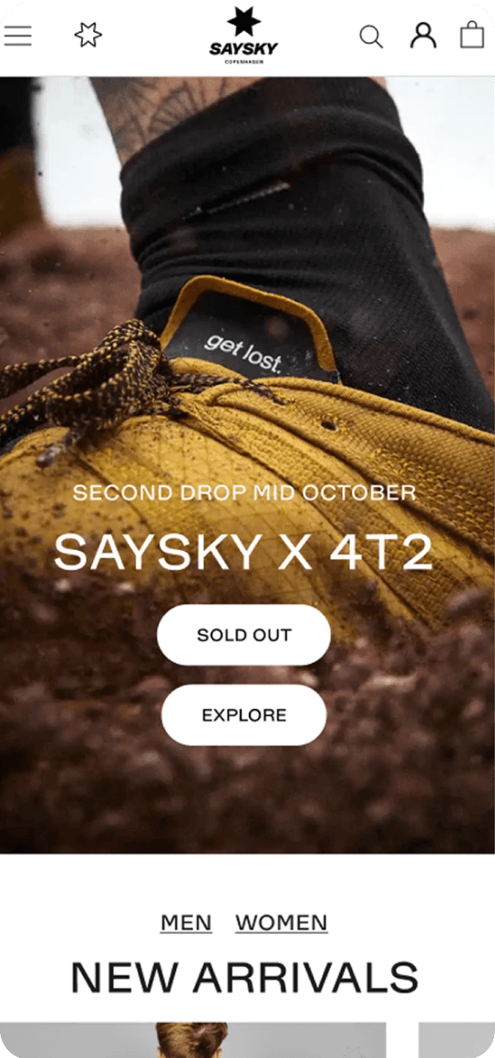
Guarantees and benefits
Before
After
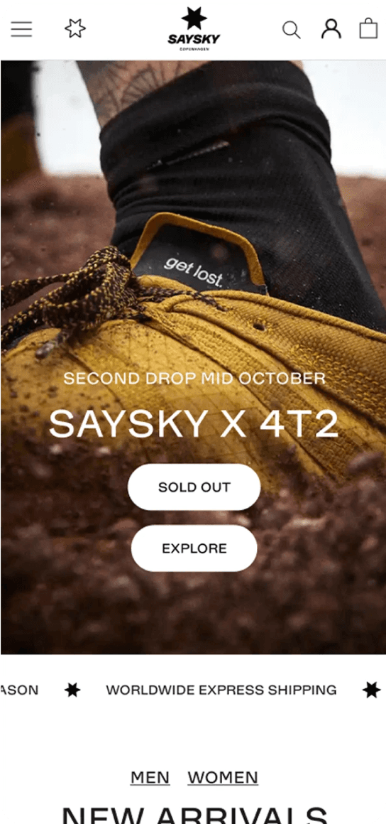
revenue
€24,663
CVR:
+12.53%
HYPOTHESIS
By having a dynamic bar below the main homepage banner highlighting the main benefits of Saysky like free shipping and returns, we expect to see an increase in CVR. Users pay more attention to bigger elements above the fold, having a greater impact than the announcement bar on top.

1st fold redesign
Before
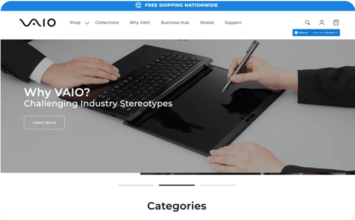
After
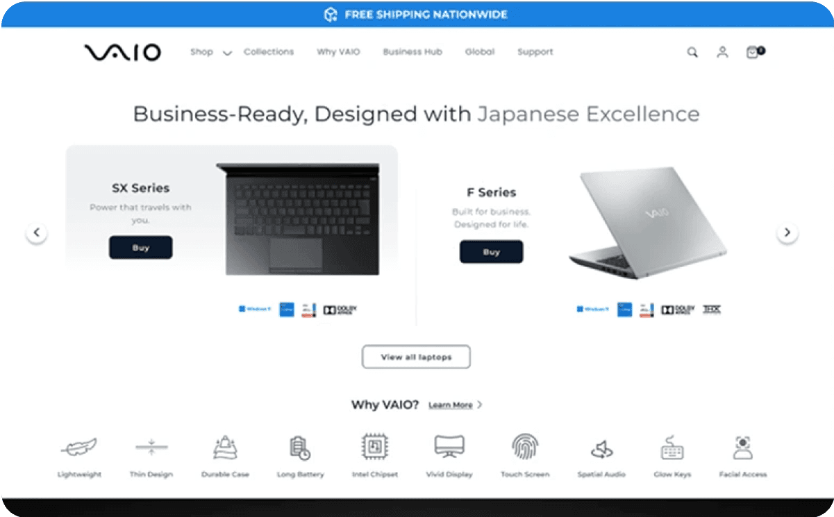
revenue
$65,669
RVP:
+46.91%
CVR:
+31.28%
HYPOTHESIS
Reduce Bounce Rate: By making the core products and collections more visible and accessible, we aim to keep users engaged and reduce the tendency to bounce back to the homepage.
Increase Conversion Rate (CVR): Highlighting the main collections and clarifying the USPs should lead to more informed and confident purchasing decisions, boosting conversions.
Improve User Experience: The new design will create a cleaner, more intuitive interface that helps users quickly understand what Vaio offers and navigate seamlessly to the products they are interested in.

PDP redesign
Before
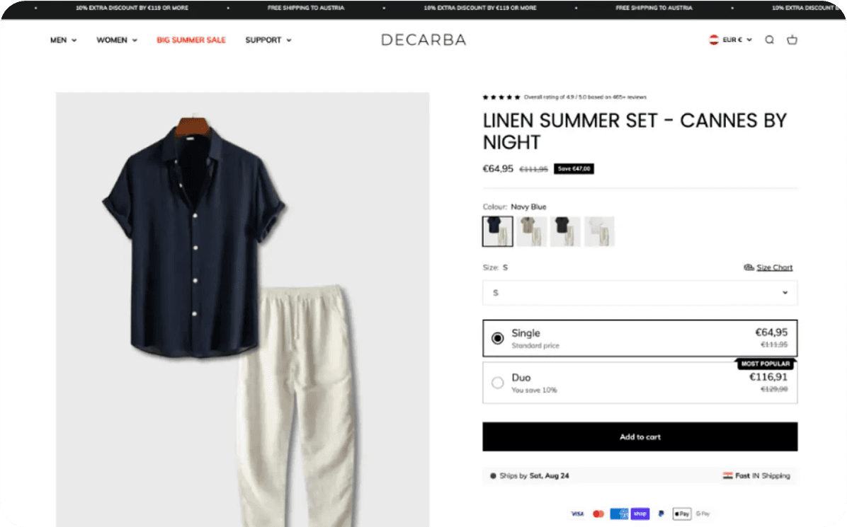
After
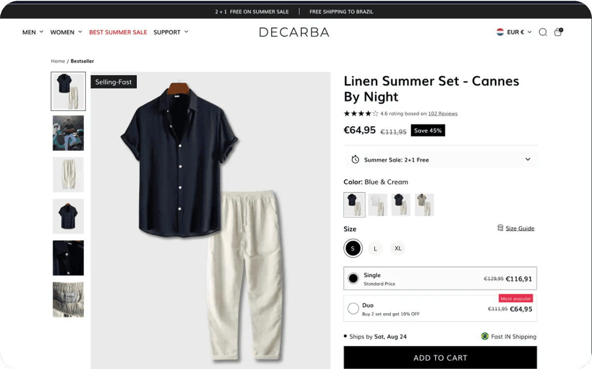
revenue
$65,669
RVP:
+46.91%
CVR:
+31.28%
HYPOTHESIS
Reduce Bounce Rate: By making the core products and collections more visible and accessible, we aim to keep users engaged and reduce the tendency to bounce back to the homepage.
Increase Conversion Rate (CVR): Highlighting the main collections and clarifying the USPs should lead to more informed and confident purchasing decisions, boosting conversions.
Improve User Experience: The new design will create a cleaner, more intuitive interface that helps users quickly understand what Vaio offers and navigate seamlessly to the products they are interested in.
The Saltworks Co.
Add sticky ATC button on the 1st fold
Before

After

revenue
£37,803
CVR:
+5.78%
HYPOTHESIS
By adding a sticky "Add to Cart" (ATC) button on the first fold that remains fixed during scrolling, we aim to reduce the effort users spend scrolling down to the "Add to Cart" section. This will increase the probability of purchase completion by making it easier for users to add items to their cart.

Use sticky order notification on PDP
Before
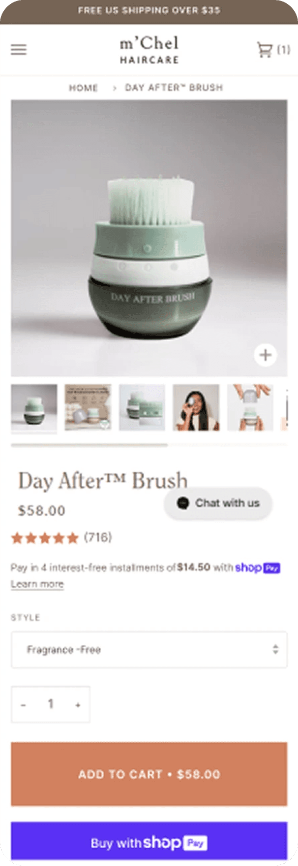
After

revenue
$15,370
CVR:
+13.36%
HYPOTHESIS
Implementing a sticky order notification on mobile product detail pages (PDP) that appears after a user clicks "Add to Cart" will improve user engagement, leading to an increase in the view cart rate and overall conversion rate.

PDP redesign
Before

After

revenue
+29.70%
CVR:
+30.64%
HYPOTHESIS
Integrating clearly defined Unique Selling Propositions (USPs) will enhance customer understanding of AirBack products, leading to increased conversion rates. Streamlining the page by removing distractions will reduce cognitive load, allowing customers to focus on key benefits. Emphasizing powerful product benefits while eliminating weaker ones is expected to enhance perceived value and engagement. Adding prominent "Add to Cart" (ATC) buttons will facilitate quicker purchasing decisions, potentially increasing add-to-cart rates and overall sales.

Sticky ATC optimisation
Before

After

revenue
kr 332,321
CVR:
+22.39%
ATC:
+34.o1%
HYPOTHESIS
Best practices dictate we need to match the feeling with CTAs and try to make them specific on what will happen next.
Display product rating, thumbnails, and usage video in upper right corner
Before

After

revenue
$224,715
CVR:
+4.84%
HYPOTHESIS
By displaying the product rating, thumbnails, and a product usage video in the upper right corner of mobile product pages, we will improve user engagement and trust, leading to higher conversion rates.

FAQs
Before

After

revenue
€32,794
CVR:
+6.32%
HYPOTHESIS
By Adding the FAQS for mobile devices, we will increase CVR, because users will find the information provided helpful and will reduce their friction for purchase.

Use arrows to guide scrolling in the “In the spotlight” section
Before

After

revenue
€2,093
CVR:
+267.32%
ENHANCES ENG:
+7.09%
HYPOTHESIS
By implementing arrow indicators to guide user scrolling in the "In the spotlight" section, users will be more likely to engage with the content, resulting in increased visibility and interaction with featured items, thereby enhancing the overall user experience and potentially boosting conversion rates. Use Netflix as example.

Guarantees and benefits
Before

After

revenue
€24,663
CVR:
+12.53%
HYPOTHESIS
By having a dynamic bar below the main homepage banner highlighting the main benefits of Saysky like free shipping and returns, we expect to see an increase in CVR. Users pay more attention to bigger elements above the fold, having a greater impact than the announcement bar on top.

1st fold redesign
Before

After

revenue
$65,669
RVP:
+46.91%
CVR:
+31.28%
HYPOTHESIS
Reduce Bounce Rate: By making the core products and collections more visible and accessible, we aim to keep users engaged and reduce the tendency to bounce back to the homepage.
Increase Conversion Rate (CVR): Highlighting the main collections and clarifying the USPs should lead to more informed and confident purchasing decisions, boosting conversions.
Improve User Experience: The new design will create a cleaner, more intuitive interface that helps users quickly understand what Vaio offers and navigate seamlessly to the products they are interested in.

PDP redesign
Before

After

revenue
$65,669
RVP:
+46.91%
CVR:
+31.28%
HYPOTHESIS
Reduce Bounce Rate: By making the core products and collections more visible and accessible, we aim to keep users engaged and reduce the tendency to bounce back to the homepage.
Increase Conversion Rate (CVR): Highlighting the main collections and clarifying the USPs should lead to more informed and confident purchasing decisions, boosting conversions.
Improve User Experience: The new design will create a cleaner, more intuitive interface that helps users quickly understand what Vaio offers and navigate seamlessly to the products they are interested in.
The Saltworks Co.
Add sticky ATC button on the 1st fold
Before

After

revenue
£37,803
CVR:
+5.78%
HYPOTHESIS
By adding a sticky "Add to Cart" (ATC) button on the first fold that remains fixed during scrolling, we aim to reduce the effort users spend scrolling down to the "Add to Cart" section. This will increase the probability of purchase completion by making it easier for users to add items to their cart.

Use sticky order notification on PDP
Before

After

revenue
$15,370
CVR:
+13.36%
HYPOTHESIS
Implementing a sticky order notification on mobile product detail pages (PDP) that appears after a user clicks "Add to Cart" will improve user engagement, leading to an increase in the view cart rate and overall conversion rate.

PDP redesign
Before

After

revenue
+29.70%
CVR:
+30.64%
HYPOTHESIS
Integrating clearly defined Unique Selling Propositions (USPs) will enhance customer understanding of AirBack products, leading to increased conversion rates. Streamlining the page by removing distractions will reduce cognitive load, allowing customers to focus on key benefits. Emphasizing powerful product benefits while eliminating weaker ones is expected to enhance perceived value and engagement. Adding prominent "Add to Cart" (ATC) buttons will facilitate quicker purchasing decisions, potentially increasing add-to-cart rates and overall sales.

Sticky ATC optimisation
Before

After

revenue
kr 332,321
CVR:
+22.39%
ATC:
+34.o1%
HYPOTHESIS
Best practices dictate we need to match the feeling with CTAs and try to make them specific on what will happen next.
Display product rating, thumbnails, and usage video in upper right corner
Before

After

revenue
$224,715
CVR:
+4.84%
HYPOTHESIS
By displaying the product rating, thumbnails, and a product usage video in the upper right corner of mobile product pages, we will improve user engagement and trust, leading to higher conversion rates.

FAQs
Before

After

revenue
€32,794
CVR:
+6.32%
HYPOTHESIS
By Adding the FAQS for mobile devices, we will increase CVR, because users will find the information provided helpful and will reduce their friction for purchase.

Use arrows to guide scrolling in the “In the spotlight” section
Before

After

revenue
€2,093
CVR:
+267.32%
ENHANCES ENG:
+7.09%
HYPOTHESIS
By implementing arrow indicators to guide user scrolling in the "In the spotlight" section, users will be more likely to engage with the content, resulting in increased visibility and interaction with featured items, thereby enhancing the overall user experience and potentially boosting conversion rates. Use Netflix as example.

Guarantees and benefits
Before

After

revenue
€24,663
CVR:
+12.53%
HYPOTHESIS
By having a dynamic bar below the main homepage banner highlighting the main benefits of Saysky like free shipping and returns, we expect to see an increase in CVR. Users pay more attention to bigger elements above the fold, having a greater impact than the announcement bar on top.

1st fold redesign
Before

After

revenue
$65,669
RVP:
+46.91%
CVR:
+31.28%
HYPOTHESIS
Reduce Bounce Rate: By making the core products and collections more visible and accessible, we aim to keep users engaged and reduce the tendency to bounce back to the homepage.
Increase Conversion Rate (CVR): Highlighting the main collections and clarifying the USPs should lead to more informed and confident purchasing decisions, boosting conversions.
Improve User Experience: The new design will create a cleaner, more intuitive interface that helps users quickly understand what Vaio offers and navigate seamlessly to the products they are interested in.

PDP redesign
Before

After

revenue
$65,669
RVP:
+46.91%
CVR:
+31.28%
HYPOTHESIS
Reduce Bounce Rate: By making the core products and collections more visible and accessible, we aim to keep users engaged and reduce the tendency to bounce back to the homepage.
Increase Conversion Rate (CVR): Highlighting the main collections and clarifying the USPs should lead to more informed and confident purchasing decisions, boosting conversions.
Improve User Experience: The new design will create a cleaner, more intuitive interface that helps users quickly understand what Vaio offers and navigate seamlessly to the products they are interested in.
The Saltworks Co.
Add sticky ATC button on the 1st fold
Before

After

revenue
£37,803
CVR:
+5.78%
HYPOTHESIS
By adding a sticky "Add to Cart" (ATC) button on the first fold that remains fixed during scrolling, we aim to reduce the effort users spend scrolling down to the "Add to Cart" section. This will increase the probability of purchase completion by making it easier for users to add items to their cart.

Use sticky order notification on PDP
Before

After

revenue
$15,370
CVR:
+13.36%
HYPOTHESIS
Implementing a sticky order notification on mobile product detail pages (PDP) that appears after a user clicks "Add to Cart" will improve user engagement, leading to an increase in the view cart rate and overall conversion rate.

PDP redesign
Before

After

revenue
+29.70%
CVR:
+30.64%
HYPOTHESIS
Integrating clearly defined Unique Selling Propositions (USPs) will enhance customer understanding of AirBack products, leading to increased conversion rates. Streamlining the page by removing distractions will reduce cognitive load, allowing customers to focus on key benefits. Emphasizing powerful product benefits while eliminating weaker ones is expected to enhance perceived value and engagement. Adding prominent "Add to Cart" (ATC) buttons will facilitate quicker purchasing decisions, potentially increasing add-to-cart rates and overall sales.

Sticky ATC optimisation
Before

After

revenue
kr 332,321
CVR:
+22.39%
ATC:
+34.o1%
HYPOTHESIS
Best practices dictate we need to match the feeling with CTAs and try to make them specific on what will happen next.
Display product rating, thumbnails, and usage video in upper right corner
Before

After

revenue
$224,715
CVR:
+4.84%
HYPOTHESIS
By displaying the product rating, thumbnails, and a product usage video in the upper right corner of mobile product pages, we will improve user engagement and trust, leading to higher conversion rates.

FAQs
Before

After

revenue
€32,794
CVR:
+6.32%
HYPOTHESIS
By Adding the FAQS for mobile devices, we will increase CVR, because users will find the information provided helpful and will reduce their friction for purchase.

Use arrows to guide scrolling in the “In the spotlight” section
Before

After

revenue
€2,093
CVR:
+267.32%
ENHANCES ENG:
+7.09%
HYPOTHESIS
By implementing arrow indicators to guide user scrolling in the "In the spotlight" section, users will be more likely to engage with the content, resulting in increased visibility and interaction with featured items, thereby enhancing the overall user experience and potentially boosting conversion rates. Use Netflix as example.

Guarantees and benefits
Before

After

revenue
€24,663
CVR:
+12.53%
HYPOTHESIS
By having a dynamic bar below the main homepage banner highlighting the main benefits of Saysky like free shipping and returns, we expect to see an increase in CVR. Users pay more attention to bigger elements above the fold, having a greater impact than the announcement bar on top.

1st fold redesign
Before

After

revenue
$65,669
RVP:
+46.91%
CVR:
+31.28%
HYPOTHESIS
Reduce Bounce Rate: By making the core products and collections more visible and accessible, we aim to keep users engaged and reduce the tendency to bounce back to the homepage.
Increase Conversion Rate (CVR): Highlighting the main collections and clarifying the USPs should lead to more informed and confident purchasing decisions, boosting conversions.
Improve User Experience: The new design will create a cleaner, more intuitive interface that helps users quickly understand what Vaio offers and navigate seamlessly to the products they are interested in.

PDP redesign
Before

After

revenue
$65,669
RVP:
+46.91%
CVR:
+31.28%
HYPOTHESIS
Reduce Bounce Rate: By making the core products and collections more visible and accessible, we aim to keep users engaged and reduce the tendency to bounce back to the homepage.
Increase Conversion Rate (CVR): Highlighting the main collections and clarifying the USPs should lead to more informed and confident purchasing decisions, boosting conversions.
Improve User Experience: The new design will create a cleaner, more intuitive interface that helps users quickly understand what Vaio offers and navigate seamlessly to the products they are interested in.
The Saltworks Co.
Add sticky ATC button on the 1st fold
Before

After

revenue
£37,803
CVR:
+5.78%
HYPOTHESIS
By adding a sticky "Add to Cart" (ATC) button on the first fold that remains fixed during scrolling, we aim to reduce the effort users spend scrolling down to the "Add to Cart" section. This will increase the probability of purchase completion by making it easier for users to add items to their cart.

Use sticky order notification on PDP
Before

After

revenue
$15,370
CVR:
+13.36%
HYPOTHESIS
Implementing a sticky order notification on mobile product detail pages (PDP) that appears after a user clicks "Add to Cart" will improve user engagement, leading to an increase in the view cart rate and overall conversion rate.
Methodology
Methodology
A CRO program is nothing without...
Like any good recipe, CRO needs the right ingredients. These three elements turn gut feelings into sustainable growth, not just temporary wins.
User behaviour
Test controls

Analysis
A
B
Put yourself in their shoes
Improve user experience (UX)
Build trust and reciprocity
Remove friction and purchase objections
Follow the frustration
Users vote with their cursors. By tracking rage clicks, u-turns, and dead ends, we spot where your funnel is leaking money. Because angry users don't convert.
Reviews tell stories data can't
Mining customer feedback, reviews, and support tickets uncovers the words your customers actually use. Because sometimes the best CRO insights aren't in your analytics.
CRO bottlenecks hide in weird places
Understanding your full marketing stack helps us spot the real roadblocks – not just the obvious ones.
POWERED BY
ECOMLAB
12 MONTH
GROWTH PLAN
1
Research Phase
Know your customer:
We need to ask questions to really know the mind of our visitors. It could be anonymous surveys, it may be interviews, it most certainly will be reading threads in weird corners of the internet.
Visitors survey

Post-purchase survey

Understand their journey:
We need to understand how they enter your website and the way they behave inside it.
Funnel analysis


Heatmaps & Session recordings

Review campaigns/creatives on Ad accounts

GA4 analysis

2
Execution Phase
Backlog & Prioritization:
We attack the lowest hanging fruits first. The result? A CRO program that performs quickly. On average, our clients see a net positive ROI within the first 90 days after engaging with us.

Database of winning test ideas:
We combine our research with our vault of over 1,000 winning tests. We can access winning split-tests based on industries and quickly build a pipeline of tests that is likely to drive meaningful revenue for you.

Ideas are great. But unless they’re deployed cleanly, tested properly, and tracked correctly… they’re useless.
Class-A team structure:
Insights are great, but without rock-solid execution, they don’t go far. That’s why our CRO team brings together the right mix of people: CRO pros, designers, developers, copywriters, and QA experts. This is the ideal structure that can actually make things happen and drive results.
We don’t launch and pray. Every test is:
Clean code. Fast, stable, and production-ready.
QA'd to death. Works on every browser, every device.
Proper testing. No false wins, no guesswork.
Revenue tracked. Not vanity metrics — real ROI.
Execution is the bridge between insight and impact. And it’s the difference between “hmm, interesting” and “holy sh*t, we just made an extra $100k this month.”
3
Results & Iterations
Analyzing A/B tests:
We are very conservative when it comes to analyzing impacts of test results, we want to be 100% sure. We make sure every change is indeed generating you more money!

We must always learn! Even if we have a loser test, we are collecting learnings that will guide us towards more winning tests.
Iterate & Win:
When a test wins and is properly built, QA’d, and tested, you can confidently apply that insight across your site to drive consistent results. This is where the real compound growth begins.

We build a dashboard that allows you to track ROI at any given time.

A CRO program is nothing without...
Like any good recipe, CRO needs the right ingredients. These three elements turn gut feelings into sustainable growth, not just temporary wins.
User behaviour
Test controls

Analysis
A
B
Put yourself in their shoes
Improve user experience (UX)
Build trust and reciprocity
Remove friction and purchase objections
Follow the frustration
Users vote with their cursors. By tracking rage clicks, u-turns, and dead ends, we spot where your funnel is leaking money. Because angry users don't convert.
Reviews tell stories data can't
Mining customer feedback, reviews, and support tickets uncovers the words your customers actually use. Because sometimes the best CRO insights aren't in your analytics.
CRO bottlenecks hide in weird places
Understanding your full marketing stack helps us spot the real roadblocks – not just the obvious ones.
POWERED BY
ECOMLAB
12 MONTH
GROWTH PLAN
1
Research Phase
Know your customer:
We need to ask questions to really know the mind of our visitors. It could be anonymous surveys, it may be interviews, it most certainly will be reading threads in weird corners of the internet.
Visitors survey

Post-purchase survey

Understand their journey:
We need to understand how they enter your website and the way they behave inside it.
Funnel analysis


Heatmaps & Session recordings

Review campaigns/creatives on Ad accounts

GA4 analysis

2
Execution Phase
Backlog & Prioritization:
We attack the lowest hanging fruits first. The result? A CRO program that performs quickly. On average, our clients see a net positive ROI within the first 90 days after engaging with us.

Database of winning test ideas:
We combine our research with our vault of over 1,000 winning tests. We can access winning split-tests based on industries and quickly build a pipeline of tests that is likely to drive meaningful revenue for you.

Ideas are great. But unless they’re deployed cleanly, tested properly, and tracked correctly… they’re useless.
Class-A team structure:
Insights are great, but without rock-solid execution, they don’t go far. That’s why our CRO team brings together the right mix of people: CRO pros, designers, developers, copywriters, and QA experts. This is the ideal structure that can actually make things happen and drive results.
We don’t launch and pray. Every test is:
Clean code. Fast, stable, and production-ready.
QA'd to death. Works on every browser, every device.
Proper testing. No false wins, no guesswork.
Revenue tracked. Not vanity metrics — real ROI.
Execution is the bridge between insight and impact. And it’s the difference between “hmm, interesting” and “holy sh*t, we just made an extra $100k this month.”
3
Results & Iterations
Analyzing A/B tests:
We are very conservative when it comes to analyzing impacts of test results, we want to be 100% sure. We make sure every change is indeed generating you more money!

We must always learn! Even if we have a loser test, we are collecting learnings that will guide us towards more winning tests.
Iterate & Win:
When a test wins and is properly built, QA’d, and tested, you can confidently apply that insight across your site to drive consistent results. This is where the real compound growth begins.

We build a dashboard that allows you to track ROI at any given time.

A CRO program is nothing without...
Like any good recipe, CRO needs the right ingredients. These three elements turn gut feelings into sustainable growth, not just temporary wins.
User Behaviour
Put yourself in their shoes
Test Controls
Testing is only as good as its execution
Impact Analysis
Less is more (most of the time)
CRO bottlenecks hide in weird places
Understanding your full marketing stack helps us spot the real roadblocks – not just the obvious ones.
POWERED BY
ECOMLAB
12 MONTH
GROWTH PLAN
1
Research Phase
Know your customer:
We need to ask questions to really know the mind of our visitors. It could be anonymous surveys, it may be interviews, it most certainly will be reading threads in weird corners of the internet.
Visitors survey

Post-purchase survey

Understand their journey:
We need to understand how they enter your website and the way they behave inside it.
Funnel analysis


Heatmaps & Session recordings

Review campaigns/creatives on Ad accounts

GA4 analysis

2
Execution Phase
Backlog & Prioritization:
We attack the lowest hanging fruits first. The result? A CRO program that performs quickly. On average, our clients see a net positive ROI within the first 90 days after engaging with us.

Database of winning test ideas:
We combine our research with our vault of over 1,000 winning tests. We can access winning split-tests based on industries and quickly build a pipeline of tests that is likely to drive meaningful revenue for you.
Funnel analysis

Ideas are great. But unless they’re deployed cleanly, tested properly, and tracked correctly… they’re useless.
Class-A team structure:
Insights are great, but without rock-solid execution, they don’t go far. That’s why our CRO team brings together the right mix of people: CRO pros, designers, developers, copywriters, and QA experts. This is the ideal structure that can actually make things happen and drive results.
We don’t launch and pray. Every test is:
Clean code. Fast, stable, and production-ready.
QA'd to death. Works on every browser, every device.
Proper testing. No false wins, no guesswork.
Revenue tracked. Not vanity metrics — real ROI.
Execution is the bridge between insight and impact. And it’s the difference between “hmm, interesting” and “holy sh*t, we just made an extra $100k this month.”
3
Results & Iterations
Analyzing A/B tests:
We are very conservative when it comes to analyzing impacts of test results, we want to be 100% sure. We make sure every change is indeed generating you more money!

We must always learn! Even if we have a loser test, we are collecting learnings that will guide us towards more winning tests.
Iterate & Win:
When a test wins and is properly built, QA’d, and tested, you can confidently apply that insight across your site to drive consistent results. This is where the real compound growth begins.

We build a dashboard that allows you to track ROI at any given time.

EcomLab™
EcomLab™
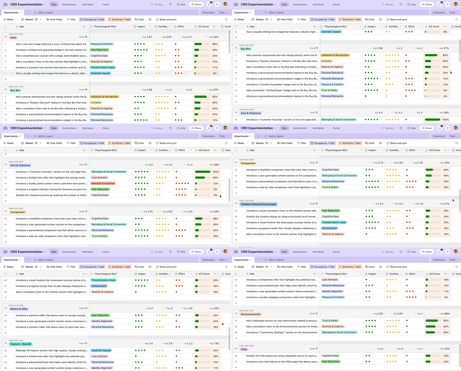
Every test teaches. We've run thousands.
Random testing is expensive guessing. Our EcomLabs™ database tracks every test we've ever run, what worked, what bombed, and most importantly – why. Your head start to higher conversions.
You must have a question or two?

POWERED BY
ECOMLAB
TM
Why is CRO important?
What is the CRO process?
Why choose PurpleFire to perform a CRO project on my website?
What metrics do you track in a CRO project?
What ROI can I expect from CRO?
What tools and platforms do you use for CRO?
How do I know if CRO services make sense to my business?
Every test teaches. We've run thousands.
Random testing is expensive guessing. Our EcomLabs™ database tracks every test we've ever run, what worked, what bombed, and most importantly – why. Your head start to higher conversions.

You must have a question or two?
Why is CRO important?
What is the CRO process?
Why choose PurpleFire to perform a CRO project on my website?
What metrics do you track in a CRO project?
What ROI can I expect from CRO?
What tools and platforms do you use for CRO?
How do I know if CRO services make sense to my business?

POWERED BY
ECOMLAB
TM
Reviews
Reviews
Hear what brand owners have to say...
Agencies pitch, partners deliver. We integrate with your team, share your revenue goals, and own your success like it's ours. Don't take our word for it – watch what our clients say...
From 30k/month to 100k/month in less than 2 months
“After we received the landing page, it was so professional and so well done that we decided to further work with Daniel and his team.”
Martijn - Owner of Real Mad Honey
ROI of more than 13x, improving the conversion rate in over 90%
"Purple Fire is an incredible full-service CRO agency, delivering exceptional results—currently at 13x ROI, truly a rare find!"
Kent Yoshimura - CEO of NeuroGum
From Insights to Revenue: Strategies That Drive Growth
"Purple Fire drove measurable revenue growth with data-driven AB testing, aligning with our goals and executing flawlessly. Highly recommended!"
Collette - SO at Nutrex Hawaii
Data-Driven CRO: Our Winning Approach
"They did an excellent job, providing super helpful and actionable insights. I am very satisfied and highly recommend Purple Fire!"
Ken Lin - CEO of Boop Bakery
Connecting Data with Insights and Drive Results
"Purple Fire excels at understanding behavioral trends and optimizing sites for better conversion—an incredibly powerful tool!"
Forrest - CEO & Co-Founder of Kineon Labs
Unlocking Growth with Data-Backed Insights
"While still implementing changes, the overall ROI and insights from Daniel and his team have been extremely valuable!"
Csaba - CEO at OptiMonk
Boosting Revenue Through Smart Site Improvements
"The team is highly professional, punctual, and excels at driving incremental revenue, making them a top choice. Daniel is especially great!"
Ryan Mckenzie - Co-Founder at Tru.earth
Expert Strategies for Ecommerce Success
"Daniel and his team were highly professional, fast, and communicative, providing strategic insights and valuable input on my ideas."
Tazo Jorjoliani - CEO at Materiel
Redesigns That Elevate Conversions
"Daniel and Purple Fire helped us identify CRO improvements for our eCommerce redesign, driving our website development forward effectively."
Brandon - Naya Tech
LOAD MORE
Hear what brand owners have to say...
Agencies pitch, partners deliver. We integrate with your team, share your revenue goals, and own your success like it's ours. Don't take our word for it – watch what our clients say...
From 30k/month to 100k/month in less than 2 months
Enter Content
Martijn - Owner of Real Mad Honey
ROI of more than 13x, improving the conversion rate in over 90%
Enter Content
Kent Yoshimura - CEO of NeuroGum
From Insights to Revenue: Strategies That Drive Growth
Enter Content
Collette - SO at Nutrex Hawaii
LOAD MORE
If you want to:
Improve user engagement
Increase average order value
Sky rocket your conversion rate
Don’t worry, it’s FREE

If you want to:
Improve user engagement
Increase average order value
Sky rocket your conversion rate
Don’t worry, it’s FREE
0
4
CRO Audits in the queue
0
4
CRO Audits in the queue
Copyright ©️ 2026 PurpleFire - All rights reserved.
Newsletter


