What Does Usability Mean for Small and Medium-sized Enterprises?
At PurpleFire our work involves working with SMEs(Small and Medium-sized Enterprises) all the way through to blue chip brands. With usability, or making websites more affective at generating leads and sales, at the heart of what we do, this is no surprise. What is interesting is to look at the key differentiators between our SME […]
The 5 Big Book Retailers Compared & Benchmarked in 2022
Following my recent article on Econsultancy, benchmarking Amazon and The Book Depository on usability and best practice, I’ve used our benchmarking application to carry out further research in the book market. Waterstone’s, WH Smith’s and Border’s are the 3 high-street booksellers that I’ve included in the report. Book sellers Amazon, The Book Depository, Borders, Waterstones […]
Usability for Fashion Retailers
Econsultancy has published a new usability article of mine entitled: Pureplay and high street fashion retailers – who value usability more? In the article I’ve taken a look at the following high street and pureplay retailers from a usability perspective… The pureplay fashion retailers I’ve taken a look at are: ASOS Net-a-porter My Wardrobe The […]
Top Four Website Problems Revealed by a Technical Audit
Why is a technical audit so important? It is vital to conduct a thorough technical audit before A/B testing to understand the mechanics of a site. An audit will highlight the pain points of your site that require fixing, providing a solid foundation from which to launch an optimisation programme. The site will be run […]
Exit, Voice and Loyalty in Web Usability
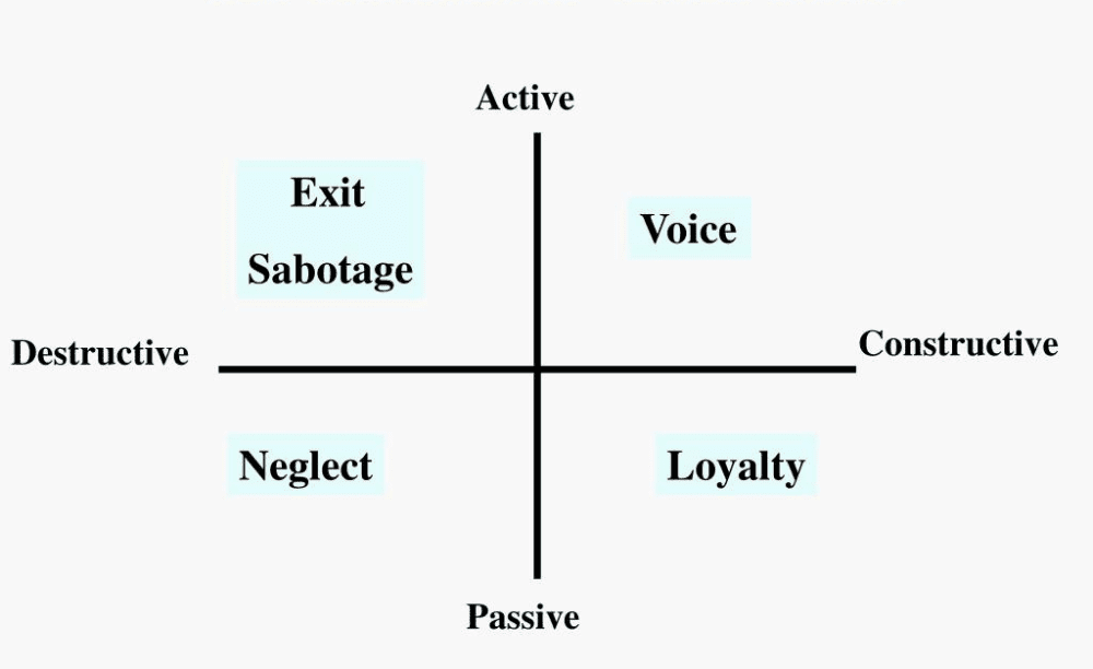
“Exit, Voice and Loyalty” is a book, written in 1970 by economist Albert O. Hirschmann. The book attempts to explain two possible responses that individuals (customers, voters and so forth) can make to a service that they find unsatisfactory – ‘exit’ and ‘voice’. ‘Exit‘ is when, for example, a customer decides to stop buying a […]
2022: The Year of Contextual Personalisation?
Where should Marketing & Ecommerce Managers focus their efforts in 2022? We posed this question to 6 industry and in-house experts to find out what they thought Marketing & Ecommerce Managers should be focusing on this year. There’s a clear theme around personalisation based on context and ensuring all channels and marketing are an optimised, seamless part […]
7 Tips for the Best Filtered Website Navigation
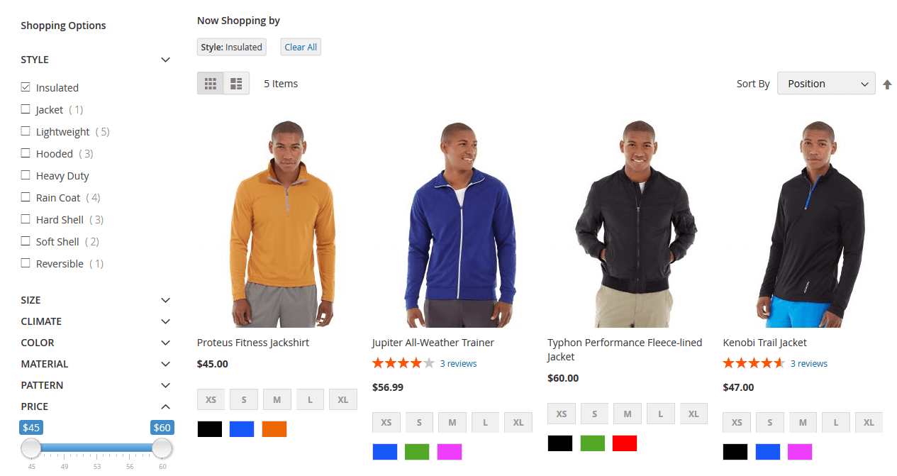
Filtered navigation is widely adopted as one of the best ways to let users browse through large categories of products. It really doesn’t need to be complicated, but there are a few things that you should get right. Here are our top tips. 1. Indicate the number of products in each filter-category It’s a really […]
7 Ways to Delight Your Website Visitors
SURPRISES, PEAKS & DELIGHTS When was the last time you genuinely delighted your visitors and new customers online? In all my years of experience working with a wide range of businesses large and small, there are three often missing ingredients to the online experience brands deliver to visitors – the peak-end rule, surprise and delighters. […]
E-Commerce Usability and Persuasion Training
Since 2008 I have been delivering training courses in areas of usability, user experience, user-centered design, e-commerce best practice and persuading visitors to buy. Training courses are either delivered for Econsultancy in both public and in-house training sessions, and I also deliver training directly to PurpleFire clients. Brands I have trained in 2011 and 2012 […]
The Right Way To Approach Product Copy
To buy or not to buy? If you are in the business of selling products/services online, that is the question potential customers will be asking as they browse your website. And while you might have already devoted significant amounts of time and resources to swaying their decision in your favour, I can almost guarantee there […]


