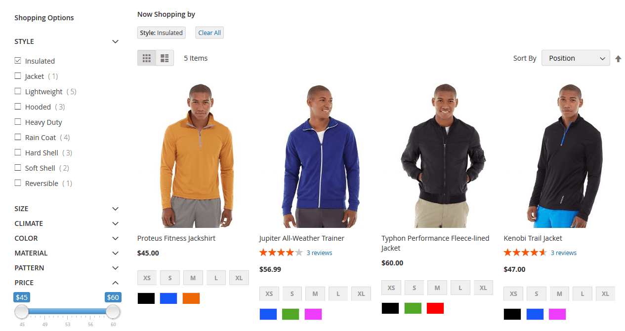
Filtered navigation is widely adopted as one of the best ways to let users browse through large categories of products. It really doesn’t need to be complicated, but there are a few things that you should get right. Here are our top tips.
Table of contents:
- 1 1. Indicate the number of products in each filter-category
- 2 2. Allow multi-select
- 3 3. Visual filtering – allow users to remove certain options from the filters
- 4 4. Give users control when entering values
- 5 5. Provide filters that matter to customers
- 6 6. Provide more information if filters are complex
- 7 7. Maintain user’s filter choices
- 8 Bonus – introduce social proof and consumer behaviour tailored filters
1. Indicate the number of products in each filter-category
It’s a really simple one, but it’s surprising how often this isn’t done. Indicating next to a filter-category how many items a user can expect to get helps users to make decisions about whether a category is worth selecting. This can reduce disappointment for users who otherwise might select a category and then find fewer items than they hoped for.
(Schuh)
2. Allow multi-select
This is nearly always the first thing that we check for when reviewing filtered navigation. We find that for some users it is vital to be able to configure filters to show products from a few important filters. We’ll take no excuses. Multi-select is a must.
(Monsoon)
3. Visual filtering – allow users to remove certain options from the filters
(ASOS)
Visual filtering allows user to change their filter settings from the product listing without interacting with the filters. The example above from ASOS (pretty much the only retailer we see doing this) shows that when you hover over a product, you can choose to ‘Hide this brand’ which de-selects that brand from the brand filtering. This allows users to even more quickly edit the products displayed without have to read through large lists of filter settings.
4. Give users control when entering values
In recent user testing we have found that users want control over how they enter pricing. Some preferred to have a flexible slider, while others wanted to manually enter their own values. Suggested pricing bands came out worst because they offer the user least control.
(Speedo)
5. Provide filters that matter to customers
Not so much feature or functionality, but we find that asking users which filters they would like to use can be an eye-opening experience and can reveal some user priorities that had not been previously anticipated. Adding new filters or changing the prominence of existing filters can really benefit from user feedback. It is also important to add analytics tracking to filter in order to identify which filters are most widely or commonly used.
6. Provide more information if filters are complex
Sometimes the names of the filters themselves are not easy for users to understand. In the example above, Schuh have made it easy to access more information about sizing conversions.
We have seen other examples where retailers provide a link to their size guide, which is a great idea. We have also identified retailers who have filters with complex or technical options that would benefit from a quick modal pop up with explanations or clarification. Why not make it easier for users to filter accurately?
(Schuh)
7. Maintain user’s filter choices
Another no-brainer, but we see too many examples of users navigating back to lister/sub-category pages only to find that their filter selections have reset. This can really frustrate users and reduces their patience with the website and ultimately the amount of time that they are likely to spend browsing.
(Lakeland)
Often overlooked, one of our clients recognises that filtered navigation can be used to provide visitors with recommendations based on not just product specific attributes but different types of product categorisation. In this case, visitors can choose to look at what are the customer favourites in this particular range (have we ever mentioned that social proof is one of the most persuasive techniques you can use to encourage visitors to buy). In addition, they can filter out only the new products, or interestingly just the products which have video reviews.
When we conducted user research with Lakeland following the launch of their website this was one of the many recommended improvements, as without this visitors were often not realizing that some products did have video demonstrations.


