The power of imagery is often underestimated and not used to its fullest potential throughout an online experience. Images connect with our subconscious “system 1” thinking; a fast, instinctive, and emotional brain process that evokes an innate emotional response. An image is much more than just displaying a product range on a retail site or a destination on a holiday site, it’s an opportunity to engage with your visitors, create an emotional connection and build a relationship. Our brains are programmed to feel first and think second.
Visitors to your website are choosing to shop online as opposed to in store or via another method, as it’s convenient. However, we are all aware of the many drawbacks of online shopping. The visitor can’t try or feel the product, ask a knowledgeable salesperson question and they are most likely to be less task-focused due to the distractions of online shopping. Imagery can help to negate all of these issues.
In user research, we have observed that images are the first thing users look at to make a decision, not the price or product description, as many retailers assume. They browse through a product range or result page looking in detail at images they are attracted to and comparing images to narrow down their choice.
It’s not just product images that we’re talking about here either. Images throughout a website act as signposts, primers and opportunities to engage with the visitor. Using inspirational imagery to connect with the visitor on the homepage can ‘set the scene’ and create an emotional response from the start of their journey.
Furthermore, this applies to more than just retailers. Images are crucial in breaking down the contact barrier if you are selling a service. They can be used to portray what the site is about, reflect the personality of the company and expose the people behind the screen. Putting a face to a name really does work; it helps to build trust in the product, brand, and service, and it allows the visitor to visualise someone.
I’ve highlighted four key areas of focus when assessing images on a website which have come from reviewing websites, user research, and testing.
Image quality
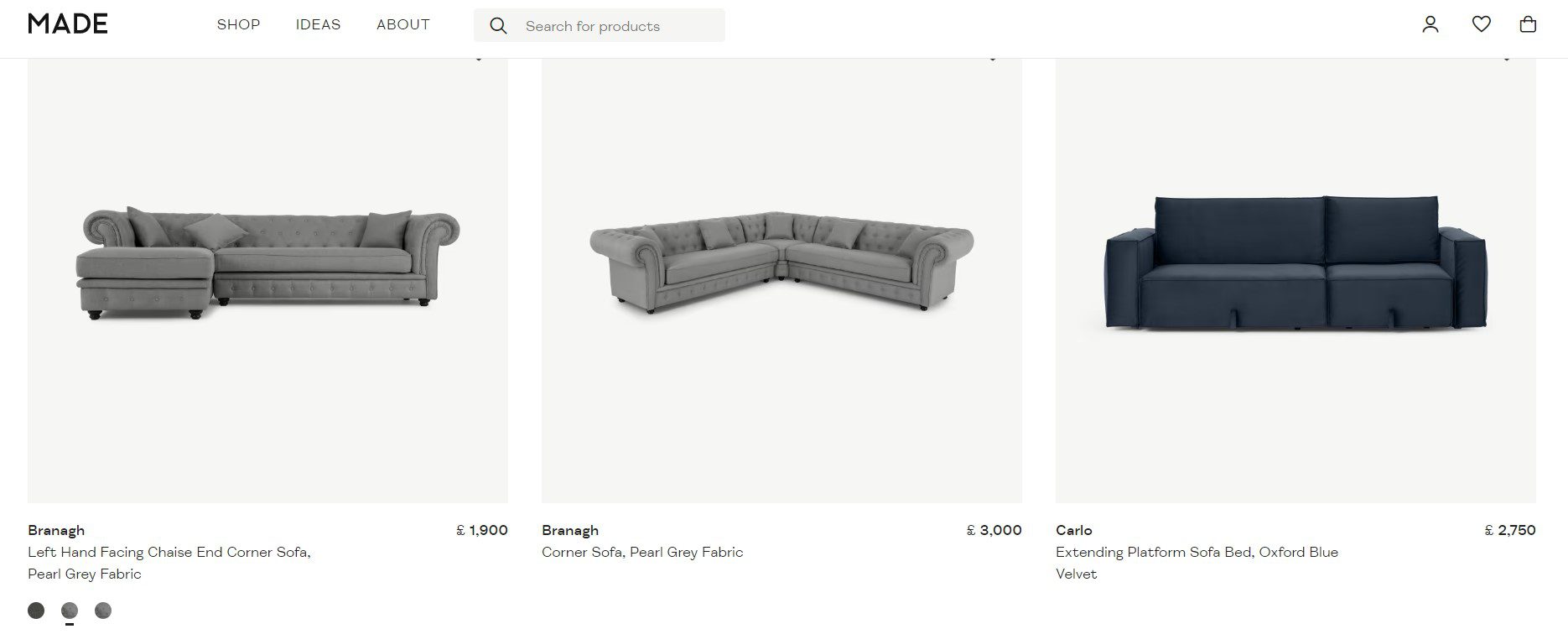
High-quality images give the impression of a high-quality product. They help to sell a service and product. Here we see Made.com displaying multiple high-quality, large, images of varying angles of a sofa with a zoom functionality to see even more detail.

It is much easier for our brains to understand information from a picture than to read information. An image can show intricate details, and a detailed written description would never do justice.
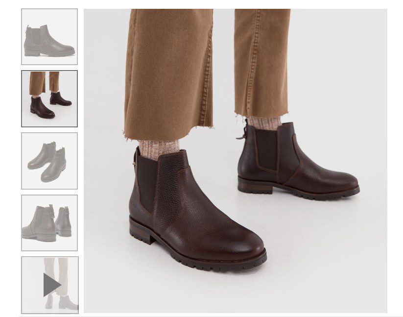
If a ‘visitor’ was in a shop, they would be able to pick up an item and see it from different angles or walk around it, so they also need to do this online. Schuh displays a 360-degree view of all products and they also have videos of people wearing and walking in the shoe, which is a nice addition.

Provide context
In user research on home furnishing sites we observed that when users were initially browsing, most of them skipped products if they were a model shot and did not even consider them. They were drawn to the products which were ‘dressed’ and more of a lifestyle shot within the context of a room. They explained that they could imagine this product in their home when they saw it in context of a bedroom or a lounge with other furniture, as opposed to a standalone picture. It is easier to visualise a product in your own home if part of the work is already done for you. Images can be used to add a persuasive element to the page, once you have visualised something in your own home you have made a connection with it, therefore are envisaging the end goal, purchasing the product.
Another key point here is consistency, for example, if all the products are model shots on a white background then they are easier to compare to each other, whereas a combination may be distracting. This is where A/B testing would give valuable insights as to which type of imagery your visitors prefer at different stages of the website.
Make a connection
A picture says a thousand words. An image is a perfect way to grab your visitor’s attention and create a connection with them. Travel sites especially play on this. Airbnb is a great example of using high-quality photography to inspire visitors, create an emotional attachment to a place or home and entice them to want to stay there. Remember, it’s so much easier to tell a story through a picture.
Use images for guidance
Make use of imagery to guide the gaze. People and faces in images can be utilised to guide a person’s attention. It is an innate reaction to either look at someone’s face or where they are pointing/looking, just as you would in real life. Eye tracking studies show that using people in images makes the visitor focus on them. Use this to your advantage and direct the visitor’s attention where you want them to focus.
A study by James Breeze at usableworld.com.au used eye-tracking software to measure if there was an impact on website readers’ eye gaze towards the direction of the baby. The results show that when the baby’s eye gaze was toward the text on the right, the text received more attention.
![]()
As much thought, if not more should be put into the images on a website. When thinking about your own websites, consider why are you displaying an image, is it useful to the visitor, does the image help the page to do the ‘job’ it’s supposed to be doing, and does it influence behaviour?
The images you use online should have a purpose. In a time where we are more distracted than ever whilst online, images are a powerful tool to attract visitors’ attention, communicate, provide information, and create a connection, which crucially influences behaviour.


