
Why the Cart Deserves More Attention Than it Gets
Most optimization strategies tend to heavily focus on top-of-funnel activities. Brands end up pouring a majority of their resources into their homepage design, categories, product images, and driving qualified traffic. Those are all efforts that matter, but at the same time they ignore the fundamental reality of where their conversions are actually going to happen.
"Users in the cart are basically users who already entered your website, checked your products, selected the ideal one for them, went to the cart, but somehow they aren't making a purchase," explains Thor Fernandes, Head of CRO at PurpleFire.
"We need to understand what's making users not complete that purchase, so we know how to change their behavior and solve their objections in the cart already."
The math behind this is more than compelling. Improving conversion rates at the cart stage of the funnel doesn't require much, or any, additional ad spend or increased traffic. All you need to do is simply convert more of the high-intent visitors you've invested in acquiring. A cart page that converts even slightly more effectively can end up generating significant revenue gains from the traffic base you already have.
The Real Reasons Intent Shoppers Abandon Their Carts
Understanding why a cart gets abandoned is the first step toward solving the issue. Baymard's research revealed that the primary drivers aren't really mysterious or unpredictable ones. They're actually systematic friction points that are found on e-commerce sites of all sizes.
Extra costs rank as the number one reason shoppers abandon carts. When users encounter unexpected shipping charges, taxes, or other fees during checkout, around half end their session without purchasing. This is a predictable response to feeling misled about the true cost. And the crazy thing about this one is, it’s completely avoidable. Simply present that information clearly earlier in the funnel. You’ll actually find less visitors turning away.
Requiring visitors to create an account before purchasing drives away another large segment of shoppers. Research from Contentsquare found that the average checkout flow contains 5.1 steps and 11.3 form fields. Each step added to that creates another abandonment opportunity. Each unnecessary field adds avoidable friction that sends many users running toward the exit.
Mobile devices present their own set of challenges. Data from Contentsquare’s research revealed that mobile cart abandonment rates reach approximately 80.2%, which is significantly higher than desktop rates. This difference reflects the compounded difficulty of completing forms, entering payment information, and navigating complex checkout flows on a phone screen.
Trust issues also play a substantial role in why many visitors flee before purchasing. Shoppers who aren’t confident about a site's security, return policies, or delivery reliability tend to hesitate at the moment of purchase. And instead of sharing direct feedback to the brand, it is much easier and much less hassle to simply walk away and abandon their cart.
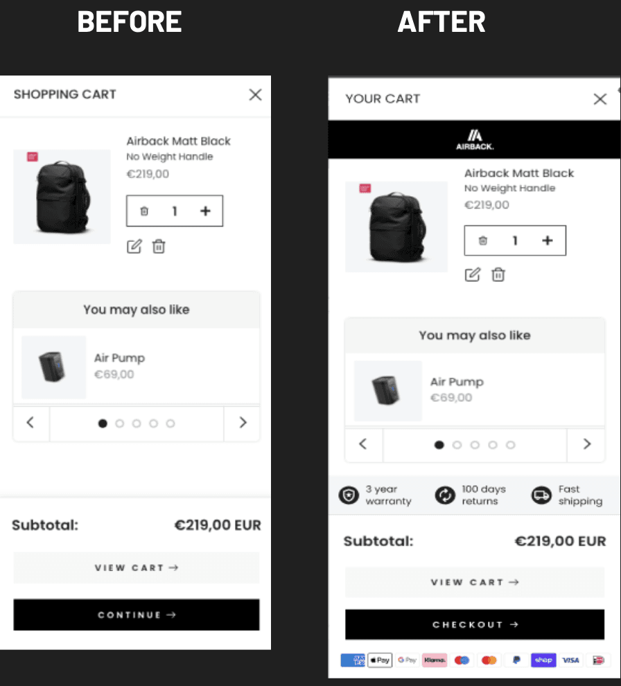
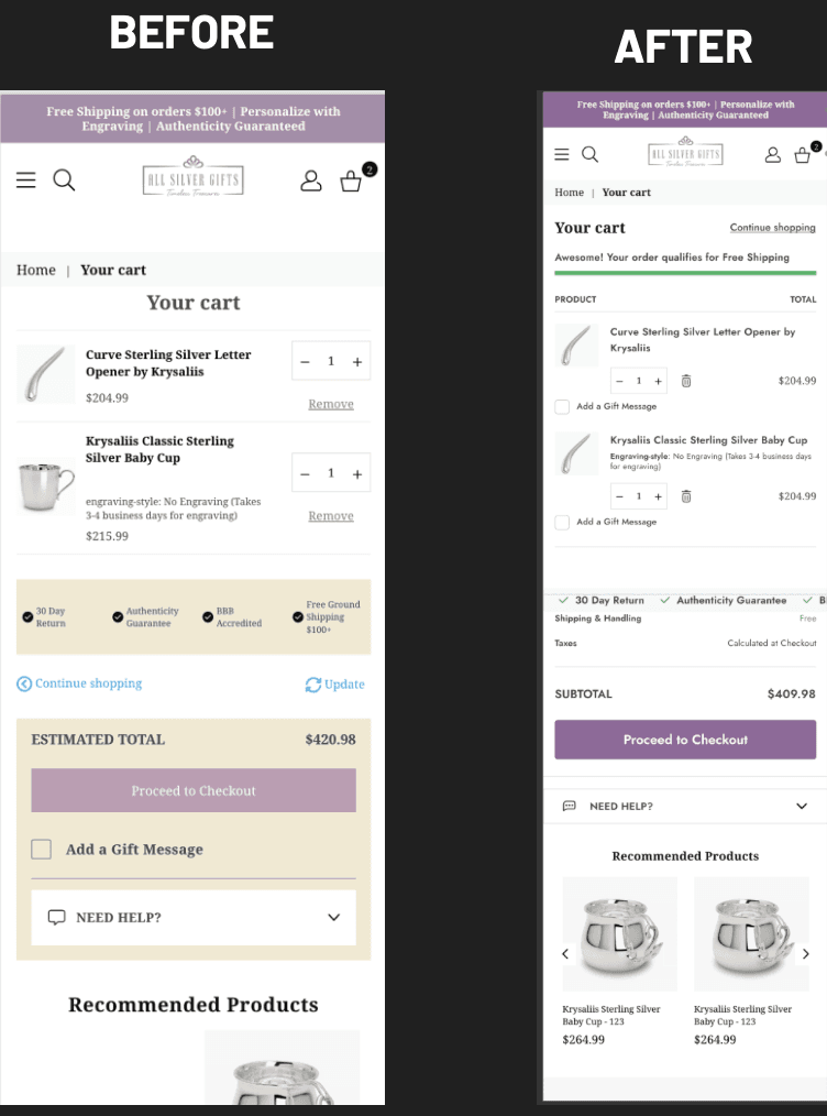
What Actually Works: Evidence from Real Cart Optimizations
You can only get so far on theory alone. The true test of cart optimization strategies comes from measuring changes in actual performance through controlled experiments.
Test #1
Our CRO team at PurpleFire tested the hypothesis that introducing upsells at the checkout stage, combined with clear Unique Selling Propositions (USP), could increase average order value without sacrificing conversion rates.
The Results:
Total Revenue: +$11,438.84
CVR: ▲34.82%
Test #2
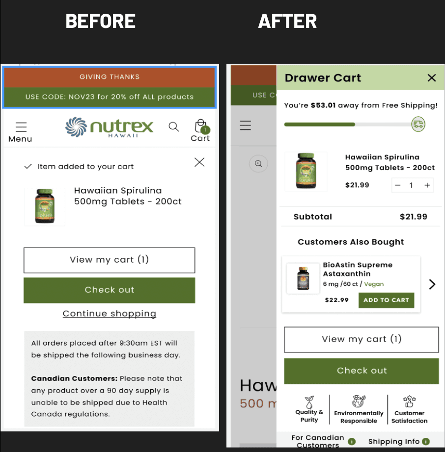
In another experiment focused on redesigning the cart page, the team implemented multiple coordinated changes.
The changes included revising page copy to improve engagement, addition of the company logo to boost brand recognition, compelling new copy for recommended products to increase CTR, and the inclusion of trust signals such as USPs and payment seals.
The Results:
Revenue: +11.66%
CVR: ▲10.04%
Test #3
We examined the impact of removing exit points from the cart while improving the overall visibility of key information. By improving how prices, USPs, free shipping progress bars, and gift message options were displayed, we saw almost immediate improvements in increased revenue and conversion rates. That means far fewer carts being abandoned and more purchases being completed.
The Results:
Revenue: 21.82% (per visitor)
CVR: ▲24.77%
These are not isolated wins. They clearly reveal a consistent pattern. Well-designed cart experiences will consistently convert better than neglected cart pages or default designs.
A Case Study in Cart Transformation
When HVAC Total came to us, we found that their cart page was leaking significant revenue. The brand's original cart experience suffered from the same unnecessary friction that other brands do and simply wasn’t addressing common shopper concerns that are rarely shared in customer feedback.
Our approach involved applying multiple coordinated changes, each research-backed and based on observed user behavior. Rather than making a single adjustment and hoping for a win, we implemented a set of improvements designed to work in tandem. There wasn’t any guesswork involved. Each change we made addressed every friction point we identified through thorough our analysis.
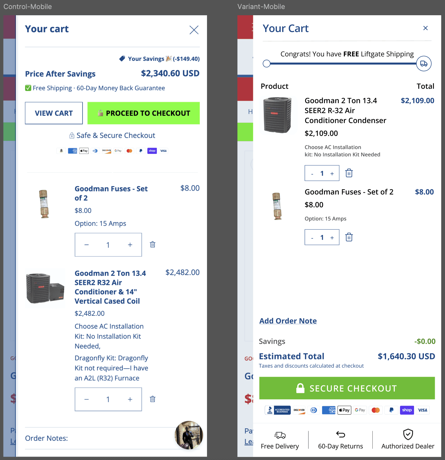
The results, well they speak for themselves. On mobile devices alone, conversion rates jumped from 0.30% to 0.50%. That’s a 69% improvement. Revenue per visitor on mobile went from $10.08 to $14.94, a 48% gain. Desktop conversion rates improved from 0.56% to 0.63%, an increase of 12%.
What made these experiments particularly interesting was the layered methodology we were able to use. Once the initial changes showed consistent positive results, the team was able to apply smaller iterations to refine the overall performance.
The original version required several changes because a single modification wouldn't have made the same amount of impact. This approach prioritized yielding more substantial results as quickly as possible rather than waiting through sequential single-variable tests.
Tactical Changes You Can Implement Now for Quick Wins
Improving your cart page doesn't mean you need a full rebuild. Most high-impact changes can be implemented fairly quickly once you know precisely what you need to prioritize.
1. Show total costs early and clearly
Display shipping times and cost, applicable taxes, and any other fees directly in the cart, where your customers can see, rather than surprising them at the end of the checkout process.
When people see upfront exactly how much they’ll need to pay, they’ll be able to make an informed decision before they reach the payment stage. Those who proceed through checkout make their purchase with real expectations, dramatically reducing last-minute cart abandonment. This also improves the likelihood of returning customers.
2. Add strong trust signals near the checkout call-to-action
Reinforce their sense of security, guarantees, delivery timelines, and return policies right where users decide whether or not to proceed. Trust badges, payment seals, and clear policy information reduce anxiety and ease customers through the checkout process at the most critical moment of their journey.
3. Use incentives strategically rather than reflexively
Don’t be afraid to test free shipping thresholds, limited-time offers, or other kinds of small bonuses that will encourage users to complete the purchase process. The key here is finding the right incentives that nudge your particular audience in the right direction without damaging your margins. Not every incentive works for every audience, which is why testing matters even more.
4. Reduce friction and distractions aggressively
Get rid of any unnecessary fields, steps, or links that slow or disrupt your potential customers from completing their purchase. The elements in your cart page must either advance the sale or reinforce confidence, or both. Anything that doesn't serve one or both of those purposes could be a big potential leak in your conversion funnel. A leak that is 100% avoidable.
5. Optimize the cart for mobile first
It’s important to make sure you have fast load times, sticky CTAs, easily readable text, and simple quantity or edit actions on mobile devices. Since the abandonment rates are significantly higher on mobile devices, improving the overall experience will put you right-side-up regarding yielded returns versus amount of effort invested.
6. Deploy psychological triggers near the call-to-action
Adding urgency through low stock indicators or delivery deadline cutoffs, and Including social proof elements or reassurance messaging right before checkout is also a good way to win trust and nudge users across the finish line. These triggers are most effective when they appear at the decision point rather than earlier in the browsing experience where they often become forgotten.
7. Make the next step crystal clear
Use a prominent, single call-to-action with crystal clear copy that tells users exactly what happens next in their process. "Proceed to Secure Checkout" communicates more confidence than "Next" or "Continue." The button should be an obvious focal point of the page, not competing with other elements for attention. This removes any confusion that an anxious online shopper might experience if they’re confused about where to go next during the checkout process.
The Compounding Value of Cart Optimization
Baymard's long-term research indicated that the average large-sized e-comm site can potentially achieve a 35.26% increase in their conversion rate through a cleaner and more straightforward cart page design.
Applied to the combined e-commerce sales of approximately $738 billion in the US and EU alone, the potential improvements end up translating to around $260 billion worth of lost purchases that could have been recovered through more effective cart pages and better overall checkout experiences alone.
These aren't mere theoretical projections. These numbers are based on a systematic analysis of what happens when websites address obvious roadblocks and clear usability issues within their purchase flows. Overall, this is a huge opportunity for essentially any online retailer to “plug their leaks” and almost immediately see improvements in their CVR and Revenue.
Rather than a problem specific to certain industries or business models, cart abandonment issues are a universal challenge that are easily avoidable in most cases.
Research from SellersCommerce confirmed that recovery strategies like abandoned cart emails can potentially achieve around 45% open rates with decent click-through percentages. Improved checkout options and streamlined flows can even further reduce unnecessary friction found in the process. Each of these improvements significantly contribute to capturing revenue that would otherwise slip through the cracks.
Then add the compounding nature of cart optimization, each of those seemingly minor improvements become even more valuable over time. If your cart converts 5% better this month, it will likely continue converting 5% better next month, and the following months after that. While promotional strategies tend to require ongoing investment to maintain their effect, structural cart improvements create durable long-lasting advantages.
Making the Move from Understanding to Action
The data couldn’t be any clearer. Cart abandonment is a massive, widespread issue with well-documented causes with proven straightforward solutions.
The strategic logic is also clear. Properly and methodically optimizing the cart stage of your purchase funnel creates exceptional leverage because it’s a stage that every conversion must pass through, and users who reach it already have demonstrated purchase intent. All you have to do is give them that last nudge across the finish line.
What separates brands that take advantage of this opportunity from the brands that don't has absolutely nothing to do with scale, budget, or even some sort of access to secret information. It's simply the willingness, and awareness, to treat cart optimization as a priority rather than an afterthought. This is literally the home stretch in your potential customer’s journey, from start to finish through your site, and they’re about to do exactly what you want them to do… Make a purchase.
Having the discipline to test hypotheses systematically rather than making changes based on intuition alone isn’t just incredibly important, it’s crucial to your overall success. It's all about recognizing that small improvements at high-intent stages will translate directly to significant revenue gains.
Your cart page might be significantly underperforming right now. And it’s not because you've done something wrong. It’s because most default cart pages tend to underperform, leaking revenue you never realized you were losing. The average exists because most brands tend to accept average results. Mostly because it’s perceived as being easier.
What we just shared with you is an opportunity to do better, and the roadmap to getting it done effectively is sitting in your analytics dashboard, right there in every abandoned cart, and measurable in every dollar that slipped through the cracks undetected. Now it’s up to you to take action and stop the leak.


