
Why Mobile Optimization (and AI) Matter More Than Ever
Let's take a look at why this really matters before getting into the fixes.
Eurostat did a survey in 2024 on e-commerce behavior, and their data shows that 77% of EU based internet users made online purchases that year. That’s a significant jump from 59% in 2014. They also found that age groups driving most of this activity (25-34 and 35-44 years) are overwhelmingly shopping on mobile devices. They expect an experience that feels intuitive on their devices.
But it gets more interesting. Even with higher mobile traffic, conversion rates on mobile still lag behind desktop. This gap, sometimes a full percentage point lower, represents a massive amount of missed revenue. The opportunity isn't about getting more mobile visitors. It's about how to convert the ones you already have.
This is the point where AI comes in. Traditional analytics tell you what happened. AI tools can tell you why it happened and what you can do about it. Machine learning algorithms can process thousands of user sessions, identify patterns human eyes would miss, and reveal specific friction points that consistently kill your mobile conversions.
We’ll show you fixes that address specific conversion killing friction points for mobile. We’ve tested each of them in real e-commerce environments with measurable results, and can be identified and optimized faster with AI analysis.
Fix #1: Sticky CTAs That Never Leave the Viewport
On mobile, your call-to-action button can disappear the moment someone scrolls down the screen. And on product pages with detailed descriptions, multiple images, customer reviews, and other info on the page, that scroll happens pretty fast.
The result? Users who are ready to buy have to hunt down the "Add to Cart" button. Perhaps a few will scroll back up, but most won't bother. They’re gone, and they probably won’t be back.
A sticky CTA solves the problem by keeping your primary action visible at all times, even while users scroll through product details, reviews, or sizing info. That button stays anchored, usually unintrusive at the bottom of the screen, but always within reach.
This isn't about being pushy. It's about removing friction from the exact spot where most people decide to act.
The Data Behind It
When we implemented a sticky Add to Cart element on a product page for a German car accessories brand, we saw immediate results. The click-through rate on their Add to Cart increased by 13.98%, and they had an additional 9.92% uplift in their overall conversion rate.
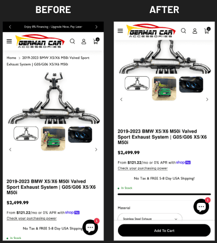
That's not marginal. That's significant revenue from a single small UX change.
How AI Accelerates This Fix
AI powered heatmap and session recording tools will quickly reveal exactly where mobile users abandon your product pages. Machine learning algorithms analyze scroll depth patterns over thousands of sessions, flagging the precise spot users lose engagement, more often than not – correlating directly with the CTA scrolling out of their view.
Tools like AI enhanced analytics platforms automatically detect "rage scrolling", where frustrated users erratically scroll up and down searching for an element they can't find. This kind of behavior is often indicative of a missing the opportunity for a sticky CTA.
AI can also help you optimize the sticky element itself. Predictive algorithms can analyze which CTA variations, whether it’s different colors, copy, positioning, drive the highest engagement based on user segment behavior. Instead of running long-term manual A/B tests, AI can identify winners within days.
On top of that, AI powered personalization engines are able dynamically adjust sticky CTA content based on specific user behavior. A brand new visitor might see "Add to Cart," while a returning customer who previously abandoned might see "Complete Your Order" with the contents of their cart. This level of contextual personalization was virtually impossible at meaningful scale before machine learning made it practical.
Why It Works
Mobile users interact with their devices much differently than desktop users. They navigate with their thumbs. Attention spans are much shorter. And, context switches constantly. Someone could be shopping while commuting, waiting in line somewhere, or watching TV.
When a user has to scroll to find your CTA, you're introducing an unnecessary decision point. You're asking users to remember what they wanted to buy, hunt down the button, and then finally take action. You’re basically adding more potential exit points. And if it takes too long, they’ll leave, and may never return.
Sticky CTAs eliminate this. They keep the next crucial step perpetually available, which is even more critical on small screens where only a fraction of the page content is visible at any time.
Implementation Notes
The sticky element should be visually distinct but not obnoxious or intrusive. It needs to include essential information like product name, price, and of course, the action button. On product pages, a small product thumbnail is also good to include, so users maintain context as they scroll.
Test the positioning carefully. Bottom-anchored CTAs work best for most webshop applications, but make sure they don't get in the way of important page content or interfere with interactive elements.
Use AI testing to accelerate validation. Multi-armed bandit algorithms can automatically point traffic toward the winners, reducing the sample size and time needed to hit statistical significance.
Remember, the goal here is to get through the testing faster, but without skipping crucial steps.
Fix #2: Instagram-Style Story Collections Above the Fold
Mobile users are conditioned by apps they use on a daily basis. Platforms such as Instagram, TikTok, and Snapchat have literally trained an entire generation of consumers to expect tappable, swipeable, visually-driven content right at their fingertips.
Your site can and should leverage these same patterns.
If you place Instagram-style story collections above the fold on mobile homepages, you’ll allow users to discover products without ever navigating through the menu. It creates an intuitive browsing experience that feels native to mobile rather than a desktop design does when it’s crammed into a smaller screen.
The Data Behind It
By adding an Instagram Story–style collection to the homepage above the fold, we got one of our clients a 13.83% lift in their mobile conversion rate with a 94.42% confidence level. That improvement generated an additional $20,000 in revenue, with only 50% of their traffic allocated to the variation during a 13 day test period.
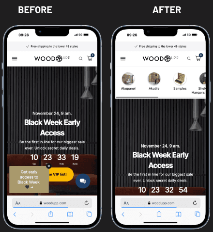
That's $20,000 from one single element on their homepage. And, it took less than two weeks to validate.
How AI Accelerates This Fix
AI transforms story collections from static content into dynamic, personalized discovery engines.
Machine learning algorithms are able to analyze individual user behaviors like browsing history, purchase patterns, time spent on the site, and the referral source, then automatically populate story collections with products most likely to resonate effectively with each visitor. A user who previously browsed running shoes will see athletic gear stories first. Someone who purchased skincare products will see new arrivals in the same category.
You can also use AI powered recommendation engines to optimize story sequencing. By analyzing completion rates and tap-through patterns through thousands of sessions, algorithms learn which story order is more likely to optimize engagement. Maybe new arrivals perform better as the first story for new visitors, while showing sale items will convert better for returning customers. AI can identify these patterns without lengthy manual analysis.
Natural language processing (NLP) tools can automatically generate story copy and product descriptions optimized for mobile viewing. These AI systems analyze high-performing content across your site and create concise, compelling text that fits the story format's constraints.
Computer vision AI can even automate story creation itself. By analyzing product images, these tools can identify which products photograph best for vertical story formats, automatically crop and optimize images, and suggest visual arrangements that maximize impact.
Why It Works
Traditional webshop navigation requires users to open a menu, search for their category, make a selection, and only then can they browse products. Those are a lot of steps and cognitive decisions to go through before seeing anything they might want to buy.
Story-style collections let users jump the line in the entire process. They immediately reveal curated products. Users get to tap through at their own pace, exploring categories or collections without committing to a deep and winding navigation rabbit hole.
This approach works really well for pushing seasonal products, new arrivals, bestsellers, or even high-margin items. It catches users in discovery mode, when they're browsing without a specific purchase intent, open to suggestion, and guides them toward products they didn't know they wanted until you showed them.
The familiar format dramatically reduces cognitive load, because users already know how to interact with stories. There's no learning curve, and zero confusion about what to do. Simply tap for the next step and to learn more, or swipe to skip. It’s an interaction pattern that is already wired into mobile behavior.
Implementation Notes
Position these prominently above the fold, because if users have to scroll to find them, your advantage is gone.
Keep the content fresh and updated. Stale story collections that haven't been updated in months are a clear sign of a neglected site. Use AI assistance for content scheduling to automatically rotate stories based on inventory, product trends, and seasonal relevance.
Make sure each story points to a clear destination. The goal is product discovery, so every tap should lead to a product page, not just content for the sake of adding content.
Use AI analytics to track story performance at a granular level. Don’t just monitor overall engagement. You should also track individual story completion rates, tap positions, and downstream conversion by story entry point.
Fix #3: Mobile Menu Optimization
Most mobile menus are almost completely ignored. They're basically desktop navigation tools collapsed into hamburger icons with little to no consideration for how mobile users actually shop.
What you end up with is a menu that’s too deep, too cluttered, or even too slow. It actually makes it harder for users to find what they’re looking for, making some give up entirely.
Menu optimization isn't glamorous, but it is foundational. A well-structured mobile menu makes it easier to find products, reduces frustration, and keeps users on track to purchase instead of bouncing from unnecessary confusion.
The Data Behind It
We optimized a mobile menu for a client, adding subcategories and implementing clear calls to action, and the result was a 21.53% increase in conversions and an improved confidence level of 94.53%.
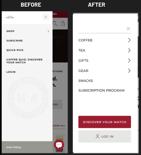
That’s a conversion lift of over 20% from menu changes alone. That's how much impact foundational UX work can have on your site.
How AI Accelerates This Fix
AI can easily analyze your site’s search and navigation to quickly identify exactly where your menu falls short.
Machine learning algorithms can analyze search queries quickly and much more thoroughly to understand exactly what users are looking for and whether your menu matches their needs.
For example, if hundreds of users search for "red dresses" but your menu only offers "Women's Apparel > Clothing > Dresses" without color filtering, AI will flag this as a mismatch, and a missed opportunity.
Natural language processing can analyze how users describe products in searches and chatbot interactions, then recommend category names that match real customer vocabulary rather than internal brand terminology.
AI predictive analytics can identify which menu items drive higher conversion value and recommend adjustments to product prominence. Perhaps "Sale" should be the first menu item for price-sensitive traffic sources, while "New Arrivals" should take the lead for social media visitors. AI can help you segment this automatically.
Session recording AI is extremely helpful in identifying "navigation rage". These are patterns where users open your menu, tap on categories, go back, and then eventually leave. These signals of frustration highlight specific menu pathways that need to be restructured.
Integrate AI chatbots with your navigation to serve as an alternative path for visitors who struggle with traditional menus. When a user spends too long in the menu without converting, your AI assistant could proactively offer help, asking what they're looking for and pointing them in the right direction.
"Whenever you design or update anything on your site such as a new feature, a block of text, a promotion, always ask yourself how it will look on mobile first," notes Thor Fernandes.
Why It Works
Your site’s navigation is how users tell you what they want. When your menu is too hard to use, you're putting a friction point right at the beginning of the purchase journey. That can kill the sale before users even had a chance to see your products
Bad mobile menus usually suffer from some common issues. Too much nesting forces visitors to tap through too many levels to reach a product. Vague category names are confusing, making it hard to find specific items. Slow responsiveness makes the entire experience feel cheap and neglected.
An optimized menu is how you address these issues directly and effectively. It reduces nesting, putting key categories upfront and clearly visible. It uses clear, specific language that goes along with how users think about products they’re looking for. It responds instantly to taps without lag or animation delays.
The secondary benefit is an SEO-related one. Frustrated shoppers who can't find what they're looking for tend to "pogo-stick", jumping back to search results to try a completely different site. This behavior tells search engines that your site didn't meet the user's intent, and this has the potential to negatively impact rankings.
Implementation Notes
Audit the current depth of your menu. If it takes more than two taps to get to a product category, you should consider restructuring.
Consider adding CTAs within the menu itself. Something like "Shop Sale" or "New Arrivals" link positioned clearly can capture certain user segments with high purchase intent before they even take time to browse your categories.
Test your menu changes carefully. Navigation is habitual, and existing customers may already be used to your current structure. Roll out changes to a specific portion of traffic first and watch closely for any negative impacts before deploying all the way.
Use AI testing tools to speed up validation and detect negative impacts across different segments of users.
The AI Enhanced Mobile-First Mindset
These three fixes share a common thread. They're all designed for mobile behavior specifically, not simply adapted from desktop patterns. And each one becomes significantly more effective when you get additional assistance from AI insights.
This distinction really matters. Mobile users scroll much more, read much less, and make decisions much quicker. They navigate with their thumbs instead of a mouse, and they're often distracted, multitasking, or just on the move.
AI tools recognize and understand these patterns at scale. Machine learning algorithms can process millions of mobile interactions to find very specific friction points, better predict user intent, and personalize experiences in ways that are almost impossible with only manual analysis.
Designing with a mobile-first mindset isn't about making things smaller. It's about clearly understanding the behavioral differences and creating experiences that work with them instead of against them. AI accelerates this understanding exponentially.
"Mobile-first isn't a design preference—it's a conversion strategy. Every pixel should serve the mobile user journey," says Fernandes.
The stats clearly support the urgency. With mobile commerce projected to hit $3.4 trillion by 2027, up from $982 billion in 2018, brands optimizing for mobile right now, using AI to guide their decisions, are on point to capture a disproportionate share of that market growth.
What to Do Next
Start by addressing your biggest friction point, using AI tools to specifically identify what that friction point actually is.
If you're seeing strong traffic to a product page, but weak add-to-cart rates, try implementing sticky CTAs first. Use AI heatmap analysis to confirm your hypothesis and optimize with the most effective placement.
If the bounce rate of your homepage is high and users aren't making it past landing pages, try story-style collections. Leverage AI personalization to maximize relevance from day one.
If your analytics show users navigation struggles like high menu open rates but low category page visits, then prioritize menu optimization. Use AI powered session analysis to identify exactly where users are getting stuck.
Each of these can be implemented and tested fairly quickly, within weeks. AI testing platforms can accelerate validation even further, shifting traffic to winning variations and reaching statistical significance much faster.
The data from your own traffic will tell you if they're working. An AI tool makes that data actionable.
And that's really the point. These aren't permanent changes based on best practices alone. They're hypotheses you can test, validate, and refine better work for how your specific audience responds, with AI giving you more analytical horsepower to iterate faster than your competitors are getting it done manually.
Mobile optimization isn't a project that you ever fully complete. Think of it more as an ongoing commitment to meet your users where they are, which, more often is on their phones. AI turns that commitment from an overwhelming and arduous manual process into a data-driven intelligent system that’s continuously improving.
The brands that recognize and act on this will convert more of the traffic they've already got coming in. The rest will keep scratching their heads, wondering why the needle isn’t moving for them.


