The Cost of Ignoring Small Problems
Most e-commerce sites lose conversions not because they don’t get enough traffic or need a website redesign. They miss out on that revenue because certain CRO mistakes keep getting repeated across the site, compounding over time, going from a small leak to significantly hemorrhaging revenue .
The operators who figure this out stop dishing out money to chase more visitors and start extracting a lot more value from the ones they already have. These are the brand owners who aren’t constantly wondering why their numbers won't budge despite increasing ad spend month over month.
"If you don't think small changes can make a difference, test it," says Thor Fernandes, Head of CRO at PurpleFire. "We've seen full theme redesigns underperform while tiny copy and UX tweaks increased final revenue."
Here are six CRO sins that could be hiding in plain sight on your webshop.
Sin #1: Believing Small UX and Copy Improvements Are Too Minor to Matter
This one is perhaps the most dangerous and costly assumption e-comm founders make. When faced with stagnant conversion rates, their first guess is the solution has to be something big, so they go for a full redesign, a brand new platform, or even a complete brand overhaul, which could potentially backfire when based solely on assumptions.
Meanwhile, small improvements go untried because they don’t seem significant enough to matter.
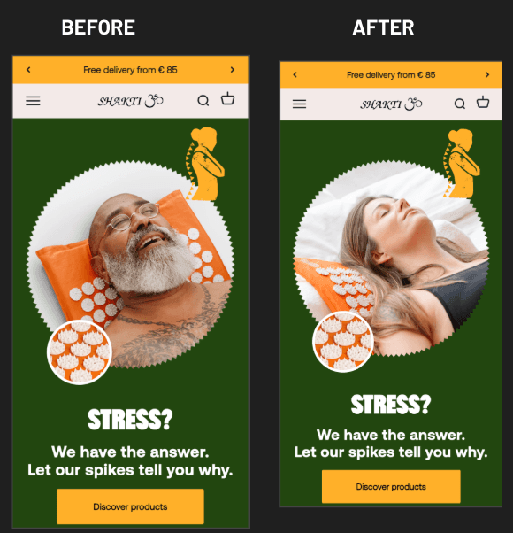
Our data tells a completely different story. In one test, simply collapsing text at the bottom of a collection page, we were able to increase the conversion rate by 3.26%. In another, simply changing the main image on a homepage resulted in a 6.33% lift in conversions.
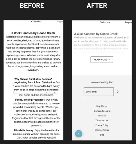
These are far from revolutionary changes. They're simple refinements that take an afternoon, or less, to implement. But when multiplied across thousands of visitors, these simple changes translate into meaningful revenue improvements.
The fix really starts when you understand where users actually struggle on your site. Heatmaps and scroll maps can answer critical questions: What key information are users missing? Where does their scrolling stop? Which elements do they completely ignore? Each insight you uncover can become a small test with potentially big results.
Session recordings reveal rage clicks, dead clicks, and confusing interactions that are happening on your site. Instead of brushing these off as minor annoyances, look at them as opportunities. Make non-clickable elements clickable. Clarify any confusing labels. Add hints to guide users where they hesitate.
When included in a proper CRO audit, structured heatmap and session-recording analysis uncovers small, data-backed UX fixes that end up potentially driving disproportionately large improvements in the results.
Sin #2: Focusing Only on "Key Pages" While Ignoring Navigation, Search, and Category Structure
Most optimization efforts tend to concentrate on checkout, product pages and maybe the homepage. Everything else gets dismissed as infrastructure rather than a real opportunity for conversions.
This is a huge mistake. Navigation, search, and category structure are the areas that directly affect whether visitors find what they're looking for or give up. And if they can't find it, they won't just not buy, they might not come back again.
"Treat navigation, filters and search as core conversion tools," Fernandes notes. "If users can't find what they need on your website, they won't purchase it. Simple as that."
All the numbers support this. Collapsing key filter categories on a collection page and redesigning input fields got us a 12.65% increase in conversions. Displaying the search bar by default on the homepage led to a 13.25% lift. A complete update of the main menu, including improved placement of the categories and subcategories actually drove an increase of 21.53% in conversions.
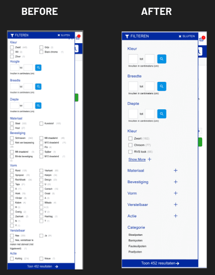
We’re talking about substantial gains from elements that most people wouldn’t think twice about optimizing.
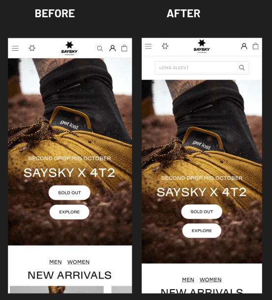
Start by structuring your main menu with clear top-level categories and logical subcategories. Instead of relying on plain text lists, try adding visual elements like images, separators, or icons.
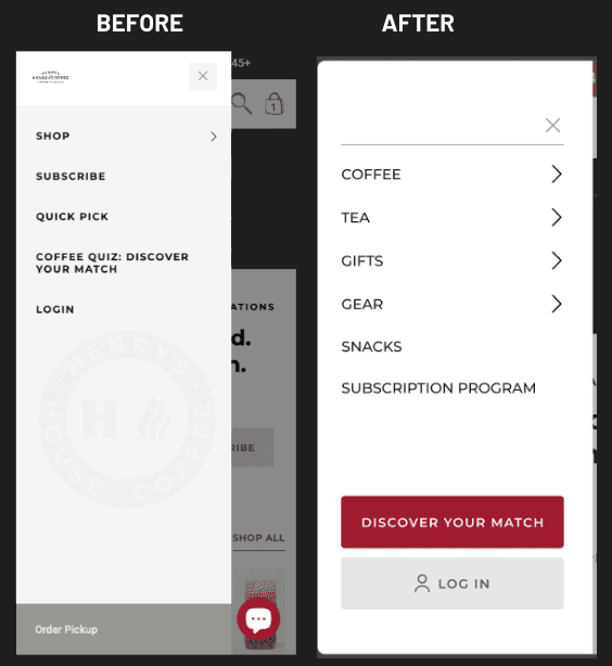
Keep the search bar visible by default, or at least test it and see how it performs. Go into GA4 and check what share of your users are actually using search. If you find it’s 10% or more of sessions, then consider an always-visible search field mandatory. These users have the highest purchase intent, so make it easy for them to buy your product.
Make your category and collection pages highly filterable. Expose the most important filters so users facing many SKU options can quickly narrow the catalog to the range they specifically want. Color, size, material, price, and use case filters help visitors self-select as efficiently as possible.
Sin #3: Adding Apps and Widgets Without Considering Page Speed
Every widget, every app and every script adds weight. Most install tools thinking about the cool features, rather than overall performance. Over time, that accumulation starts to slow everything down.
The impact of speed on revenue is quite severe and well documented. Former Amazon engineer Greg Linden described internal A/B tests where they artificially added latency in 100-millisecond increments. The finding became a classic benchmark: every extra 100ms of latency cost Amazon around 1% of sales. Think about that multiplied.
Walmart also found similar results when analyzing their own data. Each 1-second improvement in load time correlated with up to a 2% increase in conversions. Every additional 100ms improvement drove revenue up another 1%.
These are massive numbers when you think about them scaled up. Even for smaller brands, the principle is the same: faster sites convert better.
The solution requires some discipline. Manage apps wisely, only installing what has a clear, measurable impact on UX or revenue directly. A fancy review popup may seem nice, but if it’s going to add 200ms to your load time and doesn't significantly improve conversions, it's going the other way, and costing you money.
Frequently audit all of your installed apps and third-party scripts. Remove anything you aren’t using or low-impact. Always check how any new integration affects page speed before keeping it live.
Keep a close eye on asset weight as well. Compress images and videos, and try to stay away from oversized hero media. Keep your front-end codebase clean so pages stay as light and fast as possible.
Run a speed-optimization audit. This will help you identify the heaviest apps, scripts, and assets. Then you’ll be able to make a clear plan to streamline and significantly improve site performance.
Sin #4: Writing Poetic Copy Instead of Clear Product Messaging
A lot of brand owners and site operators think good marketing copy should be creative, clever, or emotionally evocative. So product descriptions become over-the-top narratives. Headlines turn overly abstract. The actual benefits of a product end up buried under brand storytelling.
This is a quick way to lose visitors and hurt your conversions.
"Remember, users don't come to your site to hear how great you are or read your brand story," Fernandes explains. "They come to solve a problem and need to understand quickly how your product solves it and why they can trust you."
Research from MECLABS and MarketingExperiments show the true impact of clarity. In a B2B landing-page A/B test for PR Newswire, rewriting the page with a crystal clear, and much more concrete value proposition – what you get, how it works, why it's better – ended up generating 201% more leads than the original vague, albeit creative, promotional copy.
For e-commerce specifically, Frictionless Commerce redesigned an Oransi air purifier product description around two reading modes: one for visitors with two minutes, another for those with more time to sit and read. They added a stronger benefit-driven headline and made the copy easier to read. This variant achieved a 30.56% increase in product sales versus the original content.
The lesson is clear: clarity sells.
Replace long paragraphs with short, focused bullet points that clearly communicate key benefits, proof, and the next steps the user should take. People tend to scan rather than reading walls of text.
Remove vague or empty headers. "About us" and "Our products" tell potential customers nothing. Every headline should already tell users what they’ll get from that section, whether it's a benefit, proof point, or feature.
Collapse long secondary text blocks so important content isn’t pushed down the page. Keep all visible copy tightly focused on core benefits, trust signals, and outcomes the user will experience.
As part of our A/B testing processes, our CRO specialists and dedicated copywriters rewrite draft copy into best-practice, conversion-focused messaging that aligns with the specific hypotheses and goals of each test.
Sin #5: Using Product Galleries for Pretty Shots Instead of Informative Images
The product gallery is prime real estate. Most visitors will go straight for the images before reading any text. Yet so many e-comm sites use this space for repetitive beauty shots that only show the product from slightly different angles, rather than demonstrating the product.
This is a massive waste of an opportunity.
Testing has proven that enhancing the gallery to provide a richer experience, including essential product information, such as clear infographics and data actually resulted in an 11.50% increase in conversions.
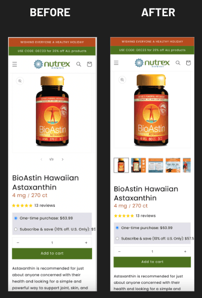
Let your gallery do the heavy lifting of communicating the product to your customers. Instead of six angles of the product box, highlight key USPs with informative visuals. Use infographics, images with very short text callouts, comparison shots, before-and-after images, sizing and fit visuals.
You should even move the most important PDP content to the gallery. Showcase benefits, features, and "what's included" information, making it immediately visible to the users while they swipe through your images. They should be able to understand the full value of the product without reading a single paragraph of body copy.
Add visuals highlighting UGC and social-proof to the gallery as well. Short customer videos and photo reviews dramatically increase trust and make the product feel more real and lower-risk to buy.
Think of your gallery as a sales presentation. A visitor who only swipes through images should still leave with a clear understanding of what the product does, why it's worth buying, and why your brand can be trusted.
Sin #6: Treating the Homepage as an "About Us" Presentation
Countless homepages read like a brand manifesto. Painfully long origin stories, drawn out mission statements, and off-topic philosophical positioning force their way to center stage while the products, the stuff you're trying to sell, get pushed below the fold or hidden in endless navigation.
This is a fundamental misunderstanding of how visitors actually use homepages.
For most people, the homepage is a navigation hub, not a reading page. This is where they expect to find their way from Point A to Point B. Case studies consistently show low scroll depth, because people mainly use it to decide where to go next. They're not settling in to learn your brand story. And a majority aren’t really that interested. They're much more interested in finding the product that solves their particular problem.
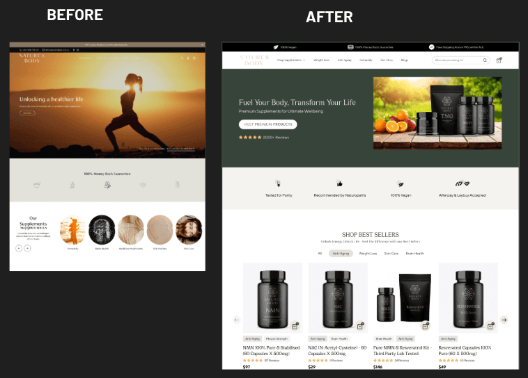
Through our testing, we’ve been able to demonstrate the real impact of treating the homepage the way users expect it to be used. Updating a homepage using CRO best practices, featuring a clearly visible CTA, highlighting key value propositions, and showing the products immediately after the hero section, we were able to get a 23.51% increase in conversion rate.
Turn the homepage into one that immediately sends the users to key categories and offers. Try testing Instagram-style story tiles that link directly to main collections without the need to even open the menu. Make it effortless to get straight into browsing.
Make sure you have strong trust signals above the fold. We’re talking about reviews, star ratings, customer photos, media mentions, partner logos. Anything that makes your visitors feel safe to browse and buy.
Remove long storytelling blocks and replace them with short highlights. If someone wants to read the full story, they can still check out a dedicated About Us page. The homepage isn't where that belongs.
The Compound Effect of Getting This Right
Each of these sins might seem manageable in isolation. But they tend to compound. A sluggishly slow site with confusing navigation, unclear or irrelevant copy, uninformative product galleries, and a homepage that doesn't point anywhere the visitors want to go creates an experience that is sure to send potential customers elsewhere, hemorrhaging conversions at every step.
"Ignore these main themes and be ready to have confused users on your website," Fernandes warns.
Conversely, fixing all of the above issues will create a compound positive effect. Each improvement makes the following step in the funnel much more likely to succeed. Visitors who find products easily are a lot more likely to click through to PDPs. Clear product messaging makes gallery images more effective. And fast load times will keep users engaged long enough to see your trust signals.
The math changes completely. Instead of paying more for traffic to offset dwindling conversion rates, you’ll actually get more value from every visitor. Your customer acquisition costs will drop. Your margins will improve. And finally, growth will be sustainable rather than dependent on pouring more money into ad spend.
Starting the Cleanup
You don't need to fix every issue all at once. Begin with the highest-impact opportunities based on your specific situation.
If you have no idea where your users are struggling, start with heatmaps and session recordings to get the data you need. If your site is sluggish, run a speed audit before you do anything else. If your search gets significant usage, make sure it's easy to find and highly functional.
The pattern across all of these sins is the same: most stores have conversion opportunities hiding in places they’ve never even thought to look at. The homepage ends up treated more as a brand statement because no one thought to test it as a product launcher. The gallery shows beauty shots rather than descriptive imagery that helps sell the product. Apps accumulate, eventually slowing the site down, because each one seemed helpful when installed.
Systematic testing will show you what actually works. And what works is almost always simpler, clearer, faster, and more helpful than what most stores do as a default.
Your customers absolutely notice these sins even when you don't. The question is whether you'll fix them before the next competitor beats you to it.


