
Simple Adjustments That Increased The Conversion Rate By 30.5%
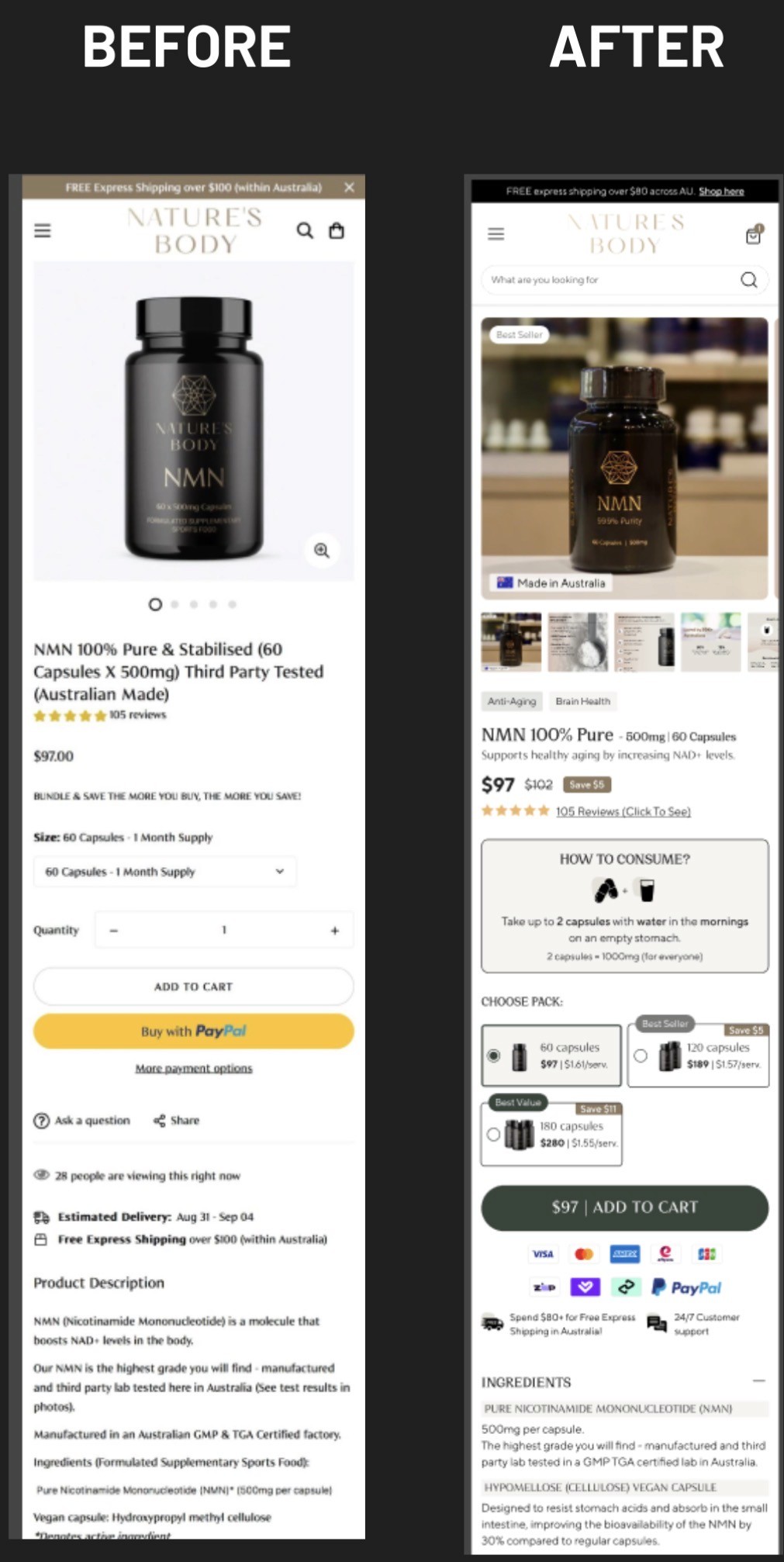
Our first big ah-hah moment came from watching sessions of real users shopping. We started noticing a frustrating pattern: visitors would land on product pages and immediately hit roadblocks. Unclear product names left them confused about what they were actually buying. They'd scroll past the hero section without seeing any reason to trust the brand. They couldn't figure out how or when to use the product. Bundle options were buried or confusing, shipping details were vague and not easy to find, and the product images didn't present enough detail visitors needed to feel confident enough to purchase. All of this uncertainty compounded more and more unnecessary friction throughout the buying process. And as a user, let's be honest, that had to be pretty frustrating.
Our hypothesis was simple: If we add compelling social proof above the fold, clearly explain when and how to use their product, improve product images with higher quality detailed visuals, we’ll improve overall confidence in the products. Then to close the sales, we clarify shipping and delivery details, highlight bundle options and progressive discounts, clearly display payment methods, then we make that elusive "Add to Cart" button always accessible, completely removing the friction of scrolling up and down for it.
So instead of completely redesigning the pages, we simply made all the aforementioned adjustments and tested adding a sticky “add-to-cart" button that stayed fixed to the top of the page, no matter how far users scrolled. Nothing shiny. Nothing fancy - we just kept the primary action visible the whole time and put all of the confidence building information front and center.
The result:
Conversion rate: +30.46%
Engagement rate: +12.8%
But here's what really made the “sticky button” part of the test fascinating: we ran the exact same sticky button test for a fashion e-commerce client, and it only produced a 3% lift. So why such a dramatic difference?
The answer lies in understanding industry-specific user behavior. Supplement shoppers spend significantly more time researching before finally deciding to purchase. They’ll scour ingredient lists, double check dosages, review multiple clinical studies, and compare with alternatives and other brands. While on the other hand, fashion shoppers make impulsive, more emotional purchase decisions. The sticky button solved a real problem for supplement shoppers who were finally ready to take action after so much research.
Key lesson: What works insanely well for one industry might just barely move the needle for another. Always base tests on the behavior patterns of your specific audience.
Collective Changes That Boosted Revenue Per Visitor by 40%
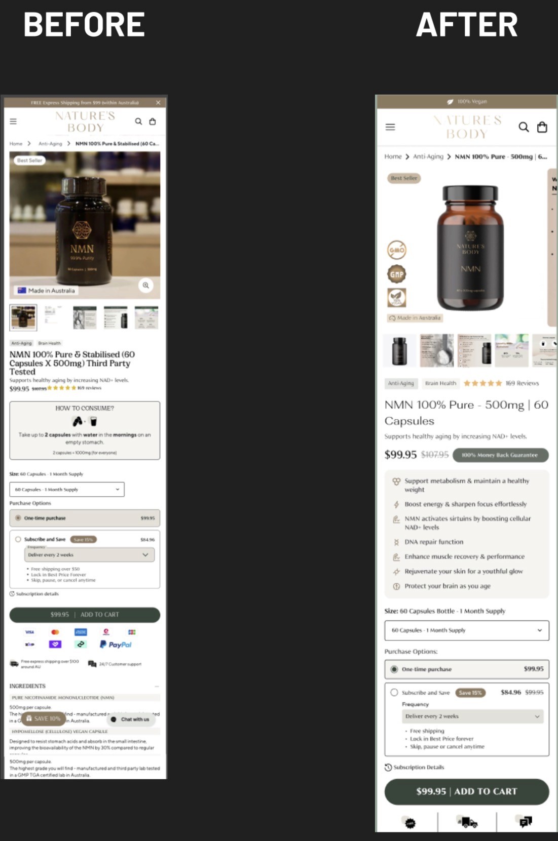
After seeing success with small adjustments, we dug deeper into the users’ behavior. Session recordings showed us yet another pattern: visitors were struggling to find critical trust signals on product pages. All their reviews were buried below the fold. Money-back guarantees were hidden in tiny text. Ingredient information required multiple clicks to find. None of the elements that gain trust were front and center where they would be of any benefit.
We decided to develop a new product page template with 3 core improvements:
Clear information hierarchy that surfaced trust signals immediately
Reviews and guarantees prominently displayed above the fold
Streamlined add-to-cart CTAs that reduced visual clutter
The result:
Conversion rate: +24.81%
Revenue: +40.29% (+$20.5k)
This wasn't just a design improvement - it was a lesson in understanding what supplement shoppers actually need to feel confident enough to purchase. As health-conscious consumers become increasingly informed, and also more skeptical, transparency and accountability are absolute musts. They need to see the detailed "why" behind your products, not just the "what."
An effective website for a supplement brand doesn't merely display products; it proves to the customer why your products matter and why they should trust you. This test proved that when you align your design with your customer’s psychology, the results can be transformative.
An Intentionally Simplified Homepage That Increased Conversions by 23.51%
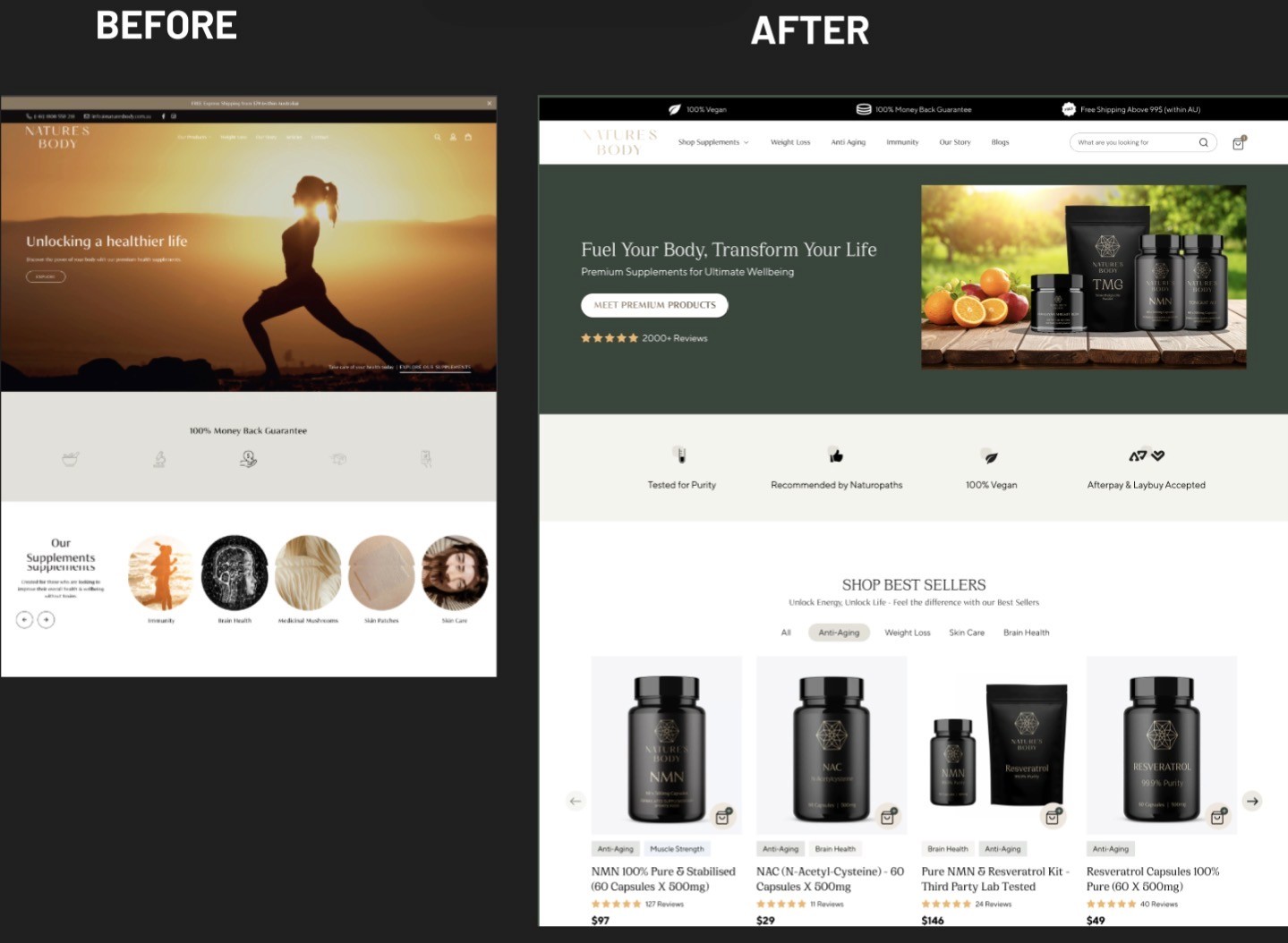
So many brands make the same mistake on their homepage: they try to showcase all of their products at once. Our client's original homepage was missing a lot of key information that helps users to understand the brand and their product, with no clear value proposition or identifiable user journey.
We could see a large number of visitors landing on the homepage then immediately bouncing. They couldn't quickly understand what made this brand different or which products were right for them, so they gave up and left.
Our hypothesis: if we help visitors immediately understand what the brand was offering and direct them to relevant bundles, we'll reduce the decision paralysis and increase conversions easier.
The redesign included:
An eye-catching hero image with naturally compelling copy that communicated the brand's unique approach
Clear CTAs that guide users to morning vs. evening supplement routines
"Add to Cart" buttons directly on bestseller product cards
Simplified navigation focused on user intent rather than every product category at the same time
The result:
Conversion rate: +23.51%
Revenue: +$23.4k
This particular test reinforced a simple yet critical principle: in the supplement industry, you're not just selling products - you're selling belief in your products. Belief that is earned through credibility and a perceived connection to the user. When your page immediately connects with visitors' goals, and establishes credibility through clear and compelling communication, conversions will naturally come next.
The Cart Page Tweak That Drove 24% More Revenue
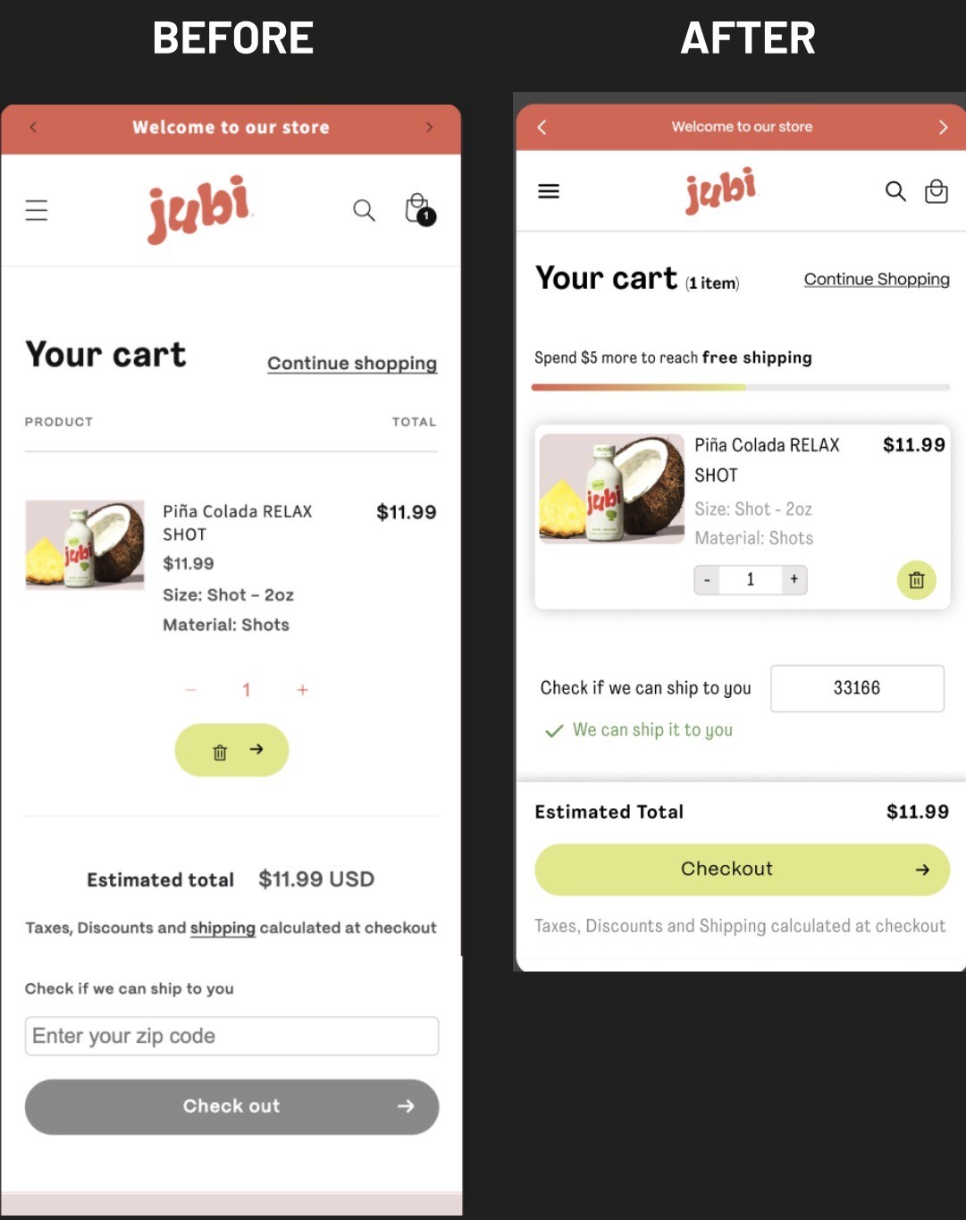
Oftentimes the smallest changes yield the biggest results. This is something we see often. We noticed many users were abandoning their carts right when they were right on the edge of making their purchase. When we looked closer, exit surveys revealed a common concern: shipping costs.
The client already offered free shipping on orders over $50, so what was the problem? It wasn’t clearly communicated until checkout, past the point where visitors were abandoning. We hypothesized that simply and clearly displaying this benefit earlier would reduce abandonment.
We added a simple message on the cart page: "Congratulations! Your order qualifies for FREE SHIPPING" (for orders over $50) or "Add just $X more to get FREE SHIPPING" (for orders under $50). It worked.
The result:
Revenue: +24.04%
This test proved to us that timing is everything. The same free shipping offer that was already in place became significantly more powerful simply by communicating it at the right moment during the customer’s journey.
What These Tests Really Teach Us About CRO
Looking back these four experiments, we learned several powerful lessons, that if done right, can easily apply to any e-commerce business:
1. Small Changes Can Have Massive Impact
None of these tests required massive development or complete overhauls. A sticky button needed to be adapted. Rearranged trust signals. Clearer messaging with better timing. These are all simple changes that any business can implement. Yet they drove revenue increases of 24-40%. Applied at large scale, we’re talking serious potential revenue gains.
The key here is understanding that small frictions will eventually compound. When you remove multiple small barriers to purchase, the cumulative effect can be game-changing.
2. Each Industry Has Unique Behavior Patterns
What works for Amazon might not work for you. What crushes it in fashion niches might flop in the supplements market. Think about how people shop for currently trending accessories, fast fashion pieces, or statement jewelry—these are impulse-driven categories where eye-catching visuals mixed with a sense of urgency can close the sale in seconds, with less effort in most cases. But health-conscious consumers operate differently. They research ingredients, demand transparency, and expect accountability. They need product education and trust-building that those quick-decision fashion purchases simply don't require. This is why copying competitors' "best practices" fails more often than wins. You have to understand your specific audience's behavior, and the best way to do that is with tools like session recordings and targeted user testing.
3. The Bigger the Change, the Bigger the Risk
When we decided to redesign specific elements on the product page template, we took a calculated risk. Big changes can have big impacts - both positive and negative, which is why testing is so crucial. Without A/B testing, we would have been gambling with the client's revenue on a hunch.
Always test significant changes before rolling them out site-wide. What seems like an obvious improvement to you might end up confusing or frustrating your real customers.
4. Session Recordings Are Your Secret Weapon
Almost every successful test we run starts with the same process: we watch real users interact with the website. Session recordings will reveal blockers you would have never found through using analytics alone.
We saw users frustratingly scroll up and down to find add-to-cart buttons. We watched them search for shipping information. We could almost feel their confusion while struggling to navigate cluttered homepages. These observations directly informed our test hypotheses.
Quick-Win CRO Checklist
Based on these experiments and dozens of others, here are some actionable tactics you can implement yourself:
Build Trust In Your Brand
Trust is the absolute foundation of supplement sales. Implement these trust-builders immediately:
Use high-quality images showing the product, packaging, and size reference
Display third-party certifications above the fold (NSF, GMP, organic, etc.)
Include detailed ingredient lists with dosage information
Feature authentic testimonials with before/after stories
Add video reviews and user-generated content
Make your return policy and guarantee impossible to miss
Remember: educated visitors with scientifically validated insights become confident customers. Compliance isn't restrictive - it's reassuring.
Create Content That Educates and Converts
Supplement brands that educate don't just build trust - they actually dominate organic search rankings. Make sure your content strategy includes:
Detailed ingredient guides thoroughly explaining benefits and research
Blog posts addressing common health concerns your products solve
Comparison guides that help customers choose between your products
FAQs that preemptively address purchase hesitations
Email courses that position your brand as an authority
This approach serves two important purposes: it makes users comfortable purchasing from you, while at the same time boosting your organic visibility through SEO.
Offer Subscription Packages and Bundles
The real money in supplements comes from repeat customers. Make retention your mission:
Offer subscription discounts (typically 10-20% off)
Create morning/evening routine bundles
Suggest products that compliment users’ purchase history
Send replenishment reminders before customers run out
Reward loyalty with discounts, exclusive products, or early access
These strategies create predictable recurring revenue while building a loyal customer base that trusts your brand as their go-to source.
Test Everything, Assume Nothing
Here's the quiet truth about CRO: what worked spectacularly for our client might fail miserably for you. Your audience is not their audience. Your brand positioning isn’t the same. And even your price points create different expectations with your audience.
The real lesson here isn't about sticky buttons, how to gain trust, or how to communicate free shipping. It's about creating a culture of testing and learning, then taking appropriate action on your findings.
Every assumption is just that until it’s tested. Every "best practice" needs to be proven with your specific audience. Every clever idea must be completely validated with factual data.
The brands we see winning over the market today aren't the ones with the massive budgets or the shiniest new websites. They're the ones that are consistently testing, constantly learning, and effectively optimizing based solely on real user behavior.
Here’s Why You Should Start Testing Today
You don't need an endless budget or even a team of experts to start boosting your conversion rates. Here’s what you really need:
A way to observe real user behavior (session recording tools)
An accurate method to test changes (A/B testing platform)
Enough discipline to let data drive your decisions
Just start with one small test. Maybe it's adding some trust signals above the fold. Perhaps it's de-cluttering your cart page. Or testing a sticky add-to-cart button of your own.
Whatever you decide to test, remember: simple tweaks or changes can dramatically impact user behavior. A few pixels, a few words, or even just a few seconds saved during the user’s journey - these micro-optimizations can potentially compound into macro results.
The supplement industry's unique challenges - building trust without physical interaction, confidently educating increasingly skeptical consumers, and competing with claims of miracle cures all make CRO even more critical to a brand in this niche. When you can't rely on tempting visitors into impulse purchases, every element of your site needs to work harder and smarter to build confidence and remove any friction points holding customers back from making their purchase.
There’s a good chance that many of your competitors are basing their decisions on what they think are “best practices”. By going with a test-and-learn approach, you’re gaining an unfair advantage. Each test reveals something new about your customers. Each win compounds your conversion rate improvements. Each lesson learned makes your next test even smarter.
Think about it. Those four simple tests we shared generated a combined revenue increase of over $80,000, but also contributed to paid media and other critical parts of our digital strategy for the brand. The lessons we learned from these tests alone showed us how to achieve better results and much more efficiency.
Imagine what a similar approach could do for your business over the course of a full year. Stop guessing. Start testing. Your future customers - and your revenue reports - will be glad you did.


