
Why It Matters Right Now
E-comm shoppers these days tend to be increasingly more skeptical, comparison-heavy, and easily distracted. Checkout abandonment remains a stubbornly common issue across the industry. But here's what gets missed most often: many shoppers don’t leave because of lost interest, but because the process takes too much effort or is simply uncertain.
They came to buy, but something stopped them. And that something is often invisible, because it's happening inside the shopper's head.
The cognitive load was too high. The information was too hard to parse. The risk felt unclear. The page created doubt instead of resolving it.
When you get a clear understanding of the psychology behind these drop-offs, you can finally stop guessing about remedies and start making strategic, testable changes that address real purchase barriers head-on.
"Shoppers rarely leave because they do not want the product," notes Thor Fernandes, Head of CRO at PurpleFire. "More often, they leave because the experience does not help them feel certain enough to buy."
The Four Psychological Principles That Drive Purchase Decisions
Before diving into the tactical applications, it helps to understand the core principles at work. These aren't marketing buzzwords. They're well-established findings from cognitive science and decision research that directly apply to how people behave on e-commerce sites.
Cognitive Load
When shoppers have to work too much to figure out an offer, compare the options, or understand what they’re really getting, your conversion will suffer. Research on online shopping supports the idea that information overload will raise uncertainty and make the decision to purchase harder. According to recent research in ScienceDirect, mental effort and difficulty are major factors in digital decision-making. That directly supports a core CRO principle: when pages feel mentally heavy, buying becomes a challenge.
Think about how much you're asking visitors to process on your product pages. Multiple CTAs competing for attention. Long walls of text over-explaining features. Badges and trust signals scattered without any real hierarchy. Annoying pop-ups that interupt the flow. Each element adds cognitive weight. And that weight will always have a cost.
Cognitive Fluency
Most brains prefer easy-to-process information. When a page feels clear, well-structured, and familiar, people have better processing fluency. That sense of ease usually increases confidence in their judgment.
The Journal of Consumer Research published work showing that processing fluency, the subjective ease of processing information, often shapes preferences, beliefs, familiarity, truth, and even certainty. This is extremely relevant to e-commerce because shoppers are constantly making quick judgments about product quality, trustworthiness, and necessity. If your website is a challenge to understand, those judgments will turn negative right away, even if the product is what they’re looking for.
Loss Aversion
Most people tend to feel the pain of loss much more than the joy of an equal gain. In the e-commerce world, that means the fear of wasting money, making a bad choice, dealing with a bad return process, or missing a better option somewhere else can quickly and easily outweigh product desire.
Loss aversion is an established principle in decision research that is highly relevant to financial and consumer choices. Your visitors aren't just asking "Do I want this?" They also ask "What happens if I’m making the wrong choice?" If your site doesn't immediately and clearly address that second question, the first question doesn’t matter.
Repetition and Familiarity
Repeated or familiar information tends to feel more trustworthy because familiarity makes the info easier to process. This is one reason consistent ads messaging, product pages, landing pages, and especially your checkout matters so much. When the whole experience is coherent and predictable, that comfortable familiarity reinforces the visitor’s certainty. When it doesn't, each transition point becomes an opportunity for people to get nervous and leave.
Real Results: How Psychology-Driven Changes Produced Measurable Lifts
These principles get their real power when you systematically apply them to your experimentation program. Here's how it has played out in actual tests we've run for our clients.
Case Study 1: Visual Hierarchy Improvement (11.83% Conversion Lift)
For one client, we identified that their original product page design created a lot of friction with cluttered elements and a very unfamiliar layout. Users who wanted to personalize products had to scroll down to the customization area, then all the way back up to add that product to the cart. The design wasn’t as easy as users expected based on their experience with other similar e-comm sites.
Our variation reduced overload by simplifying the layout to patterns users were already familiar with. Even with the add-to-cart button positioned lower on the page, the clearer structure made the visitors’ experience easier to process. That alone got us an 11.83% conversion lift.
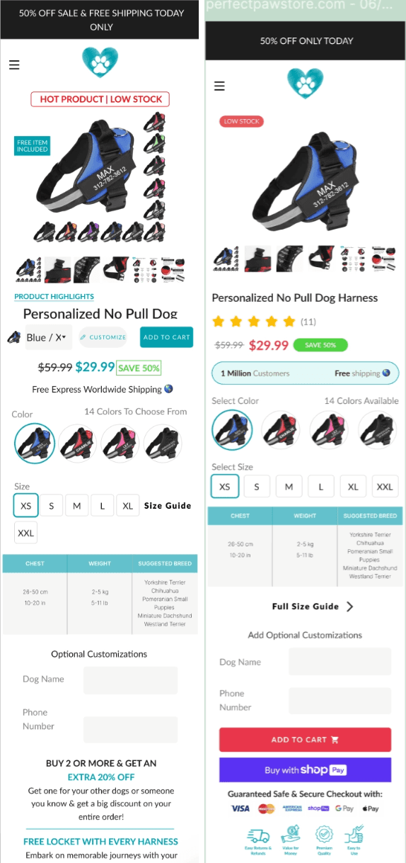
Instead of button placement, this one was all about cognitive fluency. When the page structure matched users' ideas of how e-commerce pages should work, the experience felt easier, and easier experiences convert better every time.
Case Study 2: Content Hierarchy Optimization (33.7% Conversion Lift)
Another test we did focused on how product details were presented. The client’s original version displayed the content in a long wall of text with very few visual references separating the topics. Heatmap data revealed there was almost no interaction with this section. Users didn't engage because the information took too long to process. The product info literally worked against selling the product in that format.
Our variation separated content into distinct, clearly differentiated sections. We made it easier for users to identify individual topics and click precisely where they wanted. This simple change to how the information delivered made it dramatically easier to process.
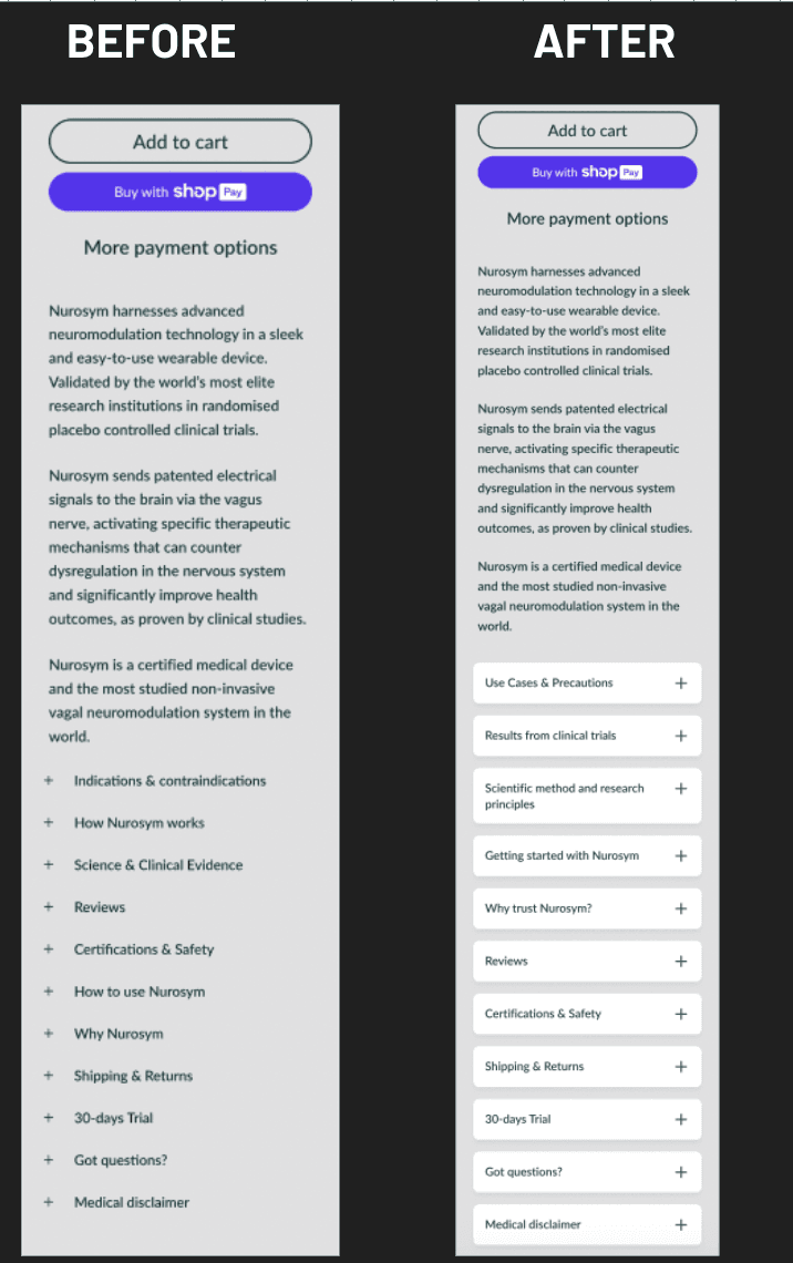
The result from that simple adjustment was a 33.7% increase in the site’s conversion rate. We shared the same information, products, and prices, with the only difference being how easy it now felt to absorb the content.
"A 19% lift in conversions is not just a testing result," says Fernandes. "It is evidence that understanding buyer psychology can change how people evaluate, trust, and choose."
Case Study 3: Reducing Cognitive Load Above the Fold (30.64% Conversion Lift)
Another test we performed reduced the amount of information the client was presenting in the top section of their product pages. Our hypothesis was straightforward. We knew that by helping users focus first on the most relevant product information, instead of overwhelming them with everything from the start, we should see a more assertive conversion path. It worked.
Our variation for this one peeled away competing elements and put the priority on clarity rather than comprehensiveness. The client’s conversion rate jumped by 30.64%, and they saw a 29.7% increase in revenue per visitor.
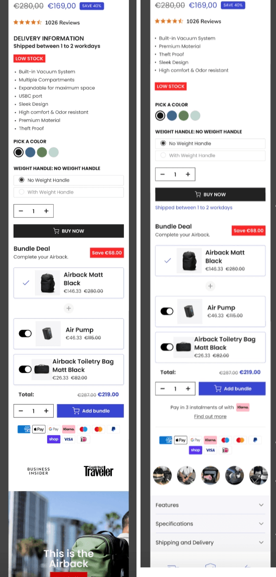
This is a pattern that repeatedly shows up in our testing data across many of our clients. When you significantly reduce the cognitive load on a visitor, you’ll typically see a rise in conversions, because the customer will put less energy on processing and more confidence on deciding.
Tactical Applications: How to Apply Buyer Psychology to Your Store
Understanding these principles is extremely valuable, but applying it all systematically is where you’ll actually start to see real results. Here’s how to practically put buyer psychology to work for your own experiments.
Write for Cognitive Ease, Not Cleverness
Use simple, clear language. Don’t include any jargon. Your product’s value needs to be obvious in seconds. If people need to interpret too much for too long, confidence and fluency will drop quickly.
This doesn't mean you need to dumb down the copy. It just means considering your visitors' cognitive resources. You’re asking them to make a quick judgment while distracted, skeptical, and comparing your product to alternatives. The harder your message is to process, the more opportunity for doubt to creep in. Make it easy to choose you.
Use Loss Aversion Ethically
Urgency messaging can get their attention, but reducing the fear of any downside is typically more powerful than pushing the fear of missing out. Clearly communicating messages like "Free returns," "30-day trial," and "Delivery by Friday" effectively reduce a lot of the perceived risk associated with purchasing. They add a sense of security to the decision process by answering that subconscious question many shoppers have — "What happens if this doesn't work out?"
When you address loss aversion head-on, it’s not manipulating someone into buying something they don't want. It’s about removing psychological barriers that hold them back from buying something they really do want.
Limit Competing Inputs at the Moment of Choice
Chat bubbles, CTAs overriding other CTAs, too many badges, more options than necessary options, or massive amounts of text can all increase cognitive load. People tend to pull the trigger on purchase when you give them clearer, simpler choices.
Audit your product pages and checkout flow with this in mind. Ask yourself “what is competing for attention right now?”. If anything can be removed or hidden without losing essential information or context, try it. You’re not going for minimalism just for its own sake. You’re trying to create an environment where the right action is obvious to your visitors.
Test Psychological Hypotheses, Not Page Cosmetics
Instead of testing a new layout" or different colors, build your experiments around psychological hypotheses. For example, try reducing perceived risk, so more users will start checkout. Or, if you improve fluency above the fold, more users will add to cart.
This approach does two things. First, it will force you to think more about the mechanism behind why a change might be effective, which leads to better experiment design. Second, it will make the results more actionable, because you’ll actually learn something about your customers' psychology, not just whether or not one arbitrary design could beat another.
Apply Neuromarketing Practically
Neuromarketing is useful when it sheds light on specific behaviors, not when it just makes flashy claims about the brain. The most practical application is connecting your page’s design to mechanisms like attention, reward, effort, uncertainty, and most of all, trust.
You don't need to perform brain scans to benefit from these insights. You need to understand that your visitors are human beings with limited cognitive resources, emotional reactions to risk, and a strong preference for easy and familiar experiences. Design your tests around that reality, and conversion improvements will start to follow.
The Bigger Picture: Certainty Over Persuasion
There's a common misconception that conversion optimization is about persuading people harder. Better headlines, stronger urgency, more aggressive tactics.
That framing completely misses the point.
Most visitors who exit your site without buying weren't unconvinced about your product. They were merely uncertain. Uncertain about whether it was right for them. Uncertain about whether you’re trustworthy. Uncertain about how it would go if something went wrong. Uncertain because the experience itself created friction instead of resolving it immediately.
"When a buying journey feels clearer, safer, and easier to process, conversions tend to rise because the brain is spending less energy on doubt," explains Fernandes.
The most powerful conversion work doesn't push people toward a decision. It actually removes the obstacles preventing them from making the decision they were already willing to make. Understanding buyer psychology is how you identify those obstacles. Systematic experimentation is how you get rid of them.
The 33% conversion lifts we've documented aren't just outliers. They're the predictable result of what happens when you systematically apply cognitive science principles to e-commerce experiences. When you reduce cognitive load, increase fluency, directly address loss aversion, and make the user’s experience familiar and trustworthy, more people buy. All you have to do is make it easier for them to say yes.
That's the real opportunity hiding in buyer psychology. And for most e-commerce brands, it remains almost entirely untapped.


