
Drop-Off Is Usually a Psychology Problem Before It's a Traffic Problem
When conversion rates fall flat, the first assumption tends to focus on targeting. The thought process goes like this: if people aren't buying, we must be attracting the wrong people. So brand owners adjust their ads, tweak their audiences, and chase a mythical "high-intent" visitor who will convert no matter what (it doesn’t exist).
But the data tells a completely different story.
Baymard Institute's did research revealing that the average cart abandonment rate globally sits at approximately 70%. Seven out of ten people who add something to their cart end up leaving before they buy. That's too big to be a targeting problem. These users clearly show they intended purchase by adding products to their cart. Something happened between that moment they filled their cart and checkout that pushed them away.
When you start digging into the reasons, the pattern becomes clear. Most of the abandonment we see stems from usability and experience issues, not lack of intent to purchase. Extra costs showing up too late. Overly complex checkout processes. Concerns about payment security. Mandatory account creation. These are all unnecessary friction points, not audience mismatches.
The uncomfortable truth everyone needs to hear is that your funnel is probably losing people who showed up to your site wanting to buy your product. They came with intent. Your experience turned them off.
Small Frictions Compound Into Abandonment
No single element usually won’t kill a conversion. It's when several issues pile up when it becomes a deal-breaker.
A page that loads half a second slower than expected. A call-to-action that's vague about what where it directs the user. A layout that pulls attention in multiple directions at once. An unexpected shipping cost that appears for the first time right before paying. It can even be one additional form field that feels unnecessary.
Each of these are seemingly minor by themselves. A site operator looking at a single element might think, "That's not a big deal." And in isolation, they're right. But users experience your funnel as a continuous flow, where every friction point chips away at their momentum like speedbumps on a highway.
"Every extra click is not just an action cost," Fernandes explains. "It's a doubt multiplier."
Think about your own behavior online. You've probably backed out of purchases for reasons you might not have even been aware of. Something just didn’t feel right. The momentum was lost somewhere. You may have even told yourself you'd come back later, but never did. Your visitors are doing that same thing, and if you’re waiting for them to fill out a survey explaining why, you’ll be waiting a while...
This is why optimizing for conversions isn't about finding that one magical solution. It's about systematically removing the compounding friction that unnecessarily builds up across your entire funnel.
Many Users Are Emotional, Not Rational
Here's a fundamental misunderstanding that absolutely tanks conversion rates: treating users like they're robots executing a preprogrammed script.
They're not. They're humans with increasingly limited attention spans, competing priorities, and varying emotional responses to everything they encounter. They respond to effort, clarity, speed, trust, and how your message meets them in the moment they're actually in. You have to calculate potential response to each point in your funnel, otherwise you lose them.
When you ask users to make too many decisions, require too much information, and make them perform too much cognitive effort, that’s when you’ll see them walk away. Not because they lack intent, but because your process burned them out, and they’ve decided it’s just not worth the effort at that moment.
"Users aren't robots following a checkout script," says Fernandes. "They react to friction, clarity, speed, trust, and how your message meets them in the moment. Ask for too much, and completion drops."
This is especially the case on mobile devices, where users have even shorter attention spans, a lot more interruptions, and much less patience. Baymard Institute's research on mobile UX pulled the curtain back on overcategorization as being one of the most common pitfalls experienced these days. Sites that offer too many product categories end up forcing users to make unnecessary decisions, actually making it much more of a challenge to find what they want.
The psychological principle is simple: every demand you put on your visitors’ plate makes it much more likely they'll simply give up. The brands that effectively convert aren't the ones with the fanciest features or the most information on their pages. They're the ones that make the path to purchase feel as effortless as possible.
Trust Isn't Built by Simply Adding Testimonials
Most funders understand that trust matters. So they add testimonials, customer reviews, trust badges, and even security seals. Then scratch their heads when conversions don't suddenly start moving.
The fact is, trust isn't a checklist item you can immediately achieve by adding a few elements. Visitors decide whether a store is trustworthy based on a holistic assessment of cues such as predictability, data handling, delivery clarity, and overall transparency. If those fundamentals are off, all the five-star reviews in the world won't get the needle to budge your way.
And even worse, if social proof feels inauthentic, it will catastrophically backfire. Users will absolutely detect fake reviews and made-up testimonials. The moment something feels staged, trust doesn't just fail to increase, it will collapse underneath you. You've confirmed their suspicion that the store can't be trusted. It’s impossible to fake-it-til-you-make-it and succeed.
Effective social proof requires combining a few factors like credible and authentic content, positioned at the right moment, with messaging that's relevant to the user's current concern. But if you get those elements just right, the impact can be enormous.
When we tested adding user-generated content for one of our clients, we positioned authentic social proof strategically in the purchase flow and the results were significant.
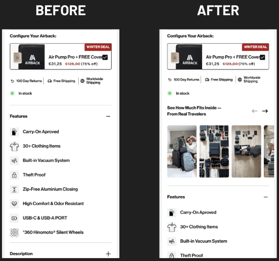
We achieved a 20.39% lift in their conversion rate and revenue per visitor increased by 22.65%. The content was real. The placement was intentional. The messaging addressed the specific doubts users had at that particular stage of the funnel.
It’s just more proof that trust is earned through a thousand small signals, not through a default testimonial widget.
Addressing Anxiety Before It Becomes Abandonment
Users bring a small degree of doubt into every purchase decision they jump into. Will this product work the way I need it to? Is it easy to return if it doesn’t work? How soon will it ship? Are there any hidden fees? Is my payment information safe?
These anxieties are constantly running in the background, even when the user doesn’t completely realize it. And if your funnel doesn't proactively address them, users will either go somewhere to search for answers (creating friction) or simply assume the worst (creating abandonment).
But before you go adding all of your reassurances to your FAQ page, that’s not the solution. You’ve got to put all of the reassurance and answers on the surface in the right spot at the exact moment doubts arise.
We tested this with a client by adding shipping estimates directly on product pages. It was a simple change that allowed users to easily see when they would receive their order before even adding it to their cart. No more hunting down that information. No more uncertainty about the delivery details.
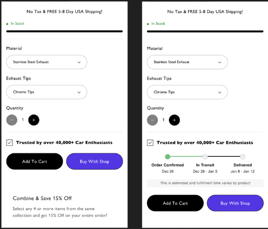
That very simple change got them a 12.30% lift in conversion rate.
All we had to do was add a simple solution to a concern users already had, at the exact moment they had it.
You can literally apply this principle across your entire funnel.
Return policy? Don't make users search for it. Place it clearly near the buy button where anxiety peaks.
Payment security? Display trust signals on your checkout page, not just on your homepage.
Shipping costs? Show them early, because surprising someone right before they pay could send them running.
Every unanswered question is a reason to second-guess that purchase. It gives user just one more opportunity to walk away.
The Compounded Impact of Micro-Friction
When we audit funnels, we're not looking for one catastrophic issue. We're looking for a bunch of micro-frictions that accumulate to collectively drain conversion.
A slow-loading page. A coupon field that requires users to hunt for discount codes. Vague product descriptions that don't answer obvious questions. Form errors with confusing messages. Awkward site interactions that don't behave as expected.
While they can be annoying, most of these don’t feel like deal-breakers when you're building the experience. But for users moving through your funnel, each one creates a moment of hesitation. When they build up enough hesitation, they're gone.
The challenge is that micro-friction tends to be invisible when looking from the inside out. You know how your site works better than anyone. You know where to find information. You've seen every page hundreds of times. And because of that, you aren’t experiencing it with fresh eyes, the same way you can't call your own baby ugly.
This is why effective optimization requires combining multiple data sources. You need heuristic analysis to identify structural issues, heatmaps to see where user attention actually goes, session recordings to watch real user behavior, and surveys or real feedback to understand intent and where the frustration builds. Each source uncovers friction the others might miss.
What You Can Actually Do About It
Understanding funnel psychology is the first step. Doing something about it is where you can start to recover some of that lost revenue. Here are the high-impact moves we've seen work consistently across e-comm stores:
Remove one decision from every key step
At each point in your funnel, ask yourself “what can the user avoid having to think about here?”
Offer fewer choices, remove unnecessary form fields, eliminate competing calls-to-action, get rid of redundant sections.
Every decision you remove is friction eliminated.
Make the next step the most obvious element on the page
Every page in your funnel has a goal. If there’s an action you want users to take next, it needs to be crystal clear.
"What should I do next and why?" should be answered instantly at every step.
If users have to search for the next action, you've already lost some of them.
Address hidden anxieties earlier
Shipping costs, return policies, delivery timelines, guarantees, payment options. All of those concerns exist whether you acknowledge them or not.
Proactively reassure your customers at the moments when their doubt is at its peak.
Remember, it’s much easier to simply walk away, rather than spend time searching for information. Make it easier for them to decide to buy.
Treat mobile users as a different psychological context
Mobile isn't just a smaller screen. It's a completely different mental state. The attention spans are shorter, There are more interruptions, less patience, and constant competition for attention.
Mobile optimization means prioritizing clarity and speed over completeness.
Think about what you can remove without losing the essential elements.
Audit your entire funnel for micro-friction
Combine heuristic analysis with heatmaps, session recordings, and user feedback.
Look for hesitation triggers such as slow loading pages, coupon hunting behavior, vague descriptions, error states, and other awkward interactions.
Each one is a conversion leak that you urgently need to get patched up.
The Real Problem With Gut-Based Optimization
Founders often approach conversion optimization with strong personal instincts. We get it. Many have built successful businesses by trusting their own judgment. And when conversion rates underperform, they tend to go back to their default and make changes based on what feels right to them at that moment.
The problem is that, more often than not, your instincts tend to be shaped by a perspective of someone who intimately knows the product, understands every detail of what they're offering, and can't experience the site the same way a first-time visitor would. Your gut is biased by that old curse of knowledge we’re always talking about.
We've seen this play out over and over again, with a client being so certain that simply changing their hero image wouldn't make much of a difference. A brand owner totally convinced their checkout was fine because they'd gone through it successfully themselves multiple times. Teams that dismissed seemingly small changes as insignificant because applying flashy redesigns was much more tempting.
The stores that we see consistently improving aren't the ones following instincts. They're the ones letting real data show them where the friction is actually happening, then taking the time to systematically test solutions instead of going with their best guess.
Your funnel is probably losing people right now. And it’s not because there’s something wrong with your product, or you just don’t have the right kind of traffic, but because the funnel your users are experiencing on your site is creating friction you can't see.
It’s not a question about whether friction points exist on your site. They do. The question is whether you're ready to take the time to find and eliminate them effectively.


