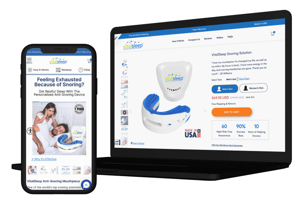

Snoring is embarrassing and harming relationship and the causes could be over weight, tired at work or stress. Their product effectively addresses the root cause of snoring, providing users with a better quality of sleep in almost any sleeping position. Is design for adults who snore (30 and older) and tried other solutions that did not help or work. Vitalsleep is designed to be effective from the very first night of use. It moves the lower jaw forward, opening up the airway and preventing the collapse of soft tissues that cause snoring.

Making the prominent features section more concise and visually appealing shall help increase User engagement and motivate more Users to go to ‘Shop now’. This will also help remove repetitive information and reduce the scroll length, which shall help increase User scroll depth and engagement on Homepage.
| Variations | Conversion Rate | Visitors | Add to Cart | Confidence Level |
| Original Page | - | 9,417 | - | 100% |
| Variation | +15.62% | 9,425 | +25.06% |


Showing Sticky tabs will increase the engagement of the users and will increase content consumption.
| Variations | Conversion Rate | Visitors | Add to Cart | Confidence Level |
| Original Page | - | 2,493 | - | 99.91% |
| Variation | +3.39% | 2,566 | +72.50% |


Resequencing content for easier navigation & clarity
| Variations | Conversion Rate | Visitors | Add to Cart | Confidence Level |
| Original Page | - | 22,131 | - | 94.67% |
| Variation | +11.93% | 22,197 | +4.44% |


As the audits showed that more users clicked on the video. Adding an exposed informative video on the homepage will help them get to know about the product and and its features. It is more user engaging and will attract user attention
| Variations | Conversion Rate | Visitors | Add to Cart | Confidence Level |
| Original Page | - | 3,246 | - | 92.96% |
| Variation | +19.88% | 3,189 | +7.56% |


Visitors are majorly checking how the device works. Also, they are watching videos, checking out reviews, reading out benefit section and always closing discount pop-up
Google Analytics: 89% of visitors landing here drop off without any shopping activity. Rest move between product, FAQs, reviews before dropping off or making a purchase
Various section are repeated and page length is high. Few important sections can be brought up. Also there is no UGC on the page
Around 50% users are abandoning the checkout and around 33% users are abandoning the cart
Cart and Checkout page lacks assurances and social proof to increase the trust of the users
Use of uniform icon packs across the website will lead to more visual consistency
After the client approves the design, we move forward with the development of the test. This process typically takes around five days, including the quality assurance (QA) process. Once complete, we share a preview link with the client. If they approve, the test is launched.
