

Unboxme is all about delivering joy – to our customers, to people receiving our gifts, and to the incredible small businesses we’re honored to work alongside. What began as personal care packages for our nearest and dearest organically grew into a fully-fledged company, and before we knew it, we were sending hugs in boxes across the country!

Adding UGC in PI will make it more relatable and motivate user to take action
| Variations | Conversion Rate | Visitors | Confidence Level |
| Original Page | 10.27% | 1,870 | 92% |
| Variation | 11.75% | 1,864 |


Allow users to recognize the products
| Variations | Conversion Rate | Visitors | Add to Cart | Confidence Level |
| Original Page | - | 1,507 | - | 88% |
| Variation | +1% | 1,550 | +9.55% |


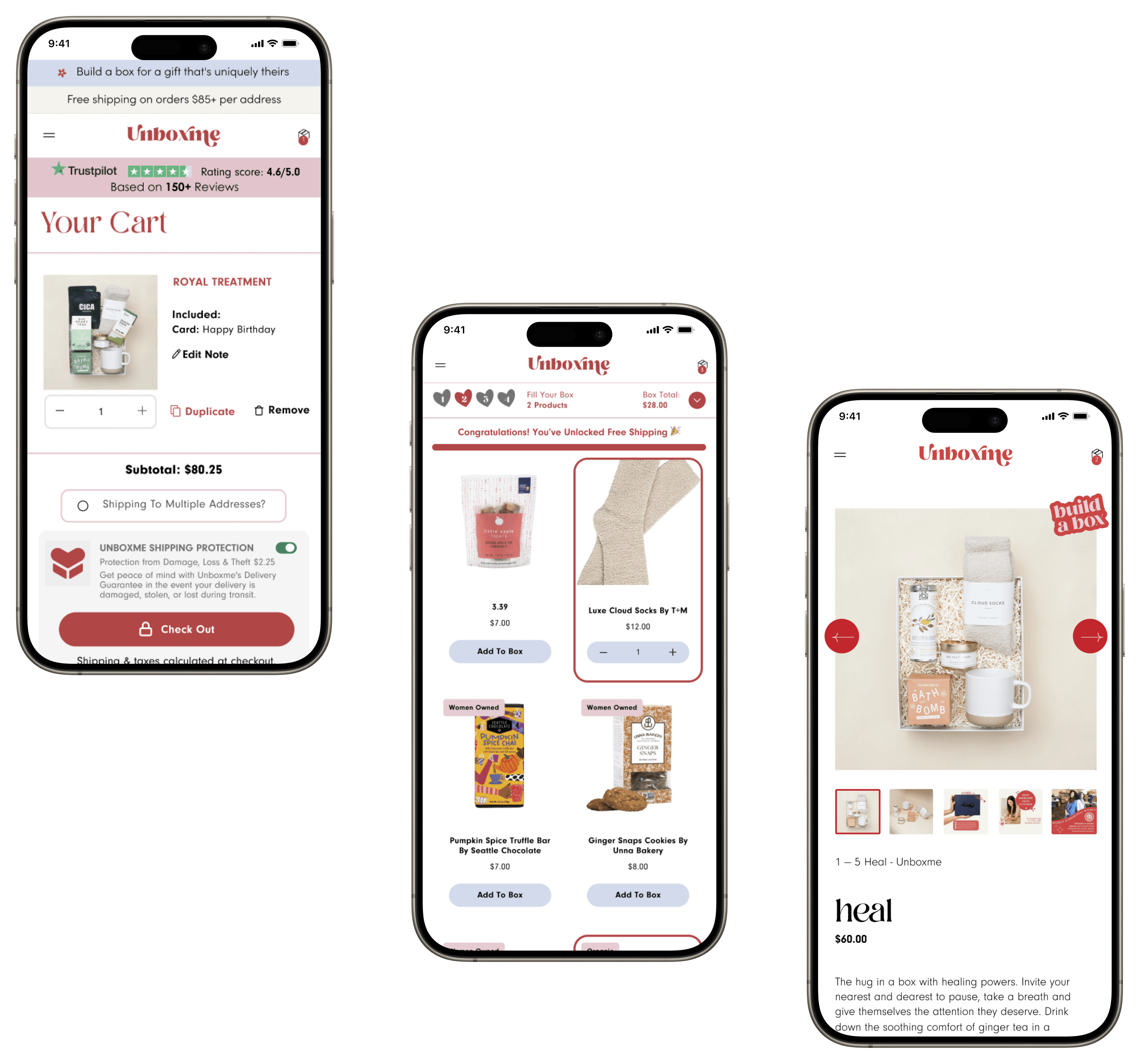
The user will see an opportunity to reach Free shipping at $85.
| Variations | Conversion Rate | Visitors | RVP | AOV | Add to Cart | Confidence Level |
| Original Page | - | 3,169 | $6.96 | $6.96 | - | 99% |
| Variation | +19.68% | 3,154 | $7.55 | $7.55 | +59.56% | |
| Increment | - | - | 8.45% | 10.88% | - |


Optimize the main cart page with different value propositions to promote proceed to checkout, and offer a cleaner experience.
| Variations | Conversion Rate | Visitors | Goal: RVP | Goal: AOV | Confidence Level |
| Original Page | 6.07% | 7,529 | $4.39 | $72.35 | 93% |
| Variation | 6.67% | 7,560 | $5.17 | $77.57 | |
| Improvement | 10% | - | 17.8% | $77.57 |


Visitors landing on the homepage are going straight to the hamburger menu to navigate to collection pages where we have less clarity, users do not use PLP filter options, few elements use a lot of space reducing visibility to other elements
Less than 60% users are not scrolling beyond the “Send a hug in a box” Section on the homepage
Users really loved the website, loved the personalized gift items and box packaging
Build-a-box page: Users are not interacting much with colour selectors for box, or for filters and category selectors in step 3 when they have to select a product. They have to browse a lot to find suitable items
Build-a-box page: The thumbnail images are noticeably small and lack clarity, leading to a subpar user experience. There is no product highlighting in the initial view, affecting visibility. Additionally, the PDP lacks badging details that are emphasized on the PLP.
The cart page layout appears misplaced, with minimal product visibility. The checkout CTA is not immediately visible. Redesigning for clarity is recommended.
After the client approves the design, we move forward with the development of the test. This process typically takes around five days, including the quality assurance (QA) process. Once complete, we share a preview link with the client.
If they approve, the test is launched
