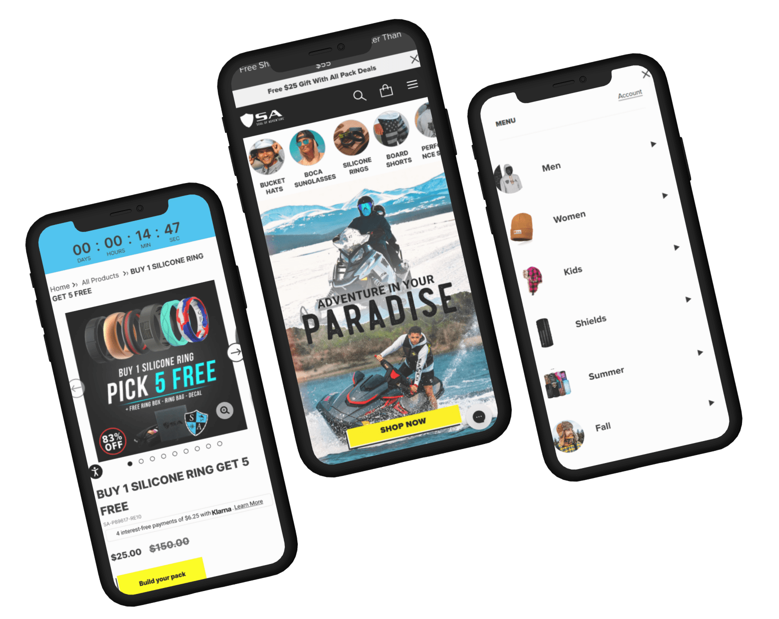

SA was founded in 2013 by those who seek adventure. Those little moments that build up and make us feel triumphantly free in the outdoors - it’s the heartbeat of adventure. We want SA Nation to experience the feeling of being alive in the outdoors and being free in your soul. Our gear is the vessel to provide protection and value to the greatest experience of all, coming alive in the outdoors.
SA was founded out of a love for the outdoors and being on the water. Being on the boat, being challenged by a problem and having the will to solve it.
The intention of SA was always to bring quality products to those that love being outside. Our products are the vessel that provide quality gear at a reasonable price allowing all of us to stay outside longer through protection and comfort.

Adding category tiles on the Home page will bring more clarity to the users about different products being offered on the site
| Variations | Conversion Rate | Visitors | Add to Cart | Confidence Level |
| Original Page | - | 12,552 | - | 100% |
| Variation | +10.36% | 12,336 | +52.75% |


Visuals are easier and quicker to consume and remember for users.
| Variations | Conversion Rate | Visitors | Add to Cart | Confidence Level |
| Original Page | - | 36,924 | - | 100% |
| Variation | +5.56% | 37,715 | +6.61% |
Adding decision making information in PI’s, for users to take desired actions.
| Variations | Conversion Rate | Visitors | Add to Cart | Confidence Level |
| Original Page | - | 30,962 | - | 98% |
| Variation | +9.6% | 31,091 | +1.68% |


Current search is having a blank section though the users have to think about the product first. Thus, by providing recommendations on the search bar, users will be motivated to take action.
| Variations | Conversion Rate | Visitors | Add to Cart | Confidence Level |
| Original Page | - | 120,428 | - | 100% |
| Variation | +2.12% | 120,118 | +56.36% |


On the Home page Navigation: Visitors landing here are going straight to the hamburger Menu to navigate to collection pages. Relevance GAP.
Most Users are not scrolling beyond the “Spring Best Seller” section on the homepage. Lack of motivation.
Users find it easy to understand what the products on the website are.
Home page - Visitors landing on this page are moving on to collection pages, and product pages.
Heuristic insights Simplification of the layout in the hamburger menu would make it easier for user to navigate.
Product page - Users are mostly landing on this page from the homepage, and moving on to product pack pages. Lack of motivation
After the client approves the design, we move forward with the development of the test. This process typically takes around five days, including the quality assurance (QA) process. Once complete, we share a preview link with the client.
If they approve, the test is launched.
