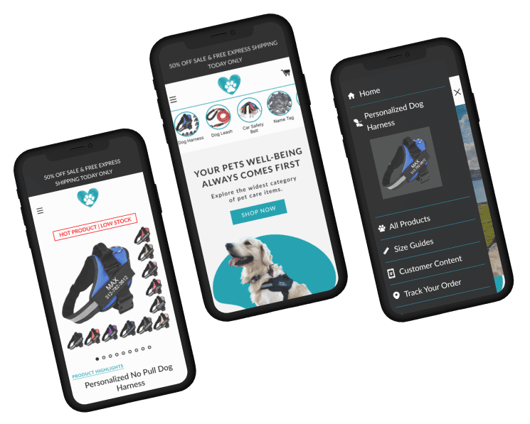


The primary audience consists of middle-aged women who own dogs and are from the United States and Canada. There were no established brand or design guidelines, but the company was open to conducting a customer survey. Additionally, the website had not been optimized. In the short term, the company's objective was to enhance the website's design and branding to increase the conversion rate and average order value.

Adding top-selling product highlights at the top of the homepage shall help increase User’s awareness of the range of products available on the website, thus helping increase ATC and PDP visits.
| Variations | Conversion Rate | Visitors | Visits on PDP | Add to Cart | Confidence Level |
| Original Page | - | 5,134 | - | - | 98.66% |
| Variation | +16.62% | 5,132 | +25.8% | +26.54% |


Adding infinite scrolling on the collection page, highlighting total reviews for social proofing, tagging products with Bestsellers and clear discount bubbles & highlighting multiple buy discounts to give a similar feel to that of social media apps and encourage more product discovery.
| Variations | Conversion Rate | Visitors | Visits on PDP | Add to Cart | Confidence Level |
| Original Page | - | 690 | - | - | 96.59% |
| Variation | +26.97% | 704 | +2.25% | +12.22% |


Optimising homepage to utilise page space judiciously with new hero banner to showcase unique value propositions and product usage, adding highlighted features and a best sellers section, incorporating reviews for social proof, Integrating an Instagram grid for user-generated content (UGC) and social proof.
| Variations | Conversion Rate | Visitors | Add to Cart | Confidence Level |
| Original Page | - | 2,125 | - | 90.22% |
| Variation | +13.09% | 2,066 | +2.59% |


Make ‘Add to Cart’ sticky while also adding an ‘Edit’ button to scroll back up if a User wants to change details. This shall improve accessibility for Users increasing ease of use while also creating recall value if they are scrolling down
| Variations | Conversion Rate | Visitors | Add to Cart | Confidence Level |
| Original Page | - | 7,431 | - | 98.66% |
| Variation | +7.82% | 7,461 | +7.52% |


Exposing the navigation menu on the desktop shall increase visibility and improve accessibility thus increasing visits to product pages.
| Variations | Conversion Rate | Visitors | Visits on PDP | Add to Cart | Confidence Level |
| Original Page | - | 2,019 | - | - | 100% |
| Variation | +10.12% | 2,006 | +91.86% | +9.51% |


50% of Users are scrolling till the end of the main content 33.4% of Users are scrolling till the end of page
The highest clicks are on the main CTA and hamburger menu. There isn’t anything else to interact with.
4.8% of the total session in the home page is getting the highest traffic among all pages. The Average engagement time per session for users on the home page is 1m 02s
Half of the visitors drop off at ATC CTA. 75% of Users are dropping off in the next fold. Few Users are going to the product description section
The add to cart button is not accessible at the bottom of the page. The scroll length is high. The size guide is also not accessible easily.
Highest viewed page with view percentage of 45.08% of total views & 55.35% share of total sessions. User flow from the product page is mostly back and forth between product pages and a few to collection pages
After the client approves the design, we move forward with the development of the test. This process typically takes around five days, including the quality assurance (QA) process. Once complete, we share a preview link with the client. If they approve, the test is launched.
