

"One thing that I really loved most is that they were able to not just show us, increases in terms of percentage points, but also attribution of actual revenue improvements in their work. And everything that they did is numbers based with AB testing and they were great listeners of our goals and great executors. So I highly recommend them and thank you, Purple Fire".
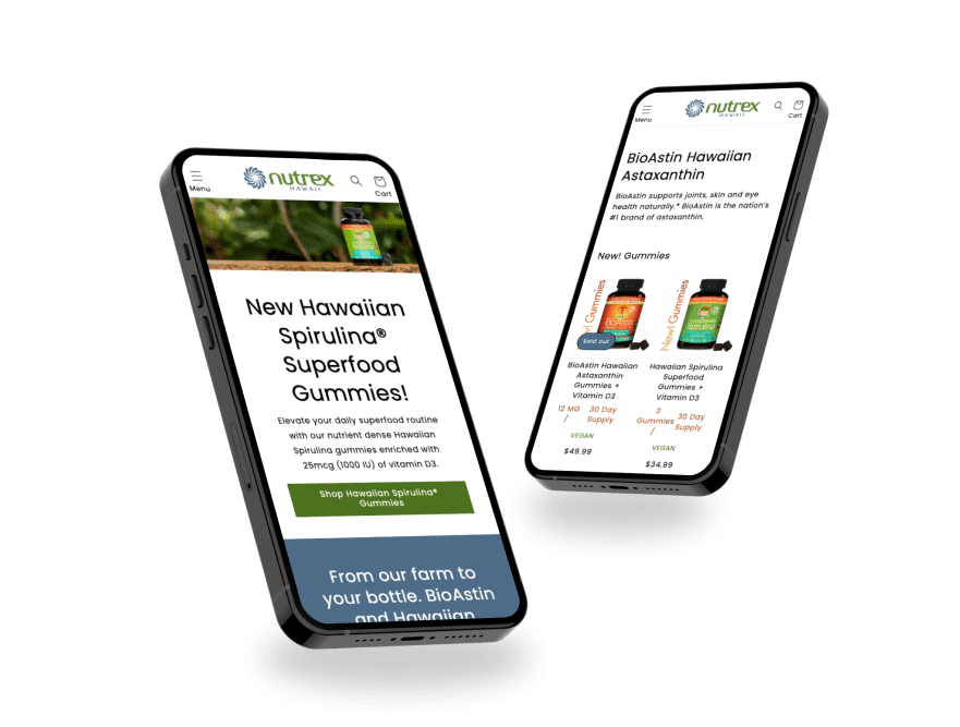
Nutrex Hawaii, founded in 1990, is based on the beautiful Kona coast. They focus on using the benefits of microalgae to improve health and extend lives worldwide. Committed to sustainability, Nutrex turns barren land into a thriving farm, using natural resources like sunlight, ocean water, and fresh aquifer water to grow their health-focused products.

Introducing upsells at the checkout stage along with USPs can potentially increase the average order value.
| Variations | Conversion Rate | Visitors | Revenue per visitor | Confidence Level |
| Original Page | - | 1,302 | - | 97.06% |
| Variation | +34.82% | 1,328 | +64.59% |


The images are not clickable which increases user anxiety, redesigning the tiles with star ratings and short product descriptions can improve the user journey.
| Variations | Conversion Rate | Visitors | Revenue per visitor | Confidence Level |
| Original Page | - | 404 | - | 92.30% |
| Variation | +31.24% | 444 | +67.49% |


We would like to work on the product images to better engage the user with more product info and storytelling to hopefully raise conversions and ease them into the buying journey with more confidence.
| Variations | Conversion Rate | Visitors | Revenue per visitor | Confidence Level |
| Original Page | - | 779 | - | 72.47% |
| Variation | +11.50% | 795 | +7.69% |


Based on user behavior, we noticed that on the Homepage, most users look out for the site categories through the hamburger menu because they cannot find this option quickly elsewhere.
We also discovered that on the Homepage, 50% of users leave immediately after the first fold. Additionally, users who reach the end of the page interact significantly with the footer icons.
On the collection pages, we noticed that users look for different SKUs of the same product by scrolling horizontally.
From heuristic analysis, we observed a lack of value proposition and options for filtering and sorting products.
Through user research, we found that users did not understand the product division on the category page and felt the need for more information about the products before proceeding with the purchase.
From surveys conducted directly with users, we discovered that they purchase the products because of the benefits they offer. Consumers are impressed with the results and are interested in product features, such as being natural and vegan.
After the client approves the design, we move forward with the development of the test. This process typically takes around five days, including the quality assurance (QA) process. Once complete, we share a preview link with the client.
If they approve, the test is launched.
