
At MiaMily, they understand the challenges of parenting. That's why they created the HIPSTER PLUS, a high-end carrier based on their own experience with their children. Within 30 days of launching on Kickstarter, they hit their target goal, were selected as a Staff Pick, and reached their stretch goal.

Adding UGC in PI will make it more relatable and motivate user to take action
| Variations | Conversion Rate | Visitors | Add to Cart | Confidence Level |
| Original Page | - | 4,284 | - | 99.32% |
| Variation | +65.90% | 4,257 | +5.19% |


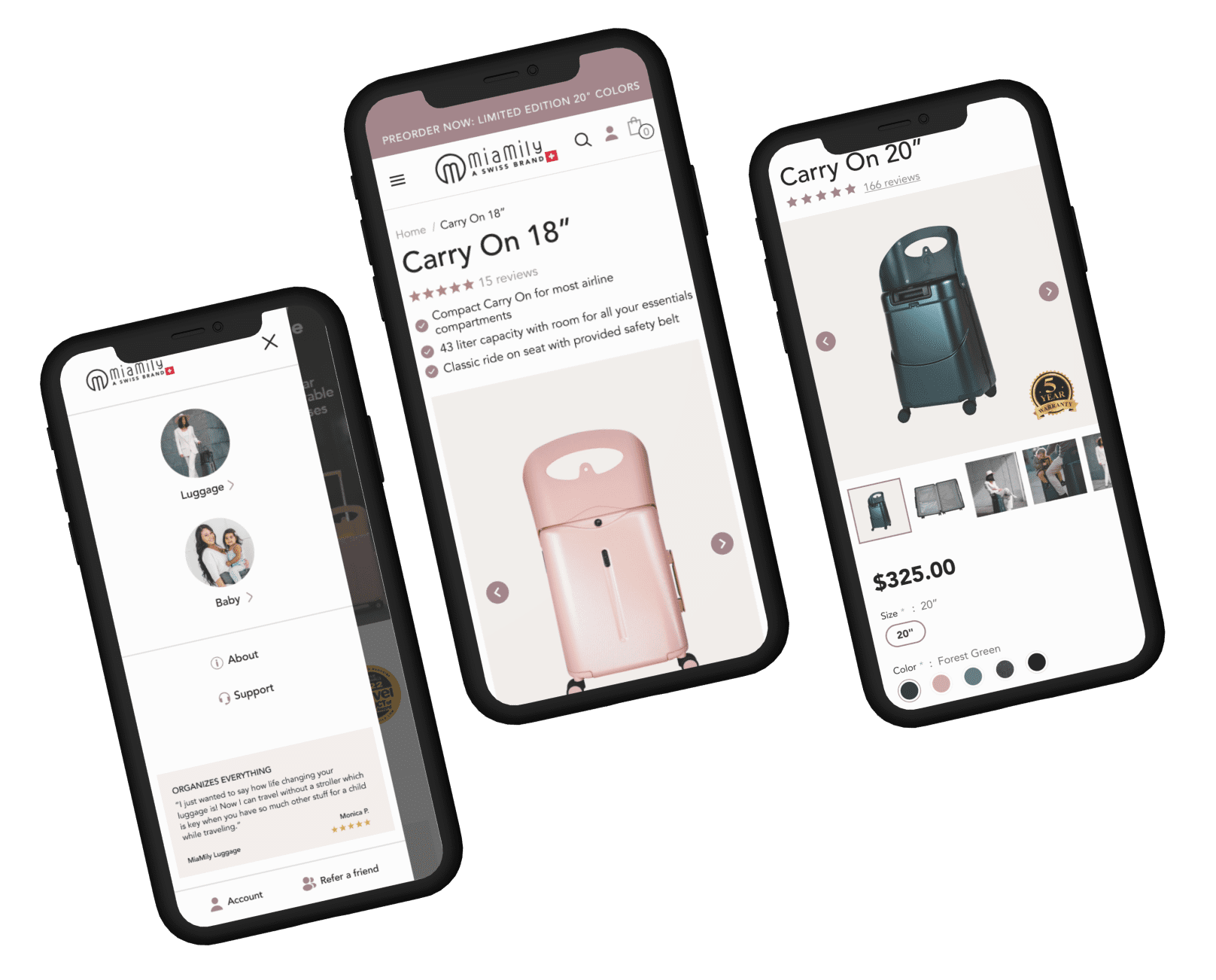
Showing product benefit with short pointers below product title will add clarity to user and motivate them.
| Variations | Conversion Rate | Visitors | Add to Cart | Confidence Level |
| Original Page | - | 5,915 | - | 98.43% |
| Variation | +32.22% | 6,049 | +3.23% |


Content in line with the voice of customer will resonate better for users to take desired action
| Variations | Conversion Rate | Visitors | Banner Clicks | Add to Cart | Confidence Level |
| Original Page | - | 2,125 | - | - | 90.22% |
| Variation | +19.68% | 2,066 | +393.66% | +59.56% |


Adding sticky tabs will decrease friction and provide ease of navigation to explore product description.
| Variations | Conversion Rate | Visitors | Confidence Level |
| Original Page | - | 7,638 | 94.99% |
| Variation | +27.92% | 7,655 |


Adding features section which includes GIFs will increase the user motivation. Increase clarity and reduce hesitation.
| Variations | Conversion Rate | Visitors | Add to Cart | Confidence Level |
| Original Page | - | 11,137 | - | 91.12% |
| Variation | +17.96% | 10,823 | +4.95% |


On the Home page Navigation is confusing and should clearly speak to the intent/purpose of the user’s visit to the site
Lack of clarity on product page: Users are still unclear about the product features such as belt, material, push-pull from both sides.
Cart - High friction: Users don't expect route protection charges getting added at cart
Hero section of homepage is not clear to convey what the website is really about.
Low motivation on PDP: Users landing on other pages and moving to product pages want to explore more colors but don't find them as they are OOS
Lack of motivation - Cart: Users add products to cart as wishlist many a times and with still having some unanswered questions from product page, they are not ready to move ahead
After the client approves the design, we move forward with the development of the test. This process typically takes around five days, including the quality assurance (QA) process. Once complete, we share a preview link with the client. If they approve, the test is launched.
