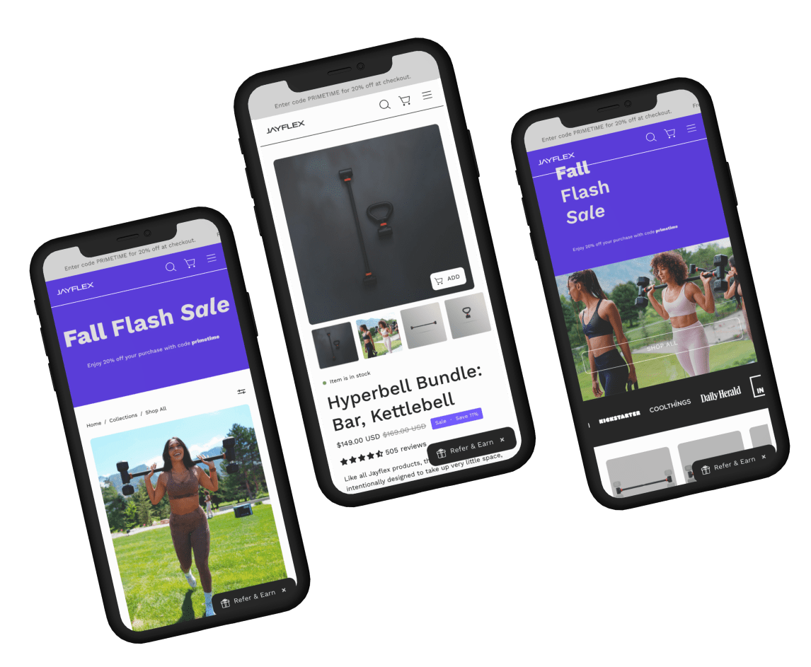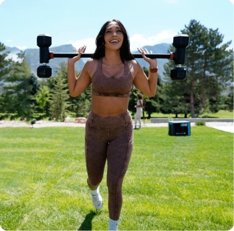

The product is design for people that work from home and have small spaces at home or live in flats. They offer also the flexibility to carry the equipment with you everywhere.
The main goal for the company was increase the CRO, clarify the product because the people could think that all the products include everything and also educate the clients that they need to read the entire description to understand what the product has.

Adding UGC in PI will make it more relatable and motivate user to take action.
| Variations | Conversion Rate | Visitors | Confidence Level |
| Original Page | - | 1,338 | 96.65% |
| Variation | +61% | 1,511 |

| Variations | Conversion Rate | Visitors | Confidence Level |
| Original Page | - | 351 | 90% |
| Variation | +50.29% | 367 |

| Variations | Conversion Rate | Visitors | Confidence Level |
| Original Page | - | 11,387 | 99.97% |
| Variation | +19.93% | 11,320 |


More than 50% users drop off on home page, remaining users move on to collection or product pages in their first interaction
88% of the users drop off after landing on the pages, only 2.6% takes any significant action, like adding to cart or checkout.
Majority of the user land on home page, and behaviour flow shows, collection pages are more interacted. Tik tok and direct channels contribute to most of the traffic but conversion rate for tik tok is low, on the other hand google cpc has better conversion rate, and can be scaled.
Users navigate from the homepage using the hamburger menu. Users are interacting with the CTAs on the 1st fold. Very few users are going down the page where they interact with the gallery carousel.
Visitors quickly scroll to the product carousel without reading much info, showing limited interest in reviews but interacting with 'Learn More' and Home gym sections (Dead clicks)
Assurances icons, happy reviews should boost the motivation of the buyer resulting in higher checkouts
