
They pride themselves in selling only the finest quality products that deliver the greatest value to their customers.

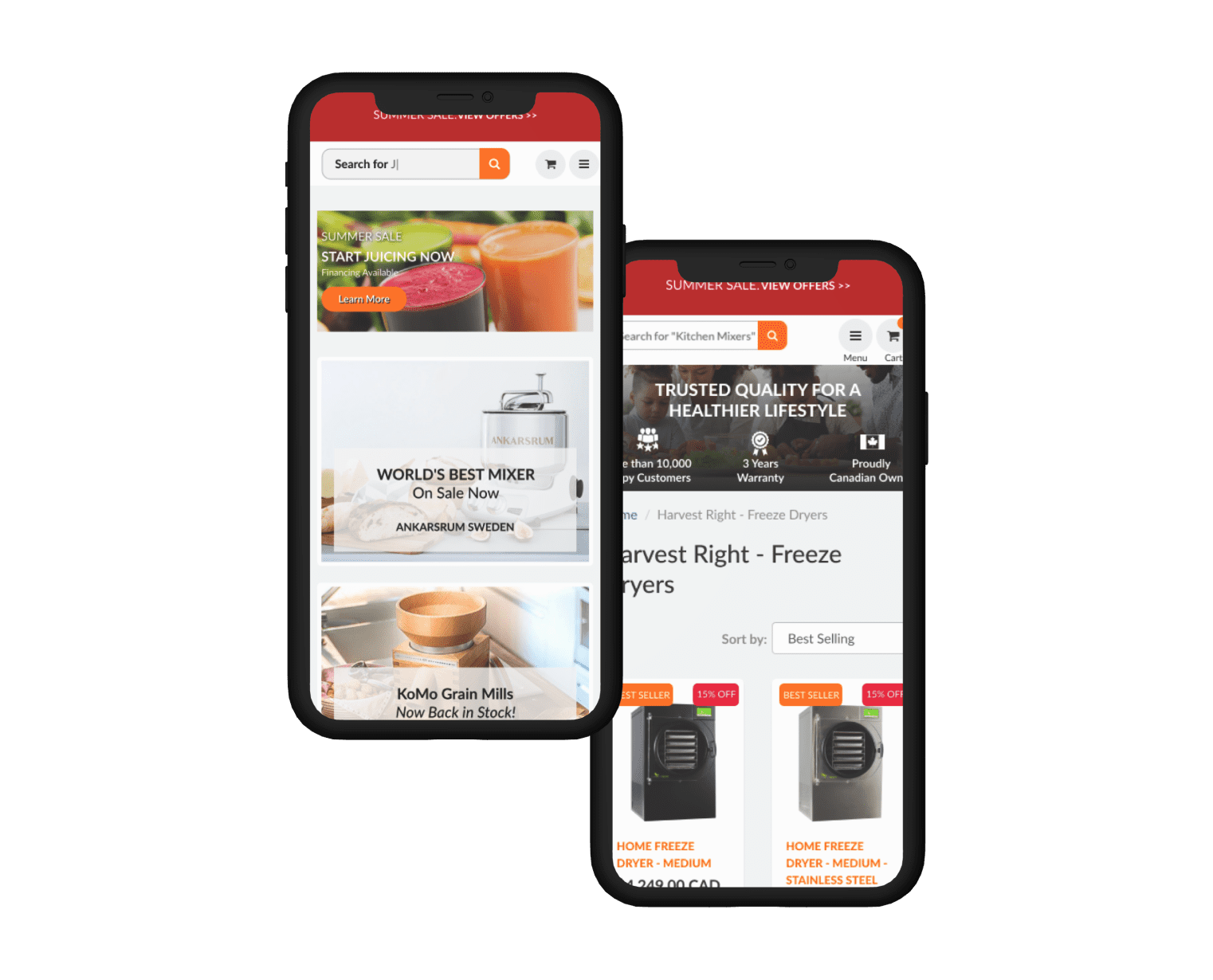
Added prominent search bar with auto rotating test will increase the motivation on the user to search the products
| Variations | Search Page Load | Visitors | Add to Cart | Conversions URL |
| Original Page | - | 2,879 | - | 99.93% |
| Variation | +48.25% | 2,932 | +8.08% |


Make “Retain 97% nutrients” the hero banner by shifting it up, and adding more USPs to it, while making the current hero banner (pay later option) smaller and shifting it below the main hero banner. This shall help highlight the main USP of this product thus increasing motivation while also increasing visits to product pages
| Variations | Visitors | PDP Visits | Cart Page |
| Original Page | 1,122 | - | 100% |
| Variation | 1,074 | +94.36% |


Adding a trust banner with icons, defaulting sorting to “Best Selling”, adding a “BEST SELLER” tag, and including an Affirm Banner on the category page are expected to enhance user trust and shopping experience, potentially increasing sales
| Variations | Conversion Rate | PDP Visits | Cart Page |
| Original Page | - | - | 98.82% |
| Variation | +26.49% | +19.86% |


Placing the assurance icons and texts at the top of the homepage ensures they are one of the first elements users see when they land on the page. Increased visibility of assurances can create a positive first impression and immediately communicate the brand's reliability.
| Variations | Conversion Rate | ATC | Visitors | Conversions URL |
| Original Page | - | - | 2,171 | 78.90% |
| Variation | +1.88% | +12.18% | 2,131 |


On the homepage navigation: users are not engaging much on homepage, going straight to navigation menu.
Collection pages - Users are engaging well with the content except for text heavy parts like the benefits section. From here most are going to PDP from listing at bottom or other PLPs via navigation menu.
Product page - 50% scroll drop off is just before product specifications in 5th fold. 27% scroll depth is till end of page for both mobile and desktop.
Home page - 50% scroll drop off is at 3rd fold in mobile and 2nd fold in desktop. 75%scroll drop off in mobile is by 4th fold while in desktop it is at end of page
Cart page - Some users are checking out shipping and return info. Some are adding item to cart on PDP then clicking on ‘Continue shopping’ on cart page.
Catalogue page - The abundance of information is appreciated. In the product listing section clear information is not given on features such as different pump types or application of different sizes
After the client approves the design, we move forward with the development of the test. This process typically takes around five days, including the quality assurance (QA) process. Once complete, we share a preview link with the client.
If they approve, the test is launched.
Implementation by our team or the client dev team
After the test is concluded successful, we create a requirement document that includes all the necessary specifications for the implementation. It is important for the client to approve this document before it is sent to the development team.
Once approved, the team begins working on the implementation and a QA process is conducting to ensure everything is functioning properly. Before going live, we offer a preview link for the client to review and ensure everything is satisfactory
In case the client wants to implement the test on their end we provide the same document that includes all the necessary specifications for the implementation
